Lift Chart and Gains Chart Generator
Create lift and cumulative gains charts online from Excel or CSV model outputs. Evaluate targeting and campaign efficiency with AI.
Or try with a sample dataset:
Preview
What Is a Lift Chart?
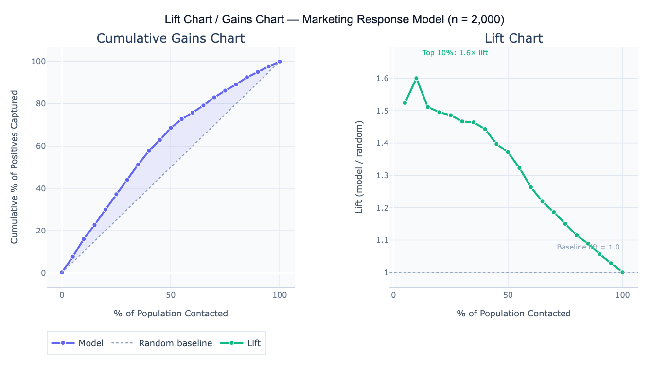
A lift chart (also called a gains chart or cumulative response chart) evaluates how much better a predictive model performs at identifying positive cases compared to random targeting. It answers the question: "If I contact the top X% of people ranked by my model's score, what fraction of all the true positives will I reach — and how does that compare to randomly contacting X% of people?" The chart is the standard tool for assessing targeting efficiency in direct marketing, lead prioritization, health screening, and churn prevention — any context where resources limit how many people can be contacted and you want to maximize the return on each outreach.
The cumulative gains chart plots the percentage of the population contacted (x-axis, sorted by descending model score) against the percentage of all positive outcomes captured (y-axis). The random baseline is a diagonal line — randomly contacting 30% of people will capture 30% of positives. A perfect model would show all positives captured within the first X% of the population (where X% equals the base rate). The model's gains curve falls between these extremes — the further above the diagonal, the more the model improves on random targeting. Lift is the ratio of the model's cumulative response rate to the random baseline: lift = 2.5 at the top 20% means the model captures 2.5× as many positives as random selection of the same 20%.
A concrete example: a direct mail campaign targets 10,000 households for a product offer with a 6% base response rate (600 total responders). A logistic regression model scores all households. The top 20% of scored households (2,000 people) contain 43% of all 600 responders — a lift of 2.15× at 20%. This means the campaign budget spent on 2,000 targeted households will reach as many responders as randomly mailing 4,300 households, reducing cost per contact by 53%. The decile table shows that lift falls from 3.4× in the top decile to 1.1× in the 7th decile — below that threshold, the model barely outperforms random, so the budget cutoff should be set at the top 60–70%.
How It Works
- Upload your data — provide a CSV or Excel file with one row per individual, a numeric score column (model-predicted probability or score), and a binary outcome column (1 = positive, 0 = negative).
- Describe the analysis — e.g. "score column = predicted_prob, outcome column = converted; cumulative gains chart; lift chart; decile table with lift per decile; top-20% lift annotation"
- Get full results — the AI writes Python code using pandas and Plotly to sort by score, compute cumulative gains and lift, generate both charts, and produce a decile-level summary table
Required Data Format
| Column | Description | Example |
|---|---|---|
score | Model-predicted probability or score | 0.82, 0.34, 0.91 |
outcome | Binary actual outcome | 1 (positive) or 0 (negative) |
id | Optional: individual identifier | C1234, lead_99 |
Any column names work — describe them in your prompt. Scores do not need to be calibrated probabilities — any numeric ranking works (higher = more likely positive). If you have multiple models to compare, include a score column per model.
Interpreting the Results
| Output | What it means |
|---|---|
| Cumulative gains curve | % of positives captured vs % of population contacted; higher = better model |
| Random baseline | Diagonal line — what random targeting would achieve |
| Lift at top N% | (% positives captured in top N%) / N% — how many times better than random |
| Decile table | Population divided into 10 equal groups by score; shows count, response rate, and lift per decile |
| Optimal cutoff | The score threshold where lift drops to 1.0 — below this, the model adds no value over random |
| Area under gains curve | Summary of overall model value for targeting; larger area = more efficient model |
| Break-even reach | % of population to contact to capture a target % of all positives |
Example Prompts
| Scenario | What to type |
|---|---|
| Basic lift chart | score column = pred_score, outcome = converted; cumulative gains chart; lift curve; top-20% lift |
| Decile table | decile analysis: 10 equal groups by score; count, response count, response rate, cumulative lift per decile |
| Budget optimization | if budget allows contacting 30% of population, how many positives are captured vs random? |
| Model comparison | compare lift curves for 3 models (logistic, random forest, gradient boost); plot on same chart |
| Optimal threshold | at what score threshold does lift drop below 1.5? what % of positives are captured at that point? |
| Campaign ROI | at top 25% reach: compare cost of outreach ($2/contact) vs expected revenue ($50/conversion) with model vs random |
| Perfect model | add perfect model curve to gains chart; what is the maximum achievable gain at 20% reach? |
| Quintile breakdown | quintile (5-group) analysis; response rate and lift per quintile; bar chart of response rate by quintile |
Assumptions to Check
- Score calibration — lift charts require only that scores correctly rank individuals from most to least likely positive — absolute calibration (scores equaling true probabilities) is not required; a model with poor calibration but good rank ordering will still produce a valid lift chart
- Sufficient positive cases — lift charts become noisy when the number of actual positives is small; with fewer than 50 positives, the decile-level lift estimates have high variance and individual decile results should not be over-interpreted; use a coarser breakdown (quintiles) with small positive counts
- No data leakage — the model scores used for the lift chart must be out-of-sample predictions (from a held-out test set), not in-sample predictions from the training data; in-sample lift charts overstate model performance because the model was optimized on the same data
- Stable base rate — lift charts assume the base rate in the population being targeted equals the base rate in the data used to build the chart; if you built the model on a 50/50 balanced sample but the real population has 5% base rate, the lift chart must be recalculated at the actual deployment base rate
Related Tools
Use the ROC Curve and AUC Calculator for a threshold-independent evaluation of model discrimination that complements the lift chart — AUC summarizes overall ranking ability while the lift chart quantifies targeting efficiency at specific reach levels. Use the Lead Scoring Model to build the predictive model whose scores are then evaluated with the lift chart. Use the Confusion Matrix & Sensitivity Specificity Calculator to evaluate model performance at a fixed classification threshold rather than across all thresholds. Use the A/B Test Calculator to validate that model-targeted campaigns actually outperform random targeting in production.
Frequently Asked Questions
What is the difference between a lift chart and an ROC curve? Both evaluate predictive model performance, but they answer different operational questions. The ROC curve (TPR vs FPR) evaluates a model's discrimination ability across all possible thresholds, independent of the base rate. The lift chart shows targeting efficiency at each reach level in the actual deployment population — it directly answers "how much better is the model than random for a given budget?" The lift chart is more directly actionable for campaign planning; the ROC curve is better for comparing models independent of the base rate. For a 6% base rate target population, the ROC curve and lift chart can diverge significantly — a model with high AUC may still have modest lift if the score distribution is not sufficiently separated.
How do I use a lift chart to set a campaign budget? Find the point on the lift curve where marginal lift drops to approximately 1.0 (the model no longer outperforms random). The corresponding x-axis value is your efficient reach ceiling — contacting more people beyond this point yields no benefit from the model. For a business constraint like a fixed budget, find the x-axis value corresponding to your affordable reach (e.g., budget covers 25% of population), read off the y-axis to see how many positives you'll capture, and multiply by conversion value to estimate ROI. The decile table makes this calculation explicit: each decile shows the expected response count and lift, so you can sum deciles until you hit your budget.
My model has high AUC but low lift at the top decile — is something wrong? This can happen when: (1) the base rate is very low — with 1% base rate, even a good model may only score a lift of 3–4 in the top decile because the number of true positives is small; (2) the score distribution is diffuse — many individuals cluster near the same score, so the top decile is not clearly separated; (3) the model is overfit — high training AUC but lower test set lift indicates overfitting; check that scores are from a held-out test set. If AUC is genuinely high but lift is low, inspect the score histogram — if most scores fall between 0.45 and 0.55, the model is not providing strong differentiation despite reasonable ranking ability.