Heatmap Generator for Excel & CSV
Create heatmaps online from Excel and CSV data. Visualize matrices, patterns, intensity, and grouped comparisons with AI.
Or try with a sample dataset:
Preview
What Is a Heatmap?
A heatmap encodes a matrix of values as a grid of colored cells — the higher the value, the more intense the color. It turns a table of numbers into an instantly readable visual, letting you spot patterns, clusters, and outliers across two categorical or temporal dimensions at a glance.
Heatmaps are used everywhere: a retail analyst tracking sales by product and month, a web developer studying user click patterns by hour and day, an epidemiologist comparing disease rates by region and year, or a biologist visualising gene expression across samples and conditions. Anywhere you have a value that varies across two axes, a heatmap is often the clearest way to show it.
The choice of color scale matters enormously. A sequential scale (light → dark) works for values that only go in one direction (counts, rates, quantities). A diverging scale (red → white → blue) is essential when values can be positive or negative, or when a natural midpoint exists (e.g. temperature anomaly centered at zero, or correlation centered at zero). Using the wrong scale can completely mislead the viewer.
How It Works
- Upload your data — provide a CSV or Excel file. The AI can work with long format (columns:
row_label,col_label,value) or wide format (rows = one dimension, columns = another, cells = values) - Describe the heatmap — e.g. "heatmap of average revenue by region (rows) and quarter (columns), red-to-green color scale"
- Get the visualization — the AI writes Python code using Plotly or seaborn to pivot, aggregate, and render the heatmap
Interpreting the Results
| Visual element | What it means |
|---|---|
| Cell color intensity | Magnitude of the value — darker/brighter = higher (sequential) |
| Red cells (diverging scale) | Values above the midpoint (e.g. above-average, positive) |
| Blue cells (diverging scale) | Values below the midpoint (e.g. below-average, negative) |
| White / pale center (diverging) | Values near zero or the defined midpoint |
| Cluster of similar colors | A group of row-column combinations sharing similar values |
| Isolated bright cell | An outlier — unusually high or low compared to neighbours |
| Annotations inside cells | Raw values printed for precision reading |
Color Scale Guide
| Scale type | When to use | Example |
|---|---|---|
| Sequential (light → dark) | All values positive; magnitude is what matters | Sales volume, visitor counts |
| Diverging (red → white → blue) | Values can be above or below a midpoint | Temperature anomaly, correlation, % change |
| Categorical | Cells represent discrete categories, not numeric values | Status labels, risk tiers |
Example Prompts
| Scenario | What to type |
|---|---|
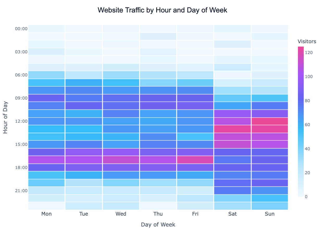
| Website traffic | heatmap of page views by hour of day (rows) and day of week (columns) |
| Sales performance | heatmap of monthly revenue by product category and region, annotate each cell |
| Survey responses | heatmap of average rating by question (rows) and demographic group (columns) |
| Stock returns | heatmap of monthly returns by year and month, diverging red-green scale |
| Gene expression | heatmap of expression values by gene (rows) and sample (columns), cluster rows |
Related Tools
Use the Exploratory Data Analysis tool to get a full correlation matrix heatmap alongside other summary statistics in one step. Use the Pivot Table tool if you want to aggregate your data before visualising it, or the AI Scatter Chart Generator to explore the relationship between two continuous variables instead of a grid.
Frequently Asked Questions
What data format does the heatmap tool expect? Either long format (three columns: row label, column label, value) or wide format (a matrix where rows and columns are already the two dimensions). Just describe your layout in the prompt — the AI will pivot or reshape as needed.
Can I cluster rows and columns to group similar patterns together? Yes — ask for a "clustered heatmap" or "dendrogram heatmap". The AI will apply hierarchical clustering and reorder the rows and columns so that similar ones are adjacent, making patterns much easier to see.
How do I add the numeric value inside each cell? Include "annotate cells" or "show values in cells" in your prompt. For large matrices this can get crowded, so also consider asking to "only annotate cells above threshold".
My matrix is very large — will it still be readable? For matrices larger than roughly 20×20, individual cell labels become too small. Ask the AI to aggregate first (e.g. group by decade instead of year) or focus on a subset of rows/columns most relevant to your question.