Scatter Plot Generator for Excel & CSV
Create scatter plots online from Excel and CSV data. Compare two variables, add trendlines, and color groups with AI.
Or try with a sample dataset:
Preview
What Is a Scatter Chart?
A scatter chart plots individual data points on two numeric axes to reveal the relationship between two variables. Each dot represents one observation — its horizontal position is the x-variable, its vertical position is the y-variable.
Scatter charts are the go-to tool for:
- Detecting correlations — do values tend to move together or in opposite directions?
- Spotting outliers — which data points deviate from the overall pattern?
- Visualizing clusters — do observations group into distinct clouds?
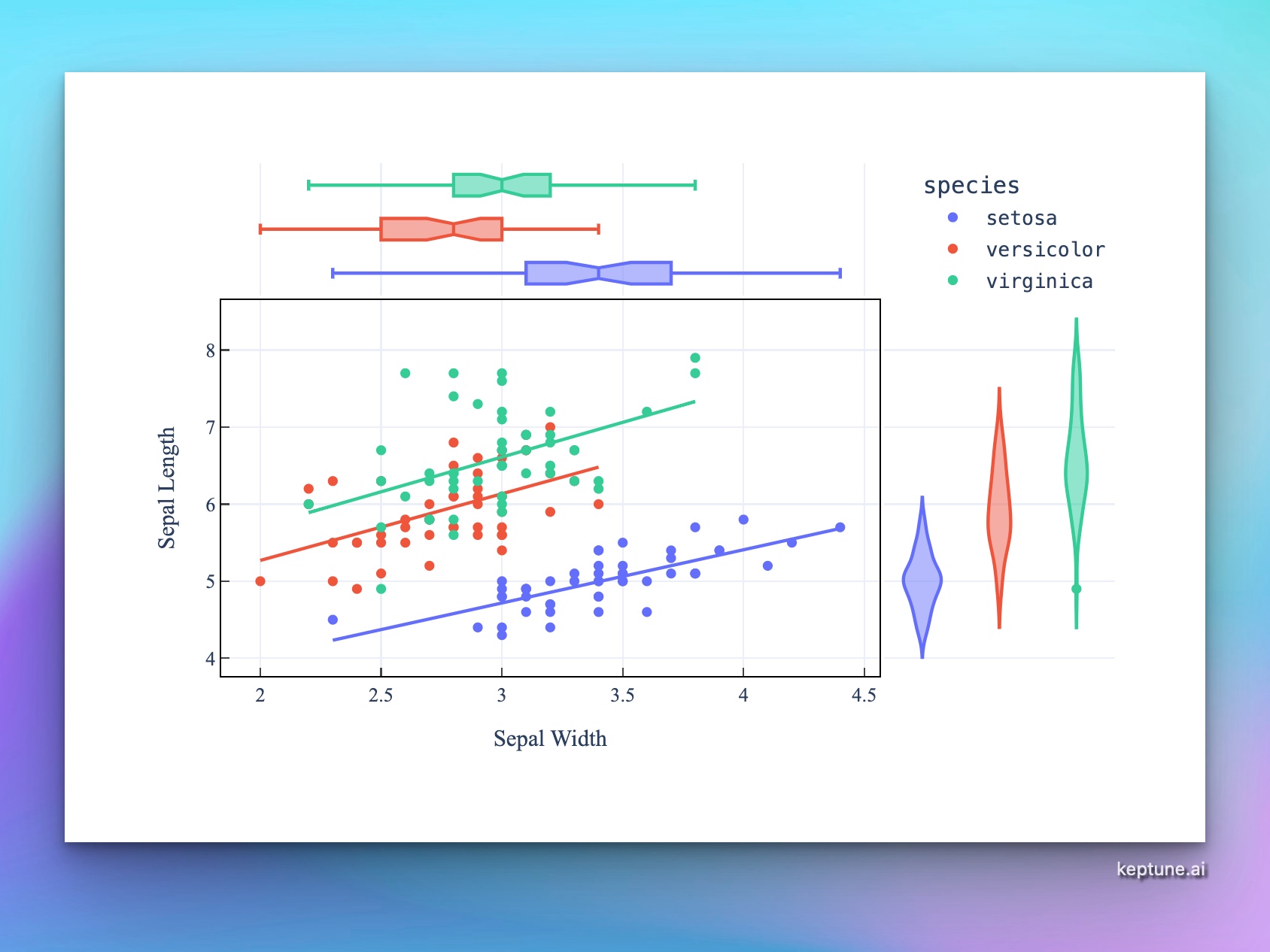
- Showing regressions — overlay a trendline to quantify the relationship
How It Works
- Upload your data — CSV or Excel with at least two numeric columns
- Describe your chart — e.g. "scatter plot of height vs weight, colored by gender"
- Get an interactive chart — hover points to see exact values and labels, zoom to explore clusters
Encoding More Information
A scatter chart can encode up to four variables at once:
| Variable | How to encode |
|---|---|
| X position | Primary numeric variable |
| Y position | Secondary numeric variable |
| Color | Categorical or numeric grouping |
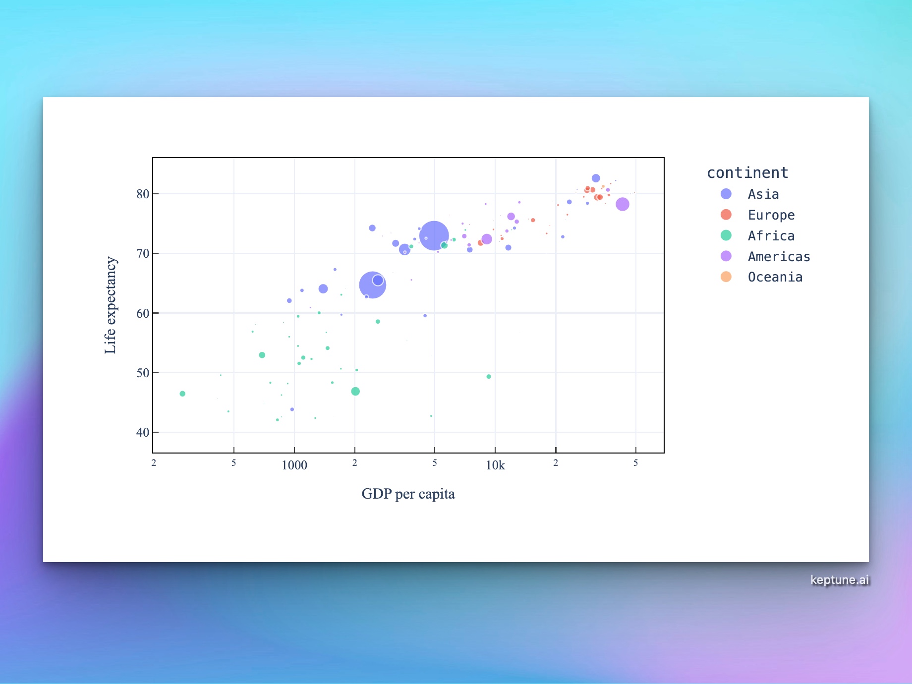
| Size | Third numeric variable (bubble chart) |
Just describe what you want — e.g. "scatter plot of GDP vs life expectancy, size = population, color = continent".
Example Prompts
| What you want | What to type |
|---|---|
| Basic correlation | scatter plot of advertising_spend vs revenue |
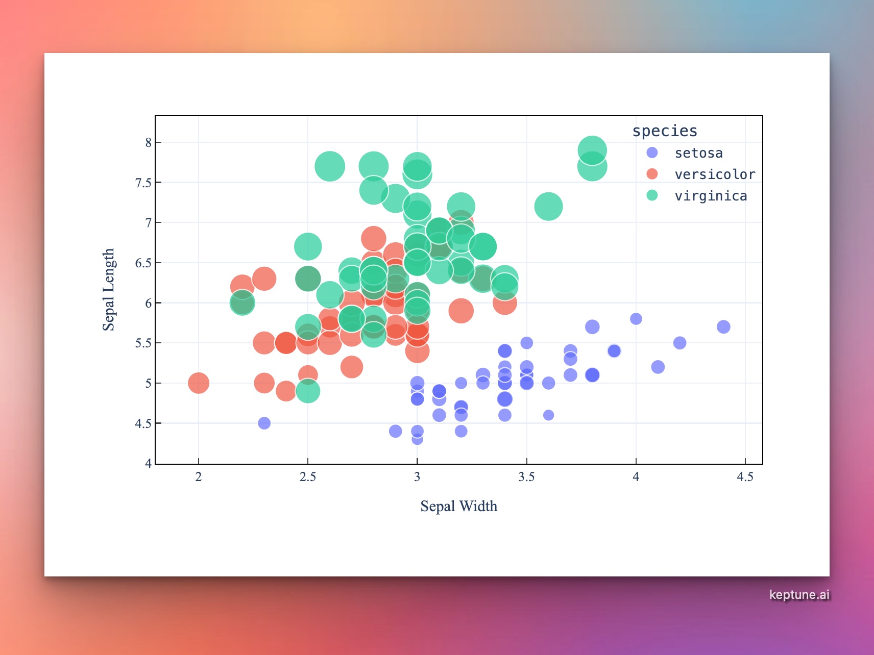
| Colored groups | scatter plot of sepal_length vs petal_length colored by species |
| With trendline | scatter plot of hours_studied vs exam_score with a linear trendline |
| Bubble chart | scatter plot of GDP per capita vs life expectancy, size = population, color = region |
| Marginal distributions | scatter plot of height vs weight with marginal histograms |
Frequently Asked Questions
How do I tell if two variables are correlated? A positive correlation shows points trending from bottom-left to top-right. A negative correlation trends from top-left to bottom-right. Ask the AI to add a trendline and display the R² value to quantify the strength.
What's the difference between a scatter chart and a bubble chart? A bubble chart is a scatter chart where point size encodes a third numeric variable. Just mention size in your prompt to create one.
Can I label individual points? Yes — ask the AI to "label each point with the name column" or "label only the top 10 points by value".
My chart has thousands of points and looks cluttered — what can I do? Ask for "reduce opacity to 30%", "add jitter", or "use a hexbin chart instead" to handle overplotting.