Data Formatting Best Practices for Analysis with LLMs
How you structure your data is just as important as the data itself.
Large Language Models (LLMs) like Claude, ChatGPT, and others have revolutionized the way we analyze data by generating code on demand—but their effectiveness depends heavily on how well your data is formatted.
This guide explores essential data formatting practices that optimize your datasets for AI-powered analysis. By following these principles, you'll enable AI assistants to generate more accurate, efficient, and useful code with fewer iterations and clarifications. Well-formatted data allows AI models to:
- Understand your dataset's structure more quickly
- Generate more accurate code on the first attempt
- Produce analyses that actually answer your questions
- Minimize preprocessing steps and error handling
Let's dive into the critical formatting practices that set your data up for successful and accurate analysis with LLMs.
Use Tabular Data Formats
LLMs work more efficiently with straightforward tabular data formats:
- CSV and Excel files are directly parsable
- Parquet files offer efficient columnar storage
- Avoid nested formats when simple tables will suffice
Tabular Example: Daily Temperature Readings (CSV)
| date | city | temperature_c | humidity_pct |
|---|---|---|---|
| 2024-01-01 | New York | 3.2 | 65 |
| 2024-01-01 | San Diego | 15.8 | 50 |
| 2024-01-02 | New York | 2.4 | 70 |
| 2024-01-02 | San Diego | 16.1 | 55 |
❌ Poorly Formatted Example 6: Nested JSON Structure
{
  "readings": [
    {
      "date": "2024-01-01",
      "locations": {
        "New York": {
          "temperature_c": 3.2,
          "humidity_pct": 65
        },
        "San Diego": {
          "temperature_c": 15.8,
          "humidity_pct": 50
        }
      }
    },
    {
      "date": "2024-01-02",
      "locations": {
        "New York": {
          "temperature_c": 2.4,
          "humidity_pct": 70
        },
        "San Diego": {
          "temperature_c": 16.1,
          "humidity_pct": 55
        }
      }
    }
  ]
}
Why it's bad:
- Deeply nested structures require complex transformations.
- LLMs need to write more code to extract and analyze data.
- Harder to visualize the full dataset at a glance.
Avoid Empty Rows and Columns
Position your data in the top-left corner and eliminate unnecessary blank spaces:
- Start your table in row 1, column 1 (cell A1 in spreadsheets)
- Remove completely empty rows and columns
- Fill missing values appropriately or use standard null indicators
- Avoid hidden rows, columns, or worksheets
❌ Poorly Formatted Example: Misplaced Table with Empty Areas
The table begins in cell D4 instead of A1, with empty rows and columns:
![Visual representation of an Excel spreadsheet with data not starting in cell A1]
| A | B | C | D | E | F | G | H |
|---|---|---|---|---|---|---|---|
| 1 | |||||||
| 2 | |||||||
| 3 | |||||||
| 4 | date | city | temperature_c | humidity_pct | |||
| 5 | 2024-01-01 | New York | 3.2 | 65 | |||
| 6 | 2024-01-01 | San Diego | 15.8 | 50 | |||
| 7 | 2024-01-02 | New York | 2.4 | 70 | |||
| 8 | |||||||
| 9 | 2024-01-02 | San Diego | 55 |
Why it's bad:
- Table doesn't start in cell A1, making it harder for code to locate and process
- Three empty rows at the top create confusion for automatic parsing
- Three empty columns before the data waste space and complicate analysis
- Empty row in the middle (row 8) disrupts data continuity
- Missing temperature value for San Diego on Jan 2 requires special handling
- LLMs must first locate the actual data boundaries before analysis can begin
Avoid Extraneous Information in the Same File
Keep your data focused and avoid mixing different types of information:
- Separate metadata from actual data
- Avoid explanatory text or instructions within data files
- Use separate files for different data domains
❌ Poorly Formatted Example: Spreadsheet with Mixed Content Types
This file mixes data tables with text explanations and notes:
| A | B | C | D | |
|---|---|---|---|---|
| 1 | DAILY TEMPERATURE AND HUMIDITY READINGS | |||
| 2 | Collected by Weather Monitoring Station | |||
| 3 | Contact: weather@example.com | |||
| 4 | ||||
| 5 | date | city | temperature_c | humidity_pct |
| 6 | 2024-01-01 | New York | 3.2 | 65 |
| 7 | 2024-01-01 | San Diego | 15.8 | 50 |
| 8 | ||||
| 9 | NOTES: | |||
| 10 | - New York had light precipitation on Jan 1 | |||
| 11 | - San Diego measurements taken at coastal station | |||
| 12 | ||||
| 13 | date | city | temperature_c | humidity_pct |
| 14 | 2024-01-02 | New York | 2.4 | 70 |
| 15 | 2024-01-02 | San Diego | 16.1 | 55 |
Why it's bad:
- Header text and notes interrupt the data structure
- Data is split into two separate tables that should be one continuous dataset
- Text content cannot be parsed as tabular data
- Requires manual preprocessing to extract and combine the actual data
- LLMs must determine which parts are actual data versus supplementary information
- Makes automated analysis significantly more complex and error-prone
Include Meaningful Column Names or Headers
Clear, descriptive column headers improve code generation accuracy:
- Use concise yet descriptive names
- Avoid spaces (use underscores or camelCase instead)
- Be consistent with naming conventions
- Include units of measurement when relevant
✅ Good Example: Descriptive Column Headers
| measurement_date | city_name | temperature_celsius | relative_humidity_percent |
|---|---|---|---|
| 2024-01-01 | New York | 3.2 | 65 |
| 2024-01-01 | San Diego | 15.8 | 50 |
| 2024-01-02 | New York | 2.4 | 70 |
| 2024-01-02 | San Diego | 16.1 | 55 |
❌ Poorly Formatted Example: Ambiguous or Missing Column Headers
| dt | loc | tmp | rh | p_mb | ||
|---|---|---|---|---|---|---|
| 1/1 | NY | 3.2 | 65 | 1013 | 12 | Light morning frost |
| 1/1 | SD | 15.8 | 50 | 1012 | 8 | Mild coastal breeze |
| 2-Jan | NY | 2.4 | 70 | 1010 | 15 | Overcast conditions |
| 2-Jan | SD | 16.1 | 55 | 1011 | 10 | Partly cloudy, humid |
Why it's bad:
- Abbreviated headers (
dt,tmp,rh) are ambiguous. - Missing headers for the last two columns.
- Inconsistent date formats (
1/1vs2-Jan). - Units of measurement are missing from column names.
- No indication that
p_mbmeans pressure in millibars. - Hard for LLMs to understand column meanings without context.
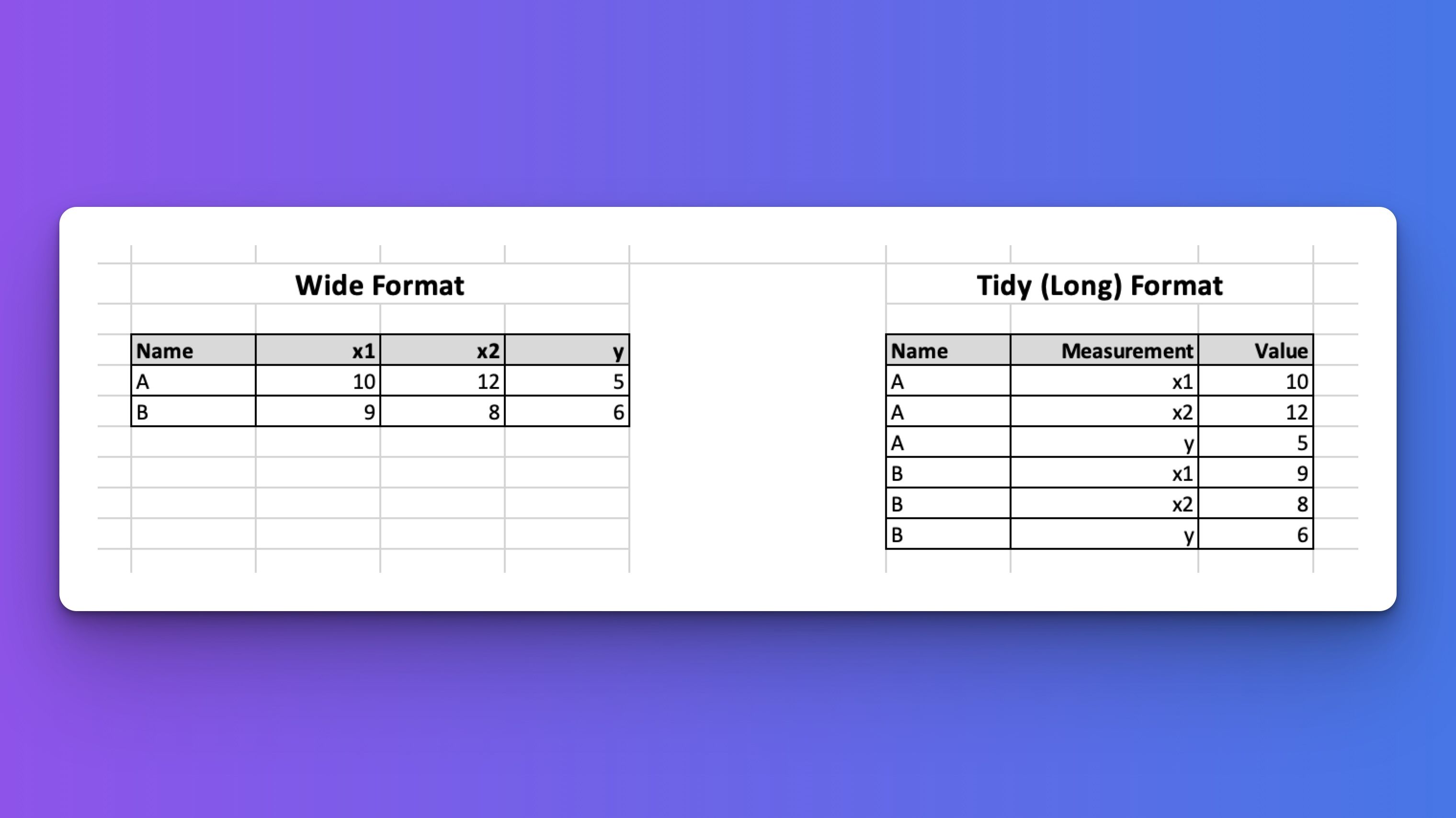
Embrace Tidy Data Principles
LLMs perform best with well-structured, tidy data that follows these principles:
- Each variable forms a column
- Each observation forms a row
- Each type of observational unit forms a table
✅ Tidy Example: Daily Temperature Readings
| date | city | temperature_c |
|---|---|---|
| 2024-01-01 | New York | 3.2 |
| 2024-01-01 | San Diego | 15.8 |
| 2024-01-02 | New York | 2.4 |
| 2024-01-02 | San Diego | 16.1 |
❌ Poorly Formatted Example: Column Headers as Values
| date | New York | San Diego |
|---|---|---|
| 2024-01-01 | 3.2 | 15.8 |
| 2024-01-02 | 2.4 | 16.1 |
Why it’s bad:
- City names are column headers, not values in a column.
- Makes it hard to filter or aggregate by city.
❌ Poorly Formatted Example: Repeating Column Names for Each Variable
| date | New York Temp | San Diego Temp | New York Humidity | San Diego Humidity |
|---|---|---|---|---|
| 2024-01-01 | 3.2 | 15.8 | 65% | 50% |
| 2024-01-02 | 2.4 | 16.1 | 70% | 55% |
Why it’s bad:
- Column names encode multiple dimensions (
city,variable). - Hard to reshape, filter by city and date.
❌ Poorly Formatted Example: Redundant Rows and Mixed Observations
| date | city | temperature_c | comment |
|---|---|---|---|
| 2024-01-01 | New York | 3.2 | Cold morning |
| 2024-01-01 | New York | 3.2 | Windy |
| 2024-01-01 | San Diego | 15.8 | Warm and sunny |
Why it’s bad:
- Duplicate measurements with multiple rows per observation.
- Comments should be separate if they are different types of observations.
❌ Poorly Formatted Example: Transposed Layout
| variable | New York | San Diego |
|---|---|---|
| 2024-01-01 | 3.2 | 15.8 |
| 2024-01-02 | 2.4 | 16.1 |
Why it’s bad:
- Dates are values in a column, not a proper variable column.
- Difficult to filter by date or apply time-based operations.
❌ Poorly Formatted Example: Multiple Variables in One Column
| date | location_temp |
|---|---|
| 2024-01-01 | New York:3.2 |
| 2024-01-01 | San Diego:15.8 |
| 2024-01-02 | New York:2.4 |
Why it’s bad:
- The
location_tempcolumn combines two variables. - Requires string parsing to separate city and temperature.