Network Graph Generator for Excel & CSV
Create network graphs online from Excel and CSV data. Map relationships, influence, and connection strength with AI.
Or try with a sample dataset:
Preview
What Is a Network Graph?
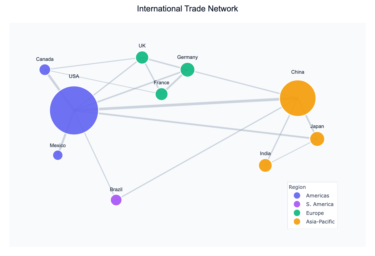
A network graph (also called a graph or network diagram) represents entities as nodes and the relationships between them as edges. The entities can be anything — countries, people, genes, websites, airports — and the edges can represent trade, migration, friendship, correlation, hyperlinks, or any measurable connection.
Network graphs are used across disciplines: economists map trade flows, epidemiologists trace disease transmission, biologists study protein interaction networks, and social scientists visualize influence and collaboration. When your data contains relationships or co-occurrences between entities, a network graph reveals structure that a bar chart or table cannot.
Two key properties govern what a network graph shows. Degree is the number of connections a node has — high-degree nodes are hubs. Edge weight encodes the strength of a relationship — a thick edge between countries means more trade or more migrants. Together these let you spot hubs, clusters, and isolated nodes at a glance.
How It Works
- Upload your data — provide a CSV or Excel file with at least two columns that identify the source and target of each relationship (e.g.,
origin,destination,flow). Multi-column datasets also work: the AI can compute a correlation network from numeric columns. - Describe the network — e.g., "draw a directed network of country-to-country migration flows, sized by total outflow"
- Get the visualization — the AI writes Python code using NetworkX and Matplotlib (or Plotly) to build the graph, apply a layout algorithm, and render it.
Supported Data Formats
| Format | Example columns | What the AI does |
|---|---|---|
| Edge list | source, target, weight | Draws edges directly from rows |
| Adjacency matrix | columns = node names, rows = node names | Reads the matrix as edge weights |
| Multi-column tabular | country, gdp, life_exp, co2 | Computes a correlation network between variables |
Interpreting the Results
| Visual element | What it means |
|---|---|
| Node size | Often mapped to degree, total weight, or a data column (e.g. GDP) |
| Node color | Typically encodes a category (region, cluster, type) |
| Edge thickness | Proportional to the weight of the relationship (e.g. trade volume) |
| Edge color | Can encode direction (in vs. out) or sign (positive vs. negative correlation) |
| Layout algorithm | Spring/force-directed layouts cluster tightly connected nodes together |
Example Prompts
| Scenario | What to type |
|---|---|
| Trade between regions | network graph of regional trade flows, thickness = export value |
| Airport connectivity | directed graph of flight routes, size airports by total passengers |
| Social influence | draw a follower network, highlight top-5 most connected accounts |
| Gene co-expression | correlation network of gene expression levels, threshold r > 0.7 |
| Supply chain | network of suppliers to products to customers with edge weights |
Choosing a Layout
The AI will pick an appropriate layout by default, but you can ask for a specific one:
- Spring / force-directed (
spring_layout) — general purpose; clusters connected nodes - Circular (
circular_layout) — all nodes on a circle; good for comparing degree - Kamada-Kawai (
kamada_kawai_layout) — aesthetically pleasing for medium-sized networks - Shell (
shell_layout) — nested rings; useful for hierarchical structures
Related Tools
Use the AI Sankey Diagram Generator if you want to emphasize directional flows with quantities (e.g. energy or budget allocation) rather than a full relational graph. Use the Exploratory Data Analysis tool first if you want to understand your dataset before building a network from it.
Frequently Asked Questions
What file format should my data be in? CSV or Excel (.xlsx / .xls). The most common input is an edge list — one row per connection with a source column, a target column, and optionally a weight column. You can also upload a wide table of numeric columns and ask the AI to build a correlation network.
My network has thousands of nodes — will it still work? Large networks (500+ nodes) can become visually cluttered. Ask the AI to filter to the top N nodes by degree or weight, or to use a community-detection algorithm to summarize clusters before plotting.
Can I get a directed graph (arrows)?
Yes — just say "directed" or "draw arrows" in your prompt. The AI will use a DiGraph in NetworkX and add arrowheads to the edges.
How is this different from a Sankey diagram? A Sankey diagram is a special case of a flow diagram where quantities are conserved along paths (e.g. energy input → conversion → output). A network graph is more general: edges don't need to sum to anything, nodes can have any number of connections, and there's no required directionality.