Sankey Diagram Generator for Excel & CSV
Create Sankey diagrams online from Excel and CSV data. Visualize flows between stages, sources, and destinations with AI.
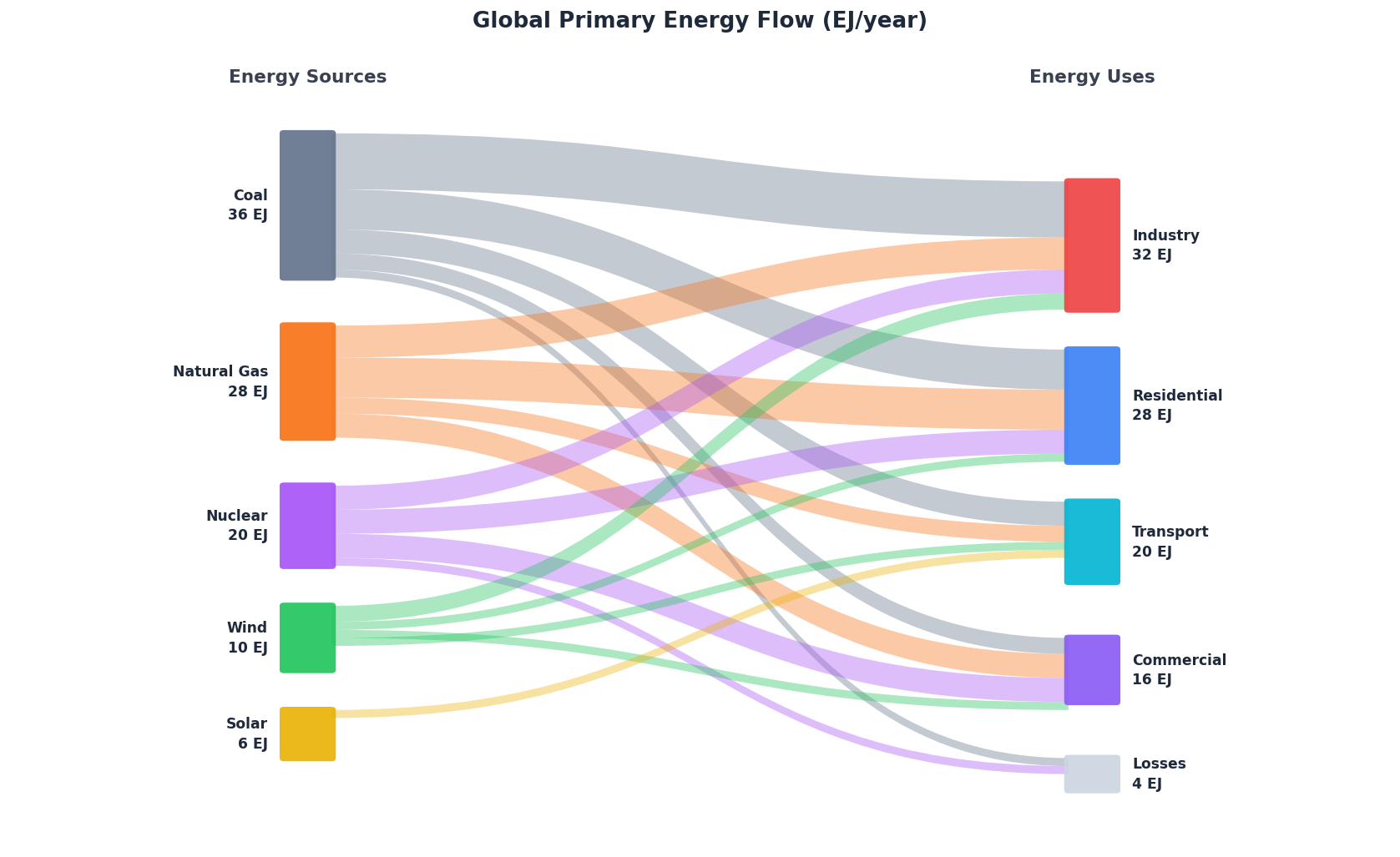
Or try with a sample dataset:
Preview
What Is a Sankey Diagram?
A Sankey diagram is a flow visualization where the width of each arrow or band is proportional to the quantity it represents. Named after Irish engineer Matthew Henry Phineas Riall Sankey, who used the format in 1898 to show steam engine energy efficiency, Sankey diagrams are today used everywhere from energy audits to budget analysis to user journey mapping.
Unlike a pie chart or bar chart, a Sankey diagram shows where things come from and where they go — making it ideal for tracing flows through a system. For example: how electricity generated from coal, gas, and renewables is ultimately consumed by households, factories, and transportation; or how a government budget flows from departments down to specific programs.
The key features are nodes (the boxes or columns representing categories) and links (the bands connecting them, sized by flow volume). Multiple layers of nodes can be added to show multi-step flows.
How It Works
- Upload your data — CSV or Excel with at least three columns: a source column, a target column, and a numeric value column
- Describe your diagram — e.g. "Sankey diagram from the 'from' column to the 'to' column, sized by value"
- Get an interactive chart — hover links to see exact flow values; ask the AI to recolor, reorder nodes, or filter to specific paths
The AI generates Python code using Plotly which produces an interactive Sankey with tooltips, drag-to-rearrange nodes, and exportable output.
Data Format
Your data should have one row per flow, with columns like:
| source | target | value |
|---|---|---|
| Coal | Industry | 14 |
| Coal | Residential | 10 |
| Wind | Residential | 4 |
Column names don't have to match exactly — just tell the AI which columns to use. The AI can also aggregate grouped data (e.g. a pivot table) into the source-target-value format automatically.
Interpreting the Results
| Element | What it means |
|---|---|
| Node width | Total flow passing through that category |
| Link width | Volume of flow between two specific nodes |
| Link color | Usually inherits from the source node (customizable) |
| Node order | Left-to-right represents stages in the process |
| Hover tooltip | Shows exact value and percentage for each link |
A wide link means a large proportion of the source flows to that destination. Thin links are minor pathways. If a node has many thin outgoing links, the flow is highly distributed.
Example Prompts
| Scenario | What to type |
|---|---|
| Basic flow | Sankey diagram from 'source' to 'target' sized by 'amount' |
| Multi-layer flow | three-level Sankey: department → program → budget item |
| Filter to top flows | Sankey showing only flows larger than 1000 units |
| Custom colors | Sankey with green for renewable sources and gray for fossil fuels |
| Percentage labels | add percentage labels to each link |
| Aggregate first | group by region and category, then draw a Sankey |
Common Use Cases
- Energy systems — sources (coal, gas, solar) → conversion → end uses (heating, transport, industry)
- Budget allocation — ministry → department → program → expense type
- Supply chains — raw materials → manufacturing → distribution → retail
- User journeys — landing page → feature → conversion or drop-off
- Migration — origin countries → destination countries, sized by number of people
- Cause of death — age group → cause → sex
Assumptions to Check
- Flows should balance — for each intermediate node, inflow should equal outflow. If your data represents a one-step flow (just sources and sinks), this isn't an issue.
- No negative values — Sankey link widths must be positive. Negative flows (e.g. returns, refunds) require special handling — ask the AI to reverse the direction of those links.
- Column types — the value column must be numeric. Source and target must be strings or categories. Ask the AI to clean up the data types if needed.
- Cycles — Plotly's Sankey does not support circular flows (e.g. A → B → A). If your data has cycles, ask the AI to break them by adding a time subscript (e.g. A_t1 → B → A_t2).
Frequently Asked Questions
What's the difference between a Sankey diagram and an alluvial diagram? They look similar but differ in purpose. A Sankey diagram shows the magnitude of flows through a system (widths encode quantities). An alluvial diagram shows how categorical groupings change over time or across dimensions — widths encode counts within each group. Ask for an "alluvial diagram" if you want to track how observations move between categories (e.g. survey responses over multiple rounds).
My data is wide-format (a matrix of flows). Can I still use it? Yes — upload your pivot/matrix and tell the AI: "melt this matrix into source, target, value format and then draw a Sankey". It will reshape the data automatically.
Can I show more than two levels of nodes? Absolutely. Just make sure your data includes intermediate nodes — e.g. rows for A→B and B→C flows. The AI will infer the multi-layer structure. You can also ask for "a three-level Sankey showing department → sub-department → project".
How do I handle very small flows that clutter the diagram? Ask the AI to "filter out flows below X units" or "group all flows smaller than 5% of total into an 'Other' category". This keeps the diagram readable.
Can I use this for website analytics or funnel analysis? Yes — export your funnel data as a CSV (step name, next step, user count) and ask for a Sankey showing the drop-off at each stage. This is a common use case in product analytics. See also the AI Bar Chart Generator for simpler funnel comparisons.