Bar Chart Maker for Excel & CSV
Create bar charts online from Excel and CSV data. Compare categories, rank values, and export clean charts with AI.
Or try with a sample dataset:
Preview
What Is a Bar Chart?
A bar chart displays categorical data as rectangular bars, where the length of each bar represents a value. Bar charts are one of the most widely used chart types for comparing quantities across categories — population by country, revenue by product, survey responses by option, and more.
Use a bar chart when you want to:
- Compare values across categories — e.g. sales by region, scores by student
- Show rankings — sort bars to highlight the highest and lowest values
- Display grouped or stacked data — compare sub-categories side by side or as parts of a whole
How It Works
- Upload your data — CSV or Excel file with at least one categorical column and one numeric column
- Describe your chart — e.g. "bar chart of total revenue by product category, sorted descending"
- Get an interactive chart — hover for exact values, zoom, and download as PNG
Vertical vs. Horizontal Bar Charts
| Type | Best for |
|---|---|
| Vertical (column chart) | Time-based categories, fewer categories |
| Horizontal | Long category labels, many categories, rankings |
Just mention your preference in the prompt — e.g. "horizontal bar chart" — or let the AI choose based on your data.
Example Prompts
| What you want | What to type |
|---|---|
| Sales by region | bar chart of total_sales by region, sorted by value descending |
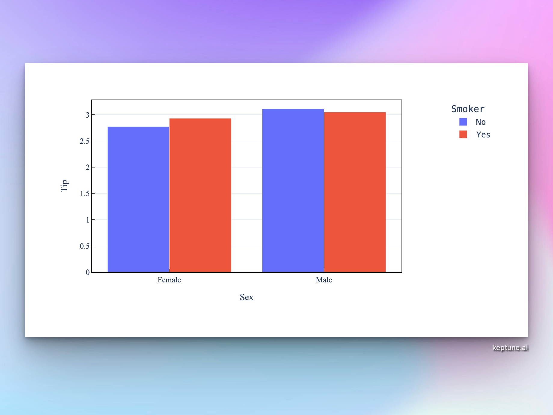
| Grouped comparison | grouped bar chart of Q1 and Q2 revenue by department |
| Stacked proportions | stacked bar chart showing count of order_status by month |
| Survey results | horizontal bar chart of response counts for each answer option |
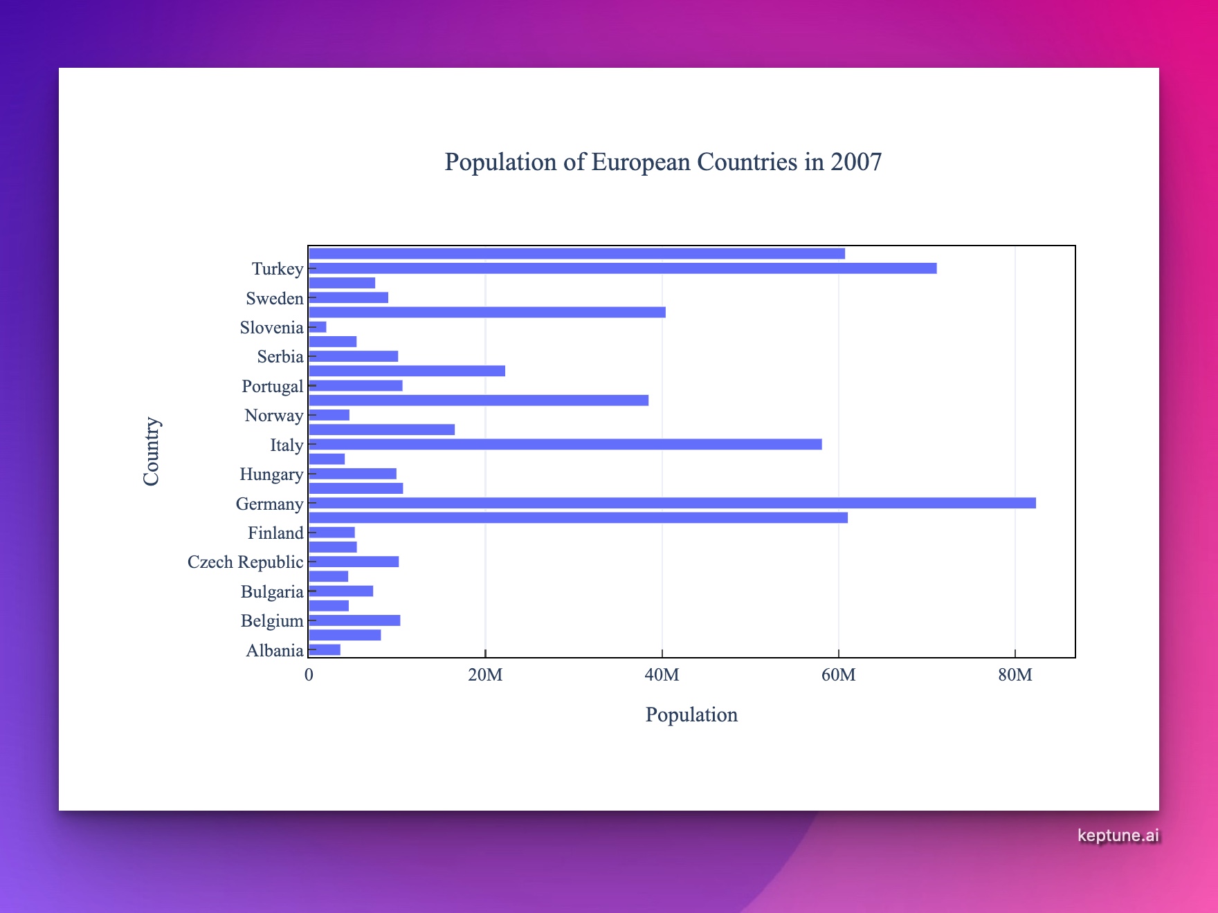
| Country populations | top 15 countries by population as a horizontal bar chart |
Frequently Asked Questions
What's the difference between a bar chart and a histogram? Bar charts show values for distinct categories (e.g. countries, product names). Histograms show the distribution of a continuous numeric variable by dividing it into bins. Use the AI Histogram Generator for distributions.
Can I display percentages instead of counts? Yes — ask for "bar chart showing percentage of total" or "normalized stacked bar chart".
How do I add labels to the bars? Ask the AI to "add value labels to each bar" — it will annotate each bar with its exact value.
Can I customize colors? Yes. Specify a color scheme in your prompt, e.g. "use a blue color palette" or "color bars by category using distinct colors".