Histogram Maker for Excel & CSV
Create histograms online from Excel and CSV data. Visualize distributions, choose bins, and explore spread and skew with AI.
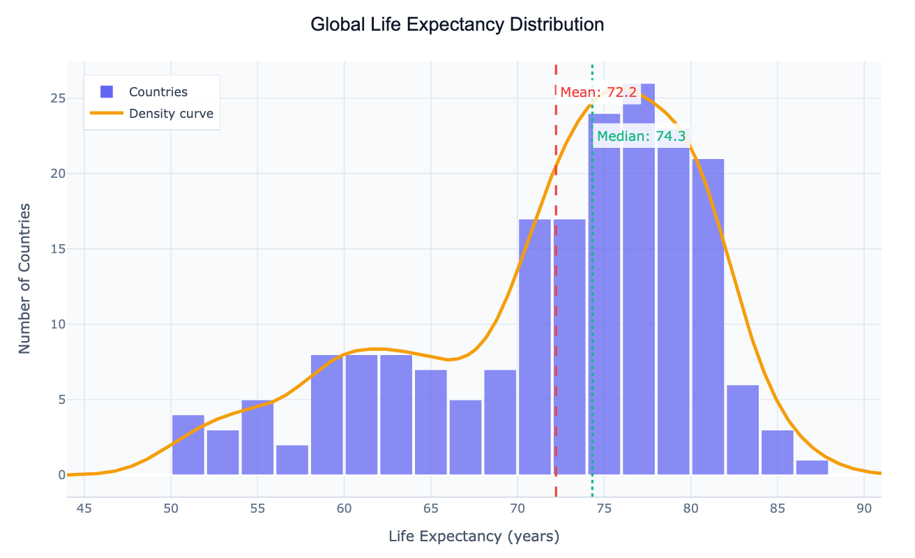
Or try with a sample dataset:
Preview
What Is a Histogram?
A histogram shows the distribution of a numeric variable by dividing values into bins and counting how many observations fall in each bin. Unlike a bar chart, both axes are numeric — the x-axis shows value ranges, the y-axis shows frequency or density.
Use a histogram to answer:
- Is my data normally distributed or skewed?
- Are there outliers or unusual gaps in the data?
- Where do most values cluster?
- Is the distribution unimodal, bimodal, or uniform?
How It Works
- Upload your data — CSV or Excel with at least one numeric column
- Describe your histogram — e.g. "histogram of age column with 20 bins"
- Get an interactive chart — hover bins to see counts, adjust bin count by asking the AI
Choosing the Right Number of Bins
Too few bins hide the shape of the distribution; too many make it noisy. Common starting points:
| Sample size | Suggested bins |
|---|---|
| < 50 | 5–10 |
| 50–200 | 10–20 |
| 200–1000 | 20–40 |
| > 1000 | 40+ or use automatic |
Just ask the AI to "adjust the number of bins" or "use automatic bin sizing" after seeing the initial result.
Example Prompts
| What you want | What to type |
|---|---|
| Basic distribution | histogram of salary with 30 bins |
| Overlay normal curve | histogram of exam_scores with a normal distribution curve overlaid |
| Compare groups | overlapping histograms of age by gender |
| Density instead of count | density histogram of response_time |
| Log scale | histogram of revenue on a log scale |
Frequently Asked Questions
What's the difference between a histogram and a bar chart? A histogram shows the distribution of a continuous numeric variable (values grouped into ranges). A bar chart compares values across distinct categories. Use the AI Bar Chart Generator for categorical comparisons.
My distribution looks skewed — what does that mean? Right-skewed (long tail to the right) means a few high values pull the mean above the median — common in income and response time data. Ask the AI to apply a log transformation to see the shape more clearly.
Can I show multiple distributions on one chart? Yes — ask for "overlapping histograms of column A grouped by column B". The AI will use transparency so both distributions are visible.
What is a KDE (kernel density estimate)? A KDE is a smooth curve overlaid on a histogram that estimates the underlying probability distribution. Ask for "histogram with KDE curve" to add it.