PCA Calculator for Excel & CSV
Run principal component analysis online from Excel or CSV data. Reduce dimensions, visualize clusters, and inspect loadings with AI.
Or try with a sample dataset:
Preview
What Is PCA?
Principal Component Analysis (PCA) is a dimensionality reduction technique that transforms a dataset with many correlated variables into a smaller set of uncorrelated principal components that capture the maximum possible variance. The first principal component (PC1) is the direction in the data that explains the most variance; the second (PC2) is perpendicular to PC1 and explains the next most variance; and so on. The result is a new coordinate system where each axis is a linear combination of the original variables, ordered by how much information they carry.
The main uses of PCA are visualization, noise reduction, and feature engineering. For visualization: if you have 10 measurements per country (GDP, emissions, life expectancy, education, etc.), you cannot plot them all at once. PCA compresses them to 2 or 3 components that you can scatter-plot, and the resulting clusters reveal which countries are similar across all dimensions simultaneously. The biplot overlays loading arrows on this scatter — an arrow pointing right along PC1 means that variable contributes positively to the first component, and its length shows how much. For noise reduction: keeping only the top few components that explain 80–90% of the variance removes low-signal dimensions. For feature engineering: PCA components can replace the original variables as inputs to a regression or clustering model.
PCA is used in genomics (reducing thousands of gene expression values to a handful of components before clustering samples), economics (building composite development indices from many indicators), neuroscience (finding dominant patterns in brain activity recordings), and computer vision (eigenfaces — representing faces as combinations of a small number of prototypical face patterns). In all cases, the goal is the same: find a compact representation that captures most of the structure in the data.
How It Works
- Upload your data — provide a CSV or Excel file with multiple numeric columns. One row per observation (country, patient, sample, etc.). The AI will standardize the variables automatically.
- Describe the analysis — e.g. "PCA on all numeric columns, color observations by region, show biplot and scree plot, list the top 3 loadings for PC1"
- Get full results — the AI writes Python code using scikit-learn for PCA and Plotly to produce the biplot, scree plot, and loadings table
Interpreting the Results
| Output | What it means |
|---|---|
| PC1, PC2 scatter (biplot) | Each point is an observation projected onto the two most important directions |
| Clusters in biplot | Observations that are similar across all original variables |
| Loading arrow | How much a variable contributes to that principal component |
| Long arrow parallel to PC1 | This variable drives the main dimension of variation |
| Short arrow | Variable contributes little to the top components |
| Two arrows pointing same direction | Those variables are positively correlated |
| Two arrows pointing opposite directions | Those variables are negatively correlated |
| Scree plot bar height | % of total variance explained by each component |
| Cumulative variance line | How many components are needed to explain 80% / 90% of variance |
| Elbow in scree plot | Natural cutoff — components after the elbow explain little additional variance |
Example Prompts
| Scenario | What to type |
|---|---|
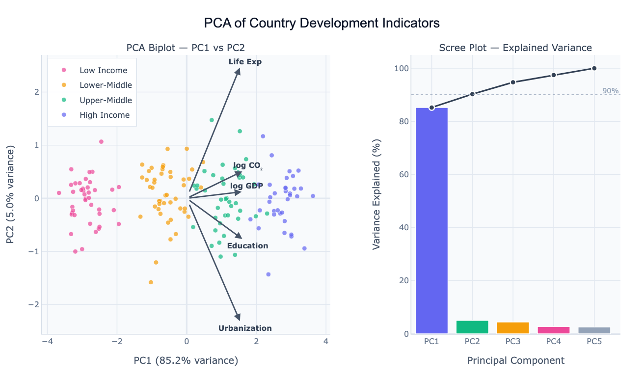
| Country comparison | PCA of GDP, life expectancy, CO2, education by country; biplot colored by continent |
| Genomics | PCA of gene expression data; color samples by tissue type; show top 20 gene loadings |
| Survey data | PCA of all Likert-scale survey responses; scree plot; name components by top loadings |
| Feature reduction | PCA on all numeric features, keep enough components for 90% variance, show loading heatmap |
| Time series | PCA of monthly economic indicators by country, trace how countries moved over 20 years |
Assumptions to Check
- Numeric variables — PCA requires all input columns to be numeric; categorical variables must be encoded or excluded
- Standardization — variables on different scales (e.g. GDP in thousands vs. rate in 0–1) must be standardized (mean=0, std=1) before PCA; the AI does this automatically unless you ask otherwise
- Linear relationships — PCA captures linear structure; if your variables have non-linear relationships, consider kernel PCA or UMAP
- Sufficient sample size — as a rule of thumb, at least 5–10 observations per variable; PCA on a 200-variable dataset with 20 rows is unreliable
- No extreme outliers — a few very extreme observations can dominate the first principal component; ask the AI to check for outliers before running PCA
Related Tools
Use the Pair Plot Generator to visually inspect pairwise correlations between variables before running PCA — heavily correlated variable pairs are where PCA adds the most value. Use the Exploratory Data Analysis tool to get summary statistics and a correlation matrix to understand the data before PCA. Use the AI Heatmap Generator to visualize the full loadings matrix (all variables × all components) as a color-coded grid.
Frequently Asked Questions
How many principal components should I keep? The standard approaches: (1) keep components until you've explained 80–90% of the variance (read off the cumulative scree plot), (2) keep components before the elbow in the scree plot where the curve flattens, or (3) keep components with eigenvalue > 1 (Kaiser criterion). For visualization, 2 components are always used regardless of variance explained — you just need to note how much information the biplot represents.
Do I need to standardize my variables before PCA? Yes, almost always. If variables have different scales (e.g. GDP in billions vs. a 0–100 index), the high-variance variable will dominate PC1 purely because of its scale, not because it's more important. Standardizing (subtracting mean, dividing by std) puts all variables on equal footing. The AI standardizes by default; mention "use raw values without standardizing" only if your variables are already on the same scale and you want variance to drive the components.
What is the difference between PCA and t-SNE or UMAP? PCA is a linear method — it finds straight-line combinations of variables. It's fast, interpretable (you can read loadings), and preserves global structure (distances between distant clusters). t-SNE and UMAP are non-linear — they can unroll complex curved manifolds and reveal local cluster structure that PCA misses, but they distort global distances and their axes have no interpretable meaning. Start with PCA; switch to t-SNE/UMAP if PCA biplots show overlapping clusters that you suspect are actually distinct.
My PC1 explains 90%+ of variance — is that normal? It depends on the data. For highly correlated variables (like development indicators that all trend together), one component can dominate. This isn't wrong — it means the data mostly varies along one direction. Check the loadings: if all variables load strongly on PC1 in the same direction, it's a "general level" component (richer countries score higher on everything). PC2 then captures deviations from this pattern (e.g. high CO₂ relative to their income level).
Can I use PCA scores as inputs to another model? Yes — this is called PCA preprocessing or PCA + regression. After running PCA, the AI can output the component scores as new columns that you can use as features in a regression, classification, or clustering model. This reduces multicollinearity (PCA components are orthogonal) and can improve model stability when you have many correlated predictors.