Pair Plot Generator for Excel & CSV
Create pair plots online from Excel and CSV data. Explore pairwise relationships, distributions, and grouped patterns with AI.
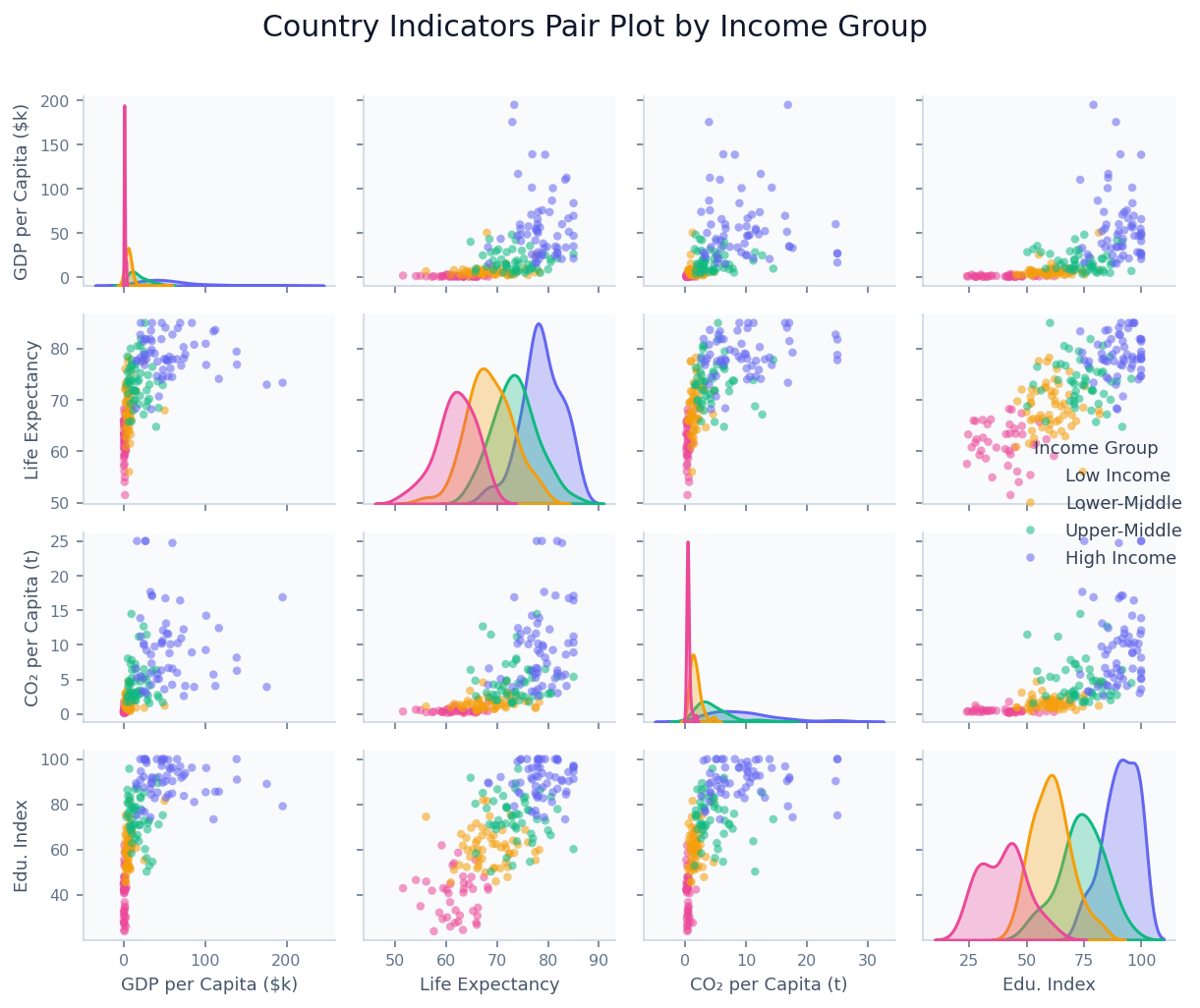
Or try with a sample dataset:
Preview
What Is a Pair Plot?
A pair plot (also called a scatter plot matrix or SPLOM) is a grid of plots that displays the pairwise relationship between every combination of numeric variables in a dataset simultaneously. For a dataset with N numeric columns, the grid is N×N: off-diagonal cells show scatter plots of one variable against another, while diagonal cells show each variable's own distribution (as a histogram or KDE curve). The result is a single compact view that lets you scan all pairwise correlations, distributions, and potential outliers at once.
The pair plot's power lies in pattern recognition at a glance. When points in an off-diagonal scatter panel form a diagonal line, the two variables are correlated. When they form a horizontal or vertical cloud, they are unrelated. When they form a curve, the relationship is non-linear. By adding a categorical color variable (e.g. species, income group, treatment arm), clusters and group-level differences become immediately visible across all panels simultaneously — something that would require dozens of individual charts to achieve otherwise.
Pair plots are the standard first step in multivariate exploratory data analysis in fields ranging from ecology (examining how plant traits co-vary across species) to economics (scanning macro indicators for correlated country clusters) to machine learning (identifying which feature pairs are most informative before model training). The classic example is the Iris dataset — its pair plot immediately reveals that setosa separates cleanly from the other two species on petal dimensions while versicolor and virginica overlap, which directly informs classifier design.
How It Works
- Upload your data — provide a CSV or Excel file with at least three numeric columns. An optional categorical column (species, group, country type) can be used to color the points. One row per observation.
- Describe the plot — e.g. "pair plot of temperature, humidity, wind speed, and pressure colored by weather type, KDE on diagonal"
- Get the visualization — the AI writes Python code using seaborn and matplotlib to build the full scatter matrix with styled axes
Interpreting the Results
| Visual element | What it means |
|---|---|
| Diagonal panel | Distribution of that variable alone — histogram or KDE |
| Off-diagonal scatter | Relationship between the row variable and the column variable |
| Tight diagonal cluster | Strong positive correlation between the two variables |
| Diffuse cloud | Weak or no linear correlation |
| Curved scatter pattern | Non-linear relationship — consider log transform |
| Separated color clusters | The categorical variable distinguishes those two variables |
| Overlapping color clusters | The categorical variable does not separate on those two variables |
| Isolated point far from cluster | Potential outlier — unusual combination of the two variables |
Example Prompts
| Scenario | What to type |
|---|---|
| Ecology | pair plot of sepal length, sepal width, petal length, petal width colored by species |
| Finance | pair plot of return, volatility, P/E ratio, and dividend yield colored by sector |
| Health research | pair plot of age, BMI, blood pressure, cholesterol colored by diabetes status |
| Climate data | pair plot of temperature, precipitation, humidity, wind speed by season |
| Machine learning | pair plot of all numeric features, color by target class, add correlation values |
Related Tools
Use the Exploratory Data Analysis tool for a complete automated analysis including pair plots, correlation matrices, summary statistics, and missing value reports — the pair plot tool is best when you want a specific, styled scatter matrix. Use the AI Heatmap Generator to show a correlation matrix as a color-coded grid when you have too many variables for a pair plot (more than ~8 columns). Use the AI Scatter Chart Generator to examine a single pair of variables in detail with a larger canvas after identifying the most interesting relationship in the pair plot.
Frequently Asked Questions
How many variables can I include in a pair plot? Pair plots work best with 3–8 variables. A 4×4 grid is the sweet spot — large enough to reveal structure, small enough to read at a glance. With 8 variables you get a 64-panel grid that becomes hard to navigate. For more variables, ask the AI to select the most interesting subset or use the heatmap tool to show correlations only.
My scatter panels are all compressed because one variable has extreme outliers — what do I do? Ask for a log scale on that variable: "log scale on the GDP axis". You can also ask to "cap outliers at the 99th percentile" or "exclude observations above X". Alternatively, ask for a log transform of the column before plotting.
Can I add correlation coefficients to each scatter panel? Yes — ask to "add Pearson r values to each scatter panel" or "annotate each panel with the correlation coefficient and p-value". The AI will compute these and place them as text annotations in the corner of each cell.
Can I show regression lines in the scatter panels?
Yes — ask for "add regression lines to all scatter panels" or "use kind='reg' in seaborn pairplot". The AI will fit a linear regression line with a confidence band in each off-diagonal cell.
What's the difference between a pair plot and a correlation heatmap? A correlation heatmap shows only the Pearson correlation coefficient between each pair as a single colored cell — fast to scan, but hides the actual shape of the relationship (linear vs. curved, presence of clusters, outliers). A pair plot shows the raw scatter for each pair, which reveals non-linearity, heteroscedasticity, and group structure that a single number cannot. Use the heatmap for a high-level overview with many variables; use the pair plot for thorough exploration with fewer variables.