Lag Plot Generator for Time Series
Create lag plots online from Excel or CSV time-series data. Visualize dependence, seasonality, and nonlinear lag structure with AI.
Or try with a sample dataset:
Preview
What Is a Lag Plot?
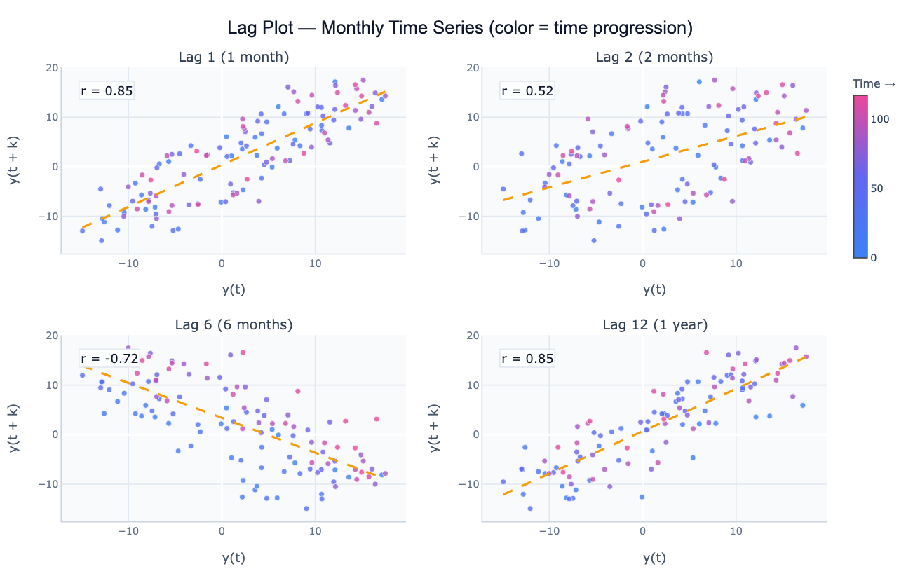
A lag plot is a scatter plot of a time series against a lagged version of itself — y(t) on the x-axis versus y(t + k) on the y-axis for a chosen lag k. Unlike the Autocorrelation Plot (ACF), which summarizes the linear correlation at each lag as a single number, the lag plot shows the full shape of the relationship: linear, elliptical, clustered, fanned, or structureless. This makes lag plots a powerful visual diagnostic for detecting autocorrelation, seasonality, and nonlinear dependence that a correlation coefficient alone would miss.
The pattern in a lag plot tells you the type of structure present in the series. A tight diagonal line (points clustering around y = x) means strong positive autocorrelation at that lag — the series changes slowly and today's value is a good predictor of the value k steps later. A horizontal or vertical cloud (random scatter) means no autocorrelation at lag k — the current value carries no information about the future value k steps ahead. A wide ellipse along the diagonal indicates moderate autocorrelation. An ellipse rotated 45° (negative slope) means negative autocorrelation — above-average values tend to be followed k steps later by below-average values, typical of over-differenced series. A non-elliptical shape — a banana curve, concentric rings, or clusters — signals nonlinear dependence that the ACF cannot capture.
Lag plots are particularly useful for identifying the seasonal period of a series. For monthly data with annual seasonality, the lag-12 plot will show a tight linear relationship (high r) while the lag-6 plot will show a looser or even negatively correlated pattern. Comparing lag plots at lag 1, 6, 12, and 24 visually identifies which lags carry predictive information and informs the choice of seasonal ARIMA order. They are also a valuable randomness test: if all lag plots show structureless scatter, the series is consistent with white noise and no time series model is warranted.
How It Works
- Upload your data — provide a CSV or Excel file with a date column and a value column. Monthly, weekly, or daily data all work. One row per time point.
- Describe the analysis — e.g. "lag plots at lags 1, 3, 6, and 12; color points by year; annotate Pearson r on each panel; identify seasonal period"
- Get full results — the AI writes Python code using pandas for lag computation and Plotly to produce a panel of lag scatter plots with fitted lines, correlation annotations, and time-colored markers
Required Data Format
| Column | Description | Example |
|---|---|---|
date | Date or timestamp | 2020-01, 2020-01-31, Jan 2020 |
value | Numeric time series | 245.3, 312.1, 198.8 |
Any column names work — describe them in your prompt. The series should be regularly spaced (monthly, weekly, daily).
Interpreting the Results
| Pattern | What it means |
|---|---|
| Tight diagonal line (positive slope) | Strong positive autocorrelation at this lag — slow-changing, persistent series |
| Scattered cloud | No autocorrelation — this lag carries no predictive information |
| Diagonal line with negative slope | Negative autocorrelation — above-average followed by below-average (oscillating or over-differenced) |
| Ellipse along the diagonal | Moderate autocorrelation — some persistence but also random variation |
| Tight line at specific lag k | Seasonal period = k — values repeat every k periods |
| Curved or banana-shaped | Nonlinear dependence — ACF will underestimate the true relationship |
| Concentric rings or clusters | Cyclic nonlinear structure — series has hidden oscillation not captured by linear methods |
| Fan shape (widening spread) | Heteroscedastic autocorrelation — variance grows with the level; consider log transform |
Example Prompts
| Scenario | What to type |
|---|---|
| Seasonal detection | lag plots at lags 1, 6, 12, 24 for monthly data; annotate r; which lag shows the tightest pattern? |
| Randomness check | lag plots at lags 1, 2, 3, 4 for residuals; check if any pattern remains (non-random = model misspecification) |
| Nonlinearity check | lag-1 plot; overlay a LOWESS smooth; does the relationship follow a straight line or curve? |
| Multi-lag panel | 2×3 panel of lag plots at lags 1–6; color by year; annotate Pearson r and Spearman ρ on each |
| Colored by season | lag-12 plot; color points by month (Jan=blue, Jul=red); check if seasonal clusters are visible |
| Comparison | lag-1 plots for each product in 'product' column; overlay on one chart; compare autocorrelation strength |
Assumptions to Check
- Regular spacing — lag plots assume equally spaced observations; resampling may be needed for irregular timestamps
- Stationarity — a strong trend inflates all lag correlations and makes the lag plot look like strong autocorrelation even if none exists after detrending; consider plotting the differenced series
- Sufficient length — at lag k, you have n − k data points; for long lags (e.g. lag 12 with only 24 observations), the lag plot is based on very few pairs and is unreliable
- Outliers — extreme points appear isolated in the lag plot and exert disproportionate influence on the fitted line; flag them in your prompt
- Linear vs. nonlinear correlation — Pearson r measures only linear association; a curved lag plot with r ≈ 0 can still show strong nonlinear dependence — Spearman ρ is more robust in that case
Related Tools
Use the Autocorrelation Plot (ACF) to quantify autocorrelation at all lags simultaneously and identify ARIMA order from the ACF/PACF pattern. Use the Time Series Decomposition to separate trend, seasonal, and residual components before plotting lags of the residuals. Use the Residual Plot Generator to check whether a fitted model's residuals show remaining lag structure. Use the Scatter Chart Generator for general x–y scatter plots that are not lag-based.
Frequently Asked Questions
What is the difference between a lag plot and an ACF plot? The ACF summarizes the linear correlation at every lag as a single number — it's compact and easy to scan for significant lags, but it loses distributional information. The lag plot shows the full scatter at one specific lag, revealing whether the relationship is linear, curved, or clustered. Use the ACF to survey all lags quickly, then use lag plots to inspect the interesting lags in detail. A curved lag plot with a high Spearman ρ but low Pearson r, for example, would appear as a weak spike in the ACF even though there is strong nonlinear dependence.
How do I identify the seasonal period from lag plots? Plot the series at several lags spanning one full expected cycle — for monthly data, try lags 1, 3, 6, 9, 12. The seasonal period corresponds to the lag where the scatter plot shows the tightest linear clustering (highest r). For annual seasonality in monthly data, lag 12 will show a much tighter pattern than lag 6 because values exactly one year apart repeat the same seasonal position. The contrast between lag-6 (opposite season, looser or negatively correlated) and lag-12 (same season, tightly correlated) is visually striking.
My lag-1 plot shows a curved pattern instead of a line — what does that mean? A curved lag-1 plot indicates nonlinear autocorrelation — the relationship between y(t) and y(t+1) is not linear. This can occur in threshold models (the series behaves differently above and below a threshold), regime-switching series (e.g. economic expansions vs. recessions), or series with heteroscedastic variance. The Pearson correlation understates the true dependence. Ask the AI to "overlay a LOWESS smooth on the lag-1 plot to visualize the nonlinear relationship" and consider nonlinear time series models.
Can I create a lag plot for residuals after fitting a model? Yes — this is a standard model diagnostic. After fitting a regression or ARIMA model, the residuals should be uncorrelated: the lag-1 plot of residuals should look like a structureless cloud with r ≈ 0. If the lag-1 residual plot shows a clear diagonal, the model hasn't captured all the autocorrelation and needs additional AR or MA terms. Ask the AI to "fit AR(1) model to the series; plot lag-1 of the residuals; check for remaining structure".