Autocorrelation Plot Generator (ACF and PACF)
Create ACF and PACF plots online from Excel or CSV time-series data. Diagnose lag structure and model order with AI.
Or try with a sample dataset:
Preview
What Is an Autocorrelation Plot?
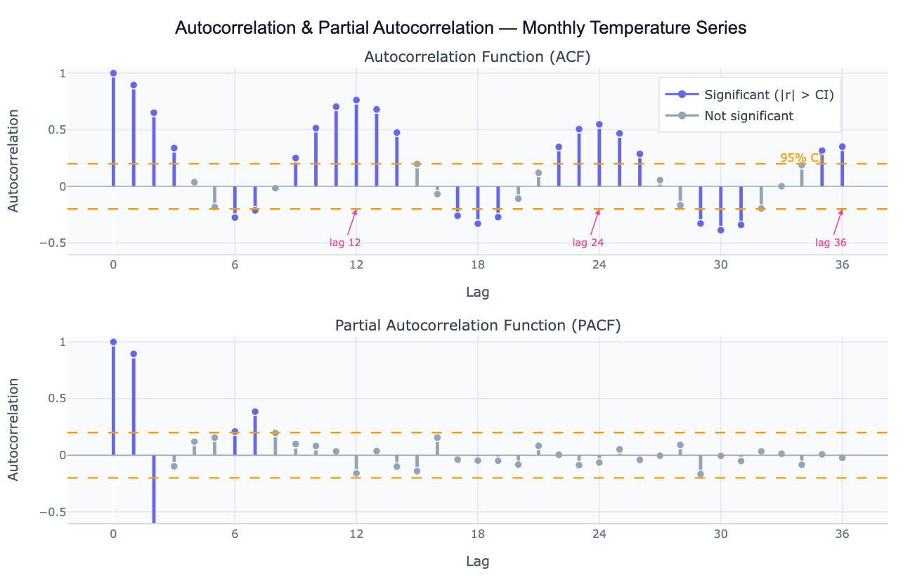
Autocorrelation measures the correlation of a time series with a lagged version of itself. The autocorrelation function (ACF) plots this correlation coefficient at every lag k — from lag 1 (how correlated is today's value with yesterday's?) to lag 40 or more (how correlated is today's value with the value 40 periods ago?). A value near +1 at lag k means the series strongly repeats its pattern every k periods; a value near −1 means it alternates; a value near 0 means no linear relationship. The ACF is the primary diagnostic tool for detecting seasonality (large positive spikes at multiples of the seasonal period), trend (slowly decaying ACF that stays above zero for many lags), and over-differencing (large negative spike at lag 1 after applying too many differences).
The partial autocorrelation function (PACF) is the correlation at lag k after removing the contribution of all shorter lags. While the ACF reflects all the ways lag-k is correlated (direct and indirect through intermediate lags), the PACF isolates the direct contribution of lag k. This distinction is crucial for ARIMA model identification: in an AR(p) process, the PACF cuts off sharply after lag p while the ACF decays gradually; in an MA(q) process, the ACF cuts off after lag q while the PACF decays. The joint pattern of ACF and PACF is the classic method for choosing p and q in the Box-Jenkins ARIMA framework.
Both plots include 95% confidence bands (±1.96/√n), shown as dashed lines. Spikes outside these bands are statistically significant autocorrelations — the time series is not behaving like white noise at those lags. A well-fitted time series model should leave residuals whose ACF shows no spikes outside the bands, confirming that all systematic structure has been captured.
How It Works
- Upload your data — provide a CSV or Excel file with a date column and a value column. Daily, weekly, monthly, or annual data all work. One row per time point.
- Describe the analysis — e.g. "plot ACF and PACF of monthly sales up to lag 36; mark significant lags; identify seasonal period; suggest ARIMA order"
- Get full results — the AI writes Python code using statsmodels acf/pacf and Plotly to produce the two-panel ACF/PACF chart with color-coded significance, confidence bands, and a lag interpretation table
Required Data Format
| Column | Description | Example |
|---|---|---|
date | Date or timestamp | 2020-01, 2020-01-31, Jan 2020 |
value | Numeric time series | 245.3, 312.1, 198.8 |
Any column names work — describe them in your prompt. The series should be regularly spaced (monthly, weekly, daily). For irregular data, ask the AI to resample to a regular frequency first.
Interpreting the Results
| Pattern | What it means |
|---|---|
| ACF decays slowly | Series is non-stationary (has trend or unit root) — apply first differencing |
| ACF spike at lag k, 2k, 3k | Seasonal period of k (e.g. spikes at 12, 24, 36 = annual seasonality in monthly data) |
| ACF cuts off at lag q, PACF decays | MA(q) process — set q = last significant ACF lag |
| PACF cuts off at lag p, ACF decays | AR(p) process — set p = last significant PACF lag |
| Both decay gradually | ARMA(p,q) process — use AIC-based model selection |
| Large negative ACF at lag 1 | Over-differenced — reduce differencing order |
| No significant lags | White noise — series is unpredictable; no ARIMA structure to model |
| Confidence band width | ±1.96/√n — wider bands with shorter series; more data = tighter bounds |
Example Prompts
| Scenario | What to type |
|---|---|
| Full diagnostic | ACF and PACF up to lag 36; 95% confidence bands; identify seasonal period and ARIMA order |
| Stationarity check | plot ACF of raw series and first-differenced series side by side; does differencing achieve stationarity? |
| Seasonal detection | ACF of monthly data up to lag 48; annotate spikes at seasonal lags 12, 24, 36 |
| Residual check | fit AR(2) model; plot ACF of residuals; check if any spikes remain outside the confidence band |
| ARIMA identification | ACF and PACF of the log-differenced series; suggest p, d, q for ARIMA from the spike pattern |
| Multiple series | plot ACF for each region in the 'region' column; compare lag structures side by side |
Assumptions to Check
- Stationarity — ACF and PACF are most interpretable for stationary series (constant mean and variance over time); if the ACF decays very slowly, difference the series first and re-plot
- Sufficient length — reliable ACF estimates require at least 50 observations; estimates at long lags (near n/4) are based on few pairs and are noisy
- Regular spacing — ACF assumes equally spaced observations; irregular timestamps must be resampled before computing autocorrelations
- Linearity — ACF captures only linear autocorrelation; nonlinear dependence (e.g. volatility clustering in financial data) may not show up in the ACF but will appear in the ACF of squared residuals
- Outliers — a single extreme outlier can distort autocorrelation at many lags; identify and handle outliers before interpreting the ACF
Related Tools
Use the Time Series Decomposition tool to separate trend, seasonal, and residual components before analyzing the residual ACF structure. Use the Trendline Calculator when you just need a trend summary without full ARIMA diagnostics. Use the Partial Correlation Calculator when you want partial correlations between different variables (cross-series) rather than lags of the same series. Use the Residual Plot Generator to check whether model residuals show remaining autocorrelation after fitting.
Frequently Asked Questions
What is the difference between ACF and PACF? The ACF at lag k is the raw correlation between the series at time t and time t−k, including both direct and indirect effects through intermediate lags. The PACF at lag k removes the effect of lags 1 through k−1, leaving only the direct relationship. In an AR(2) model, for example, the ACF decays gradually over many lags (because lag 1 is correlated with lag 2 through lag 1), while the PACF is non-zero only at lags 1 and 2 and cuts off sharply. Use the ACF and PACF together — the pattern of cutoff vs decay in the two plots identifies the ARIMA order.
How do I use ACF/PACF to identify an ARIMA model? The Box-Jenkins identification rules are: (1) if the ACF cuts off after q lags and the PACF decays, the process is MA(q) — set q to the last significant ACF lag; (2) if the PACF cuts off after p lags and the ACF decays, the process is AR(p) — set p to the last significant PACF lag; (3) if both decay gradually, the process is ARMA(p,q) — try small values of both and compare AIC. Ask the AI to "suggest tentative ARIMA(p,d,q) from the ACF and PACF pattern and fit candidate models".
My ACF has slowly decaying positive values — what does that mean? A slowly decaying ACF (high positive values for many lags) is the signature of a non-stationary series with a trend or unit root. Apply first differencing (subtract each observation from the previous one) and re-plot the ACF. If it still decays slowly, apply a second difference. The correct differencing order d is the value that produces a stationary ACF. Ask the AI to "plot ACF of the raw series and first- and second-differenced series to determine the differencing order d".
What does a spike at lag 12 in monthly data mean? A significant positive spike at lag 12 (and often also at 24, 36) means the series has a 12-month seasonal cycle — values are correlated with the value from the same month in the previous year. This is the standard fingerprint of annual seasonality in monthly economic, weather, or sales data. The presence of seasonal spikes means you should either use seasonal differencing (subtract the value 12 periods ago) or include seasonal AR/MA terms — a SARIMA(p,d,q)(P,D,Q)12 model.
How many lags should I plot? A common rule is to plot lags up to n/4 (quarter of the series length) or a domain-relevant maximum. For monthly data with an annual seasonal cycle, plot at least 36 lags (three full seasonal cycles) to see the repeating seasonal spikes clearly. For daily data with a weekly cycle, plot at least 21 lags. For detecting trend-related non-stationarity, even 20–30 lags is usually sufficient to see the slow decay pattern.