Trendline Calculator for Excel & CSV
Add and compare trendlines online from Excel and CSV data. Fit linear, polynomial, exponential, and other trends with AI.
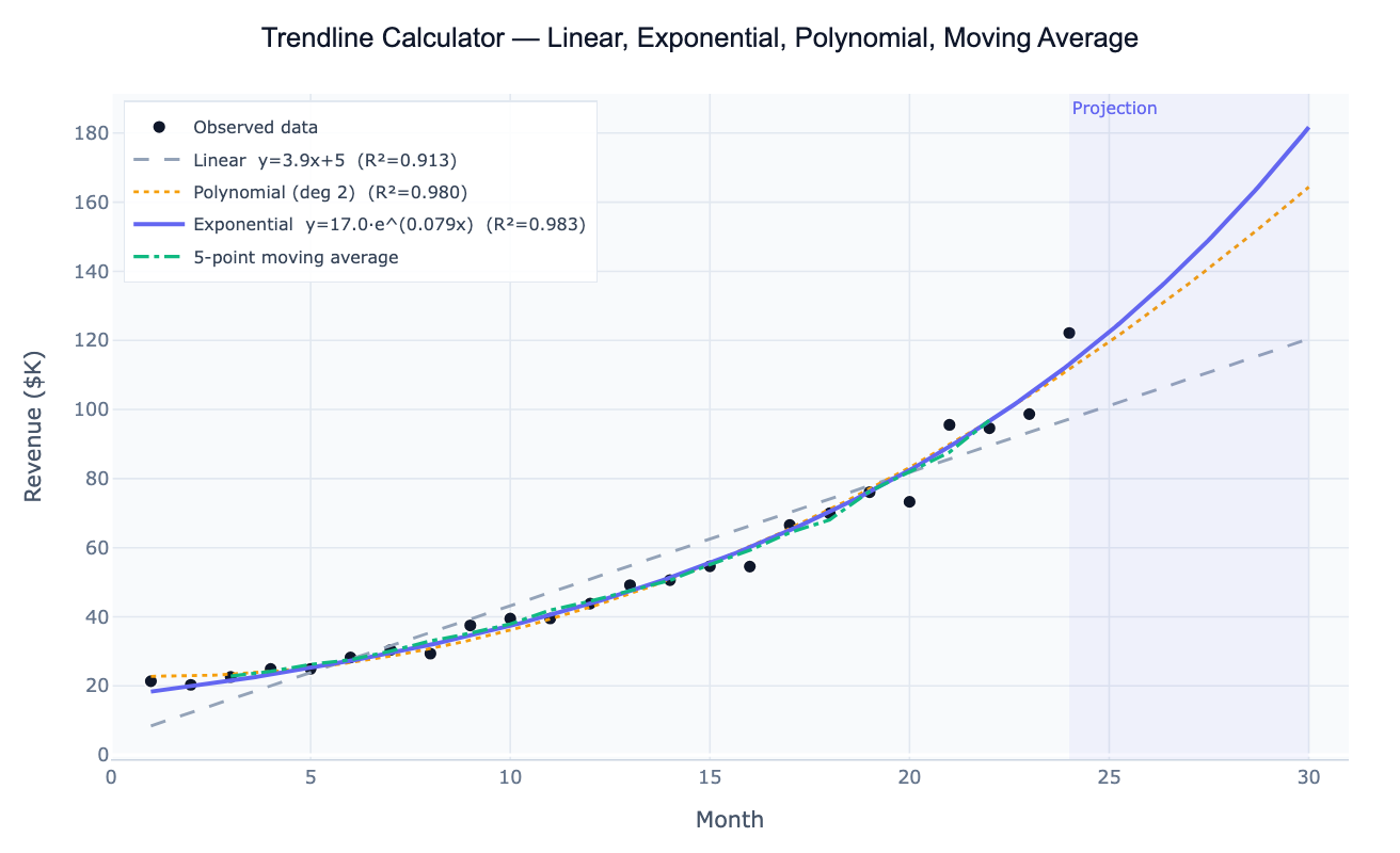
Or try with a sample dataset:
Preview
What Is a Trendline?
A trendline is a line or curve fitted to a dataset to summarize the overall direction and rate of change. It reduces noisy, observation-by-observation data to a smooth mathematical function that captures the underlying pattern — and allows you to project that pattern forward into the future. The choice of trendline type encodes a hypothesis about how the variable changes: a linear trendline assumes a constant rate of change (y = a + bx); an exponential trendline assumes a constant percentage rate of change (y = ae^(bx)), appropriate for populations, compound growth, and viral spread; a polynomial trendline captures curves with one or more bends (quadratic, cubic); and a moving average smooths out short-term fluctuations without committing to a parametric model.
The primary goodness-of-fit metric is R² (coefficient of determination): the proportion of variance in the data explained by the trendline, ranging from 0 (no fit) to 1 (perfect fit). A higher-degree polynomial will always achieve higher R² than a linear fit on the same data — but that doesn't mean it's the better model. A quadratic may capture a real curve or may simply be overfitting random noise. The correct approach is to choose the trendline type based on subject-matter knowledge (does exponential growth make physical sense here?) and then use R² to quantify how well that model fits, rather than choosing the type that maximizes R².
How It Works
- Upload your data — provide a CSV or Excel file with an x column (time, concentration, distance, or any numeric variable) and a y column (the measured outcome). One row per observation.
- Describe the analysis — e.g. "fit linear and exponential trendlines to the 'month' and 'revenue' columns; compare R²; project 6 months forward; plot with confidence bands"
- Get full results — the AI writes Python code using scipy.optimize, numpy.polyfit, and Plotly to overlay multiple trendlines, display R² in the legend, shade the projection region, and report the fitted equation
Required Data Format
| Column | Description | Example |
|---|---|---|
x | Independent variable — time, dose, distance | 1, 2, 3 … (month) or 2020-01-01 |
y | Dependent variable — count, sales, concentration | 12.3, 18.7, 31.2 |
group | Optional: series label for multi-series comparison | Product A, Product B |
Any column names work — describe them in your prompt. Dates are automatically converted to numeric time indices for fitting.
Interpreting the Results
| Output | What it means |
|---|---|
| R² | Proportion of variance explained — closer to 1 = better fit for that trendline type |
| Slope (linear) | Rate of change per unit x — e.g. $4,200 revenue per month |
| Growth rate (exponential) | b in y = ae^(bx) — multiply by 100 for % growth per unit x |
| Doubling time | ln(2) / b — how long until the value doubles at exponential rate b |
| Polynomial coefficients | β₀, β₁, β₂ … — interpret the quadratic term for curvature direction |
| Moving average | Smoothed value at each point — no equation, useful for visualizing cycles |
| Confidence band | Range of plausible mean y at each x — widens as you extrapolate further |
| Projection | Extrapolated trendline beyond the data — always treat as a best-case linear estimate |
Example Prompts
| Scenario | What to type |
|---|---|
| Compare all types | fit linear, exponential, and polynomial (degree 2) trendlines; compare R² for each; plot overlaid on scatter |
| Forecast forward | fit exponential trendline to monthly sales; project 12 months forward; shade projection region; report projected values |
| Growth rate | fit exponential trendline to cumulative users; report growth rate b and doubling time |
| Moving average | overlay 3-month and 12-month moving averages on annual temperature data; highlight long-term trend |
| Multi-series | fit linear trendlines for each product in the 'product' column; overlay on one plot; table of slopes ranked highest to lowest |
| Log-linear | fit linear trendline to log(y) vs x (semi-log plot); report log growth rate; back-transform to original scale |
Assumptions to Check
- Trendline type matches the data — exponential requires all y > 0; a linear fit to exponential data will show systematic curvature in the residuals
- Extrapolation caution — all trendlines can be extended beyond the data range, but reliability drops rapidly; polynomial fits in particular can diverge wildly outside the observed x range
- Outliers inflate uncertainty — a single anomalous point can drag the trendline significantly; ask the AI to fit with and without outliers to assess sensitivity
- Time series autocorrelation — standard R² and confidence intervals assume independent residuals; if observations are correlated over time (as they often are), standard errors are underestimated and confidence bands are too narrow
- Seasonality is not a trendline — if your data shows strong seasonal cycles, fit a trend + seasonality model (see the Time Series Decomposition tool) rather than a single trendline that will smear the cycles into the fit
Related Tools
Use the Polynomial Regression tool for curved relationships where you want full statistical inference (F-tests, AIC-based degree selection, standardized coefficients). Use the Time Series Decomposition tool when you need to separate the trend from seasonal cycles and residuals. Use the Linear Regression tool when you have multiple predictor variables and want to control for confounders. Use the Logistic Growth Curve Fit when your series is S-shaped and approaching a natural ceiling (carrying capacity).
Frequently Asked Questions
Which trendline type should I use? Start with the underlying process: if your variable grows by a fixed amount per period (revenue increases by $5k/month regardless of the current level), use linear. If it grows by a fixed percentage (revenue increases 8% per month), use exponential. If the relationship has a peak or valley (e.g. an environmental Kuznets curve), use polynomial degree 2. If you just want to visualize the direction without a parametric commitment, use a moving average. Ask the AI to "fit all four types and show R² for each" when you're unsure.
What does a negative exponential growth rate mean? In the model y = ae^(bx), a negative b means exponential decay — the value decreases by a constant percentage per unit x. This is appropriate for radioactive decay, drug elimination, cooling, or any process where the rate of decrease is proportional to the current value. The half-life is ln(2)/|b| — the time for the value to drop to half its current level.
My R² is high but the forecast looks wrong — why? High R² only measures fit within the observed data range. A polynomial that perfectly fits 10 historical data points can diverge wildly when extrapolated. This is especially common with degree 3+ polynomials. Always plot the projection region separately, and prefer exponential or linear trendlines for forecasting unless there is a strong reason for the curve to continue.
How do I get a trendline equation for Excel or Google Sheets?
After the AI fits the trendline, it reports the equation parameters (slope, intercept, growth rate, polynomial coefficients). You can enter these directly in a spreadsheet as a formula. For example, a linear trendline y = 5.7x + 3.1 becomes =5.7*A2+3.1 in Excel. For exponential, y = 17.4×e^(0.078x) becomes =17.4*EXP(0.078*A2).
Can I fit a trendline to multiple groups at once? Yes — include a group or category column in your data and ask the AI to "fit a linear trendline for each group in the 'region' column; overlay on one plot; table of slopes and R² per group". This produces a panel of parallel trendlines useful for comparing growth rates across products, countries, or experimental conditions.