Residual Plot Generator for Regression Diagnostics
Create residual plots online from Excel and CSV data. Check regression assumptions, nonlinearity, and heteroscedasticity with AI.
Or try with a sample dataset:
Preview
What Is a Residual Plot?
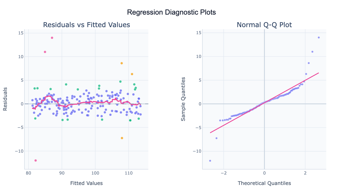
A residual plot is a diagnostic chart used to check whether the assumptions of a regression model are satisfied. After fitting a regression, each observation has a residual — the difference between the actual observed value and the value predicted by the model. Plotting these residuals against the fitted values (predicted values) reveals patterns that indicate whether the model is appropriate. A well-fitting regression produces residuals that scatter randomly around zero with no discernible shape; systematic patterns signal that the model is misspecified or that an assumption is violated.
The most important assumption checked by residual plots is linearity — whether the true relationship between the predictor and outcome is actually linear. If the residual vs. fitted plot shows a curve or a U-shape rather than a random cloud, a non-linear relationship exists and the model needs a transformation (e.g. log of the predictor). The second key assumption is homoscedasticity (equal variance) — the spread of residuals should be constant across all fitted values. A funnel-shaped scatter (wide at one end, narrow at the other) indicates heteroscedasticity, which inflates standard errors unevenly. The third assumption is normality of residuals, checked with a Q-Q plot: if the residual points follow the diagonal reference line, the residuals are approximately normal.
Residual plots are essential before trusting the p-values and confidence intervals from any regression. A regression that looks reasonable in terms of R² can have severely violated assumptions that make all the inferential statistics unreliable. In practice, residual analysis is used across every domain that uses regression: clinical trials (checking whether a treatment effect model fits the data), econometrics (validating country-level growth models), and machine learning (diagnosing whether a linear baseline is appropriate before trying complex models).
How It Works
- Upload your data — provide a CSV or Excel file with at least two numeric columns: one outcome variable (Y) and one or more predictor variables (X). One row per observation.
- Describe the analysis — e.g. "residual plot for regression of salary on years of experience and education; show residuals vs fitted, Q-Q plot, and scale-location plot"
- Get the diagnostic plots — the AI writes Python code using statsmodels or scikit-learn to fit the regression and Plotly to generate the diagnostic charts
Interpreting the Results
| Plot | What to look for | What a problem looks like |
|---|---|---|
| Residuals vs Fitted | Random scatter around y=0 | Curve, U-shape, or systematic trend |
| Normal Q-Q Plot | Points follow the diagonal line | Points curve away at ends (heavy tails) |
| Scale-Location Plot | Horizontal band of equal width | Funnel shape (heteroscedasticity) |
| Residuals vs Leverage | No points in top-right corner | High-leverage + large residual = influential outlier |
| Histogram of Residuals | Roughly bell-shaped | Skewed or bimodal (non-normal errors) |
| LOWESS smoother | Flat line near zero | Curved line (non-linearity) |
Example Prompts
| Scenario | What to type |
|---|---|
| Basic regression check | residual plot for regression of house price on square footage, show all 4 diagnostic plots |
| Multiple regression | residuals vs each predictor separately for regression of salary on age, education, and experience |
| Time series check | residuals vs time order to check for autocorrelation in quarterly revenue regression |
| Influential points | residuals vs leverage with Cook's distance contours, flag observations with Cook's D > 0.5 |
| Log transform check | residual plot before and after log-transforming GDP, compare which fits better |
Assumptions to Check
- Linearity — the relationship between predictors and outcome is linear; check with residuals vs. fitted plot (should be a flat band around zero)
- Independence — residuals are not correlated with each other; especially important for time series or clustered data
- Homoscedasticity — residual variance is constant across all fitted values; check the scale-location plot for a horizontal band
- Normality of residuals — residuals are approximately normally distributed; check the Q-Q plot and residual histogram
- No influential outliers — no single observation dominates the fit; check residuals vs. leverage with Cook's distance
Related Tools
Use the Linear Regression tool to fit and interpret the regression model itself before examining its residuals. Use the Exploratory Data Analysis tool to check for outliers and non-normal distributions in the raw data before fitting. Use the AI Scatter Chart Generator to visualize the raw X–Y relationship and identify obvious non-linearities that a residual plot would confirm.
Frequently Asked Questions
My residuals vs. fitted plot shows a curved pattern — what does that mean? A curve (often a U-shape) means the true relationship is non-linear and a linear model is not appropriate. Common fixes: apply a log, square root, or polynomial transformation to one of the variables, or use a non-linear regression model. Ask the AI to "try a log transform of the predictor and replot the residuals" to see if the pattern disappears.
My Q-Q plot has points curving away at both ends — is that a problem? Curving away at both ends (an S-shape) indicates heavy tails — the residuals have more extreme values than a normal distribution would predict. This can affect hypothesis tests if extreme. If the middle of the Q-Q plot is straight, the inference is likely robust. If you have a small sample (< 50), some deviation is expected — focus on severe S-curves or systematic skew.
What is Cook's distance and when does it matter? Cook's distance measures how much the fitted values would change if you removed a single observation. An observation with high leverage (unusual predictor values) AND a large residual has high Cook's distance — it is influential and may be driving the entire regression. A rule of thumb: Cook's D > 4/n (where n is sample size) or > 0.5 is worth investigating. Ask the AI to "show residuals vs leverage with Cook's distance contours".
Can I get residual plots for multiple regression? Yes — the AI will fit all predictors simultaneously and produce the same diagnostic plots (residuals vs fitted, Q-Q, scale-location, leverage). You can also ask for "partial residual plots" (also called component-plus-residual plots) that show the relationship between each individual predictor and the outcome after controlling for the others.
How do I fix heteroscedasticity if I find it? Options include: (1) transform the outcome variable (log or square root often stabilizes variance), (2) use weighted least squares where observations with higher variance get lower weight, or (3) use robust standard errors (HC3) which correct the standard errors without changing the estimates. Tell the AI which fix you want to try: "refit using log(Y) and recheck the residuals".