Empirical CDF Plot Generator for Excel & CSV
Create empirical CDF plots online from Excel and CSV data. Compare percentiles, thresholds, and full distributions with AI.
Or try with a sample dataset:
Preview
What Is an Empirical CDF?
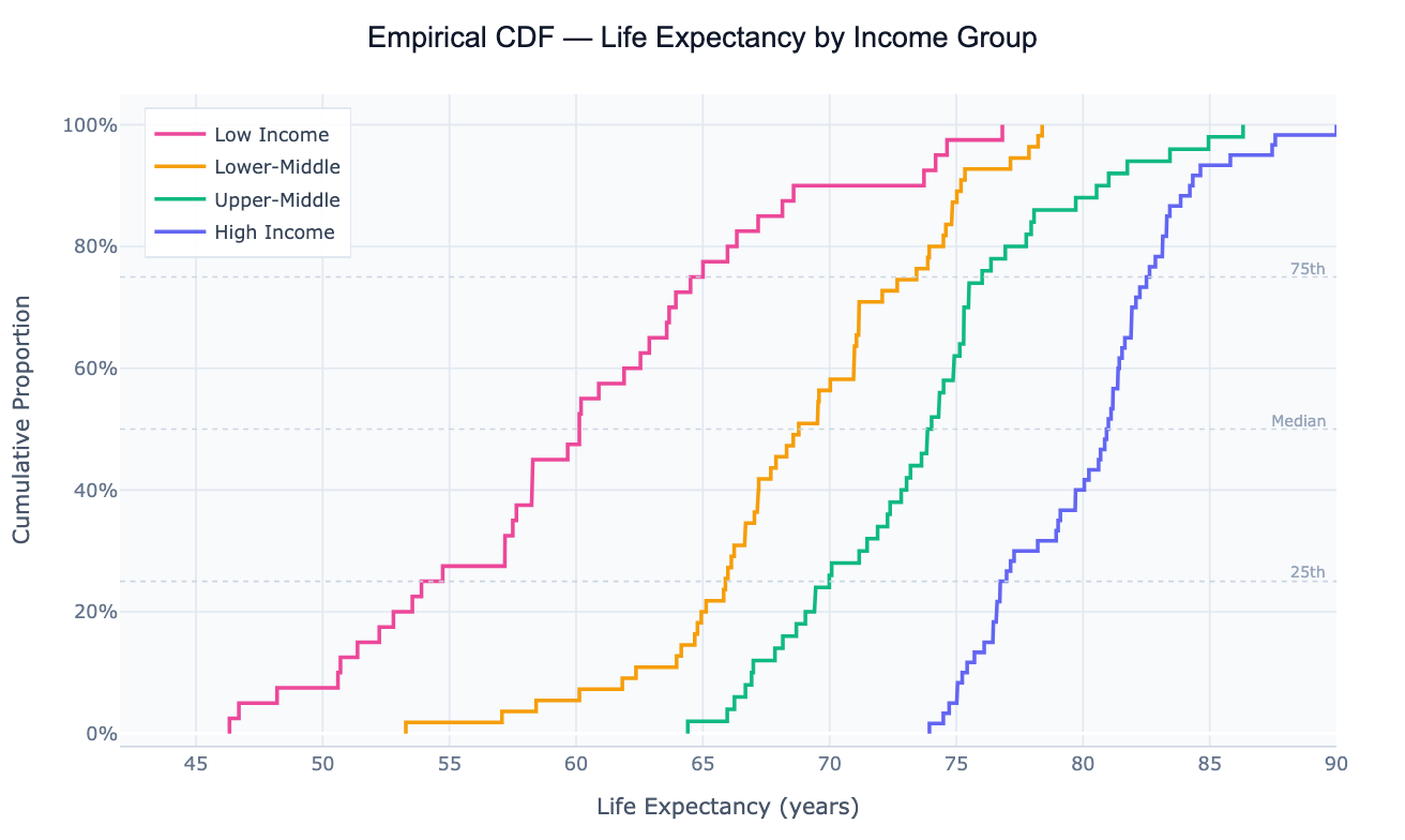
An empirical cumulative distribution function (ECDF) is a step-function that, for each value x on the horizontal axis, shows the proportion of observations in the dataset that are less than or equal to x. Sort your data from smallest to largest; the first observation sits at 1/n, the second at 2/n, and so on until the last observation reaches 1.0 (100%). The result is a staircase curve that rises from 0 to 1 across the range of the data, with each step corresponding to one observation.
The ECDF's key advantage over a histogram or density plot is that it is non-parametric and assumption-free — it makes no choices about bin widths or smoothing parameters that could distort the shape. Every observation appears exactly once, as one step. This makes the ECDF a reliable reference for percentile reading: to find the median, draw a horizontal line at 0.5 and read off where it crosses the curve. The 90th percentile is where the curve crosses 0.9. Comparing two ECDFs directly shows which group is stochastically larger (its curve lies to the right), and where exactly the distributions diverge — whether at the tails, the center, or uniformly.
ECDFs are used for distribution comparison in almost every quantitative field. In survival analysis, the complement (1 − ECDF) is the survival function. In quality control, an ECDF shows what fraction of products fall within specification. In economics, the Lorenz curve (used to compute the Gini coefficient) is a specific ECDF of income shares. In machine learning, ECDFs help calibrate probability outputs — a perfectly calibrated classifier has its confidence ECDF match the diagonal.
How It Works
- Upload your data — provide a CSV or Excel file with at least one numeric column and optionally a categorical column for grouping. One row per observation.
- Describe the plot — e.g. "ECDF of salary by department, add median reference lines, log scale on x-axis"
- Get the visualization — the AI writes Python code using numpy and Plotly to sort the data, compute cumulative proportions, and render step-function curves for each group
Interpreting the Results
| Visual element | What it means |
|---|---|
| Curve far to the right | Group has higher values overall — stochastically dominant |
| Steep section | Many observations clustered in a narrow range — values concentrate here |
| Flat section | Gap in the data — few observations in that value range |
| Crossing curves | One group is better below the crossing point; the other is better above |
| Reading at y = 0.5 | Median of that group — 50% of observations below this value |
| Reading at y = 0.9 | 90th percentile — only 10% of observations exceed this value |
| Vertical gap between curves at the same x | Proportion difference — e.g. "30% more countries in Group A fall below $15k GDP" |
Example Prompts
| Scenario | What to type |
|---|---|
| Group comparison | ECDF of test scores by teaching method, add 50th and 90th percentile lines |
| Threshold analysis | ECDF of income, add vertical line at poverty threshold, show % below |
| Before/after | ECDF of response time before and after system upgrade, overlay both curves |
| Log scale | ECDF of CO2 emissions per capita, log scale on x-axis, one curve per region |
| Percentile lookup | ECDF of salary distribution, annotate where $80k falls as a percentile |
Related Tools
Use the Density Plot Generator when you want a smoothed continuous curve showing relative likelihood rather than cumulative proportion — density plots are more intuitive for general audiences but require bandwidth choice. Use the AI Box Plot Generator to compare groups by summary statistics (median, IQR, outliers) in a more compact form. Use the AI Histogram Generator when you want to show raw counts in discrete bins rather than a cumulative proportion.
Frequently Asked Questions
What's the difference between an ECDF and a histogram? A histogram groups observations into bins and counts how many fall in each — the result depends on bin width and starting position, and shows relative frequency (not cumulative). An ECDF makes no binning choices, shows every observation exactly once as a step, and reads out cumulative proportions directly. The ECDF is more precise for percentile lookups and group comparisons; the histogram is more intuitive for showing the shape of a single distribution.
How do I read the percentile of a specific value from the plot? Find the value on the x-axis, draw a vertical line up to the curve, then read the y-axis. That y-value is the percentile — if the curve crosses 0.73 at x = 50,000. Ask the AI to "annotate where $50,000 falls as a percentile" and it will add the crossing point label automatically.
Can I use the ECDF to formally test whether two groups have the same distribution? Yes — the Kolmogorov-Smirnov (KS) test uses the maximum vertical distance between two ECDFs as its test statistic. Ask for "two-sample KS test between Group A and Group B" and the AI will compute the KS statistic, p-value, and mark the maximum separation point on the ECDF plot.
My data has ties — does that affect the ECDF? Ties create flat horizontal sections in the ECDF (no step) followed by a larger single step when the tied value is reached. This is mathematically correct and doesn't need special handling. For continuous theoretical distributions there are no ties by definition, but real data always has some.
Can I overlay a theoretical CDF (e.g. normal) on top of the empirical one? Yes — ask to "overlay the theoretical normal CDF using the sample mean and standard deviation". If the ECDF closely follows the theoretical curve, the data is approximately normally distributed. The vertical distance between the curves at each point is what the KS goodness-of-fit test measures, and the Q-Q Plot Generator shows the same comparison from a different angle.