Density Plot Generator for Excel & CSV
Create density plots online from Excel and CSV data. Compare smooth distributions, overlap, and shape across groups with AI.
Or try with a sample dataset:
Preview
What Is a Density Plot?
A density plot (formally a kernel density estimate or KDE plot) is a smooth, continuous curve that represents the probability distribution of a numeric variable. Unlike a histogram, which groups data into discrete bins and is sensitive to bin width, a density plot uses a mathematical smoothing technique to produce a continuous curve where the area under the curve always equals 1. The height of the curve at any point estimates how likely it is to observe a value near that point — peaks correspond to the most common values, and the curve's spread reflects the variability in the data.
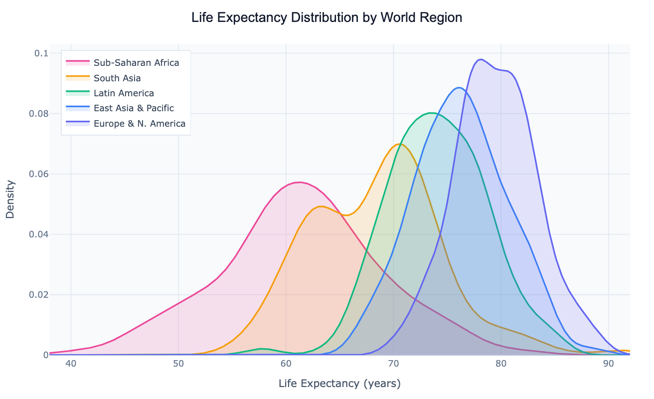
The density plot's main strength is comparing the shape of distributions across multiple groups simultaneously. Overlaid, semi-transparent KDE curves let you see at a glance whether groups peak at the same value, whether one group's distribution is wider or more skewed, and whether there are bimodal patterns (two peaks) that would be obscured in a single summary statistic. A classic example: plotting life expectancy for countries by world region shows a clear rightward shift from Sub-Saharan Africa to Europe, with each curve's width revealing how much within-region inequality exists. This comparison would require five separate histograms to achieve the same visual clarity.
Density plots are widely used in statistics, data science, and research for distributional comparisons — checking whether a treatment group's outcome distribution shifted relative to control, visualizing how income distributions differ by country or decade, or confirming whether a variable is approximately normally distributed before applying parametric tests. They are particularly useful when you have continuous data with 100+ observations per group (for reliable KDE estimation) and want to show full distribution shape rather than just summary statistics.
How It Works
- Upload your data — provide a CSV or Excel file with at least one numeric column (the variable to plot) and optionally a categorical column for grouping. One row per observation; long format works best.
- Describe the plot — e.g. "density plot of salary by department, filled curves, add median lines, log scale on x-axis"
- Get the visualization — the AI writes Python code using Plotly with scipy KDE to build smooth overlapping distribution curves
Interpreting the Results
| Visual element | What it means |
|---|---|
| Peak of the curve | Mode — the most common value in that group |
| Width of the curve | Spread — wide curve = high variance, narrow = concentrated values |
| Position of the peak | Central tendency — where most observations cluster |
| Long tail to the right | Right-skewed distribution — a few very large values |
| Long tail to the left | Left-skewed distribution — a few very small values |
| Two peaks (bimodal) | Two sub-populations with different typical values |
| Curves shifting right across groups | The variable increases systematically across those groups |
| Overlap between curves | Similarity between groups — heavy overlap = distributions are close |
Example Prompts
| Scenario | What to type |
|---|---|
| Regional comparison | density plot of life expectancy by world region, filled curves, label peaks |
| Before/after treatment | density plot of test scores before and after intervention, overlay both curves |
| Income distribution | density plot of log income by decade from 1980 to 2020, show how distribution shifted |
| Quality control | density plot of product weight measurements by production line, add spec limit lines |
| Clinical trial | density plot of biomarker levels by treatment arm, add p-value annotation |
Related Tools
Use the AI Histogram Generator when you want to show the raw counts in discrete bins rather than a smoothed continuous curve — histograms are more honest about the actual data at small sample sizes (< 100 observations per group). Use the Ridgeline Plot Generator when you have many groups (10+) to compare and want to stack the density curves vertically rather than overlay them. Use the AI Violin Plot Generator when you want to combine the density shape with summary statistics (median, IQR) in a single compact chart for a small number of groups.
Frequently Asked Questions
How does a density plot differ from a histogram? A histogram divides the data into discrete bins and counts observations per bin — the result depends heavily on bin width and starting position. A density plot uses kernel density estimation to fit a smooth curve through the data, which makes it easier to see the distribution's shape, compare multiple groups by overlaying curves, and avoid the "spiky" appearance of histograms with many bins. The trade-off: a density plot can suggest smoothness that doesn't exist in small datasets. For fewer than ~50 observations, a histogram is more honest.
What bandwidth (smoothing) is used? By default, scipy uses Silverman's rule to automatically choose a bandwidth that balances smoothness against detail. If the result looks too smooth (hiding real features) or too jagged (over-fitting noise), ask for "increase the bandwidth" (smoother) or "decrease the bandwidth" (shows more detail). You can also specify a numeric value: "bandwidth 0.3".
My data is heavily right-skewed — should I use a log scale? Yes, for data like income, population, or revenue that span multiple orders of magnitude, ask for a "log scale on the x-axis". The AI will apply a log transform before computing the KDE, which produces a much more readable density curve that shows the shape of the bulk of the data without being dominated by extreme outliers.
Can I add a rug plot to show individual data points? Yes — ask for a "rug plot below the density curves". This adds a small tick mark at the x-axis for each observation, showing where the actual data points fall alongside the smooth KDE. It's especially useful for checking whether the KDE is a faithful representation of the raw data.
Can I show a 2D density plot (heatmap of two variables)? Yes — ask for a "2D density plot" or "density heatmap of variable A vs variable B". The AI will use a 2D KDE to produce a contour or heatmap showing where observations cluster in the joint distribution of two numeric variables.