Ridgeline Plot Generator for Excel & CSV
Create ridgeline plots online from Excel and CSV data. Compare many distributions across groups or time periods with AI.
Or try with a sample dataset:
Preview
What Is a Ridgeline Plot?
A ridgeline plot (also called a joy plot or joyplot) displays the distribution of a numeric variable across many groups as a series of overlapping kernel density estimate (KDE) curves, stacked vertically — one per group. Each curve sits on its own baseline, slightly offset upward from the one below, creating a layered "ridge" appearance. The overlap between adjacent curves can be adjusted: more overlap saves vertical space but requires careful color choice to keep curves distinguishable.
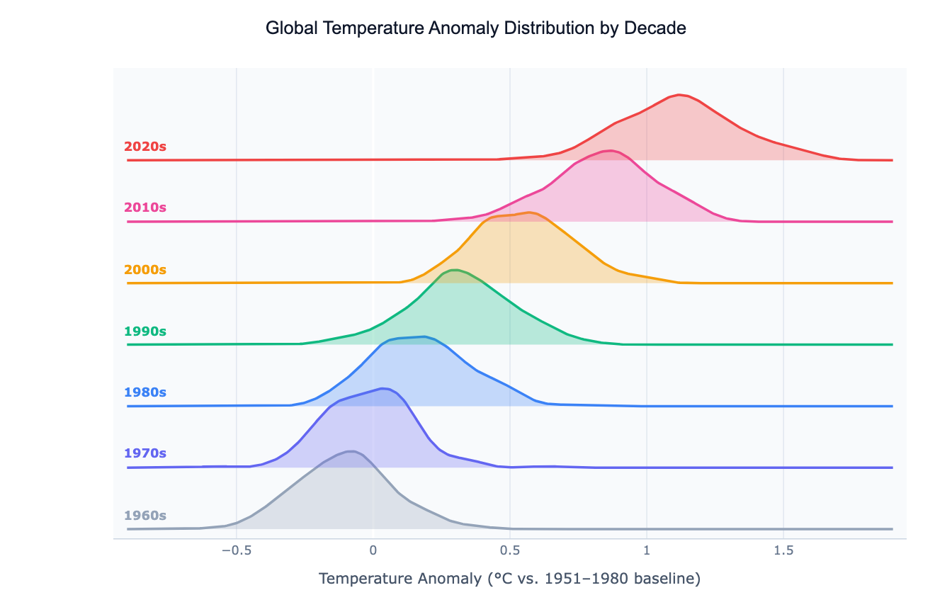
The chart's signature strength is showing how a distribution shifts across a categorical dimension — especially when that dimension has a natural order (years, decades, age groups, income bands). A classic use is climate science: plotting the distribution of annual temperature anomalies by decade, where the entire distribution visibly shifts rightward over time. Other applications include music streaming (distribution of song plays by genre), finance (return distributions by asset class across years), and medicine (biomarker distributions by age group across a study cohort).
Ridgeline plots outperform both histograms and box plots when you have 10 or more groups to compare: a box plot grid becomes hard to scan, and overlapping histograms turn into noise. The ridgeline plot keeps each group's shape legible while still allowing comparison across the full stack at a glance.
How It Works
- Upload your data — provide a CSV or Excel file with at least one numeric column (the variable to distribute) and one categorical or ordinal column (the grouping variable). Long format works best: one row per observation.
- Describe the plot — e.g. "ridgeline plot of salary by department, color from lightest (lowest median) to darkest, sort ridges by median"
- Get the visualization — the AI writes Python code using Plotly or matplotlib with scipy KDE to build the stacked offset curves
Interpreting the Results
| Visual element | What it means |
|---|---|
| Peak of a ridge | Mode — the most common value for that group |
| Width of a ridge | Spread — wide = high variance, narrow = concentrated |
| Horizontal position of peak | Central tendency of that group |
| Shift between adjacent ridges | Change in the distribution from one group to the next |
| Overlap between ridges | Similarity between adjacent groups — heavy overlap = similar distributions |
| Tail extending right | Right-skewed distribution — a few very high values pull the mean up |
| Bimodal bump | Two sub-populations within the group |
Example Prompts
| Scenario | What to type |
|---|---|
| Climate change | ridgeline plot of temperature anomaly by decade, blue to red gradient, sorted chronologically |
| Income inequality | ridgeline plot of log income by country income group, 4 groups, color by group |
| Music streaming | ridgeline plot of daily plays by genre, sort by median plays, show top 12 genres |
| Hospital data | ridgeline plot of patient length of stay by diagnosis group, log x-axis |
| Survey responses | ridgeline plot of satisfaction score by department, sorted by mean score |
Related Tools
Use the AI Violin Plot Generator when you have fewer groups (2–8) and want to show both the distribution shape and a summary box plot side by side. Use the AI Histogram Generator to examine a single group's distribution in detail. Use the AI Box Plot Generator when you need to compare many groups by summary statistics (median, IQR, outliers) rather than full shape.
Frequently Asked Questions
How many groups can I compare with a ridgeline plot? Ridgeline plots work well with roughly 5–30 groups. Fewer than 5 groups are better served by a violin or box plot; more than 30 groups make the stack too tall to read comfortably. For very many groups, ask the AI to filter to the most interesting subset or to facet the ridgelines into multiple panels.
How do I control the amount of overlap between ridges? Include "more overlap" or "less overlap" in your prompt, or specify a numeric value: "overlap factor 0.8". More overlap is visually dramatic but requires careful coloring; less overlap is safer and easier to read if groups have similar distributions.
What's the difference between a ridgeline plot and stacked area chart? A stacked area chart shows cumulative totals over a continuous axis (e.g. time). A ridgeline plot shows independent distributions per group — each curve is a KDE of the raw data, not a cumulative sum. They look similar but convey completely different things.
Can I sort the ridges by a statistic rather than alphabetically? Yes — ask to "sort ridges by median", "sort by mean", or "sort by variance". The AI will reorder the groups along the y-axis accordingly, which often reveals a meaningful gradient in the data.