Box Plot Generator for Excel & CSV
Create box plots online from Excel and CSV data. Compare medians, quartiles, spread, and outliers with AI.
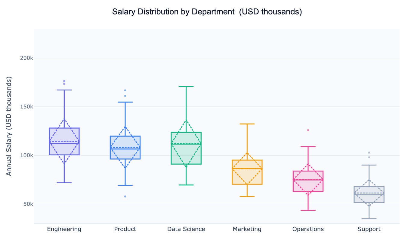
Or try with a sample dataset:
Preview
What Is a Box Plot?
A box plot (also called a box-and-whisker plot) is a compact chart that summarises a distribution using five numbers: the minimum, first quartile (Q1), median, third quartile (Q3), and maximum. The rectangle (the "box") spans from Q1 to Q3, enclosing the interquartile range (IQR) — the middle 50% of the data. A line inside the box marks the median, and "whiskers" extend to the furthest points within 1.5× the IQR. Any values beyond the whiskers are plotted individually as outliers.
Box plots were designed for comparison. Placing several side by side immediately reveals which groups have higher medians, wider spreads, or unusual outliers — something that is much harder to read from a table. A common real-world use: an HR analyst comparing salary distributions across departments to identify pay equity issues, or a medical researcher comparing patient biomarker levels across treatment arms.
Because they summarise data into just a few statistics, box plots work well even with large datasets where individual data points would be too dense to plot. For smaller samples (under ~30 per group) it is often worth overlaying the raw points so viewers can judge the density directly.
How It Works
- Upload your data — provide a CSV or Excel file with at least one numeric column and one categorical column to group by (e.g.
department,region,treatment,category) - Describe the plot — e.g. "box plot of test scores by school type, show the mean and label outliers"
- Get the visualization — the AI writes Python code using Plotly or seaborn to build and style the chart
Interpreting the Results
| Visual element | What it means |
|---|---|
| Box (IQR) | Middle 50% of observations — Q1 to Q3 |
| Line inside box | Median (50th percentile) |
| Dashed line inside box | Mean (when shown) — distance from median reveals skew |
| Whiskers | Extend to the last data point within 1.5× IQR from the box edge |
| Individual dots beyond whiskers | Outliers — values unusually far from the bulk of the data |
| Tall narrow box | Low variance — values are clustered near the median |
| Wide box | High variance — values are spread out |
| Median near Q1 | Right-skewed distribution (long upper tail) |
| Median near Q3 | Left-skewed distribution (long lower tail) |
Example Prompts
| Scenario | What to type |
|---|---|
| Department salary comparison | box plot of salary by department, color by department, show outliers |
| Clinical trial | box plot of blood pressure by treatment group, show individual patients as dots |
| Academic performance | box plot of exam scores by school, horizontal orientation, sort by median |
| Financial returns | box plot of monthly returns by asset class, log scale |
| Survey data | box plot of customer satisfaction score by product line, annotate median |
Box Plot vs. Violin Plot vs. Histogram
| Chart | Best for |
|---|---|
| Box plot | Comparing many groups quickly; outlier detection; large datasets |
| Violin plot | Comparing distribution shape (bimodal, skewed) across a few groups |
| Histogram | Showing one group's distribution in detail |
| Strip / swarm plot | Small samples where every point should be visible |
Choose a box plot when you have more than ~6 groups to compare, or when outlier detection is the primary goal. Switch to a violin plot when distribution shape matters more than outlier identification.
Related Tools
Use the Online t-test calculator to test whether two groups differ significantly, or the ANOVA calculator to compare three or more groups. Use the AI Violin Plot Generator when you want to see the full distribution shape alongside the summary statistics.
Frequently Asked Questions
Why do some points appear beyond the whiskers — are they errors? Not necessarily. Outliers are simply values more than 1.5× the IQR beyond the box. They may be genuine extreme values, data entry errors, or members of a distinct sub-population. Ask the AI to label outliers with their row identifiers so you can investigate them.
Can I show a notched box plot? Yes — ask for a "notched box plot". The notches represent a 95% confidence interval around the median. If the notches of two boxes do not overlap, the medians are significantly different at roughly the 5% level.
How do I sort the boxes by median? Include "sort by median" or "order boxes from lowest to highest median" in your prompt. The AI will reorder the categorical axis accordingly.
My data has many groups — the chart is too wide. What should I do? Ask for a horizontal box plot — it reads more naturally when there are many categories. You can also ask the AI to filter to the top N groups by count or median.