Q-Q Plot Generator for Normality Testing
Create Q-Q plots online from Excel and CSV data. Compare sample distributions to theoretical distributions and check normality with AI.
Or try with a sample dataset:
Preview
What Is a Q-Q Plot?
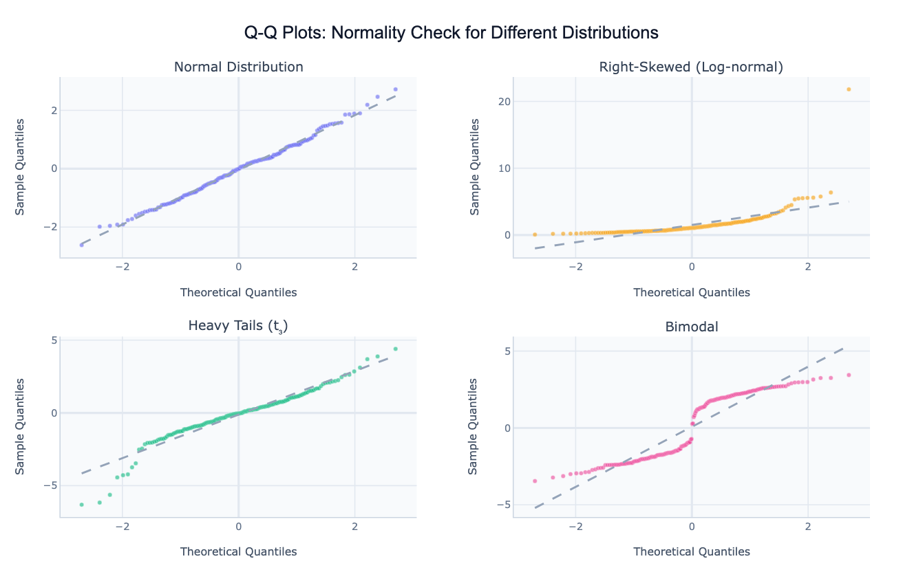
A Q-Q plot (quantile-quantile plot) is a graphical method for comparing the distribution of a dataset against a theoretical reference distribution — most commonly the normal (Gaussian) distribution. The plot places the theoretical quantiles of the reference distribution on the x-axis and the corresponding sample quantiles from your data on the y-axis. If the data follows the theoretical distribution, the points fall along a straight diagonal reference line. Deviations from this line reveal exactly how and where the distributions differ.
The shape of the deviation tells you what kind of departure from normality you have. An S-curve (points curving above the line at both ends) signals heavy tails — more extreme values than a normal distribution would predict, common in financial returns or test scores. A convex curve (points bowing above the line on the right) indicates right skew — a long upper tail typical of income, wealth, and population data. Points that follow the line perfectly until they step sideways at the extremes indicate a bimodal distribution with two separate sub-populations. This visual diagnostic is far more informative than a single p-value from a normality test, which can reject normality for trivial deviations in large samples or fail to detect real departures in small ones.
Q-Q plots are widely used in statistics (checking whether regression residuals are normally distributed before reporting t-tests and F-tests), quality control (verifying that manufacturing measurements follow a specified distribution), finance (examining whether log-returns have heavier tails than normal — they almost always do), and scientific research (checking assumptions before applying parametric tests). They can also compare a sample against any reference: log-normal, exponential, uniform, or even another empirical dataset.
How It Works
- Upload your data — provide a CSV or Excel file with at least one numeric column to test. One row per observation.
- Describe the plot — e.g. "Q-Q plot of exam scores against normal distribution, add 95% confidence band, flag outliers"
- Get the visualization — the AI writes Python code using scipy and Plotly to compute theoretical quantiles and render the plot with the reference line
Interpreting the Results
| Pattern on the Q-Q plot | What it means |
|---|---|
| Points on the diagonal line | Data follows the reference distribution closely |
| S-curve (both ends bow away) | Heavy tails — more extreme values than expected |
| Inverted S-curve | Light tails — fewer extreme values than expected |
| Convex curve (bows up on right) | Right skew — long upper tail, most values are small |
| Concave curve (bows down on left) | Left skew — long lower tail, most values are large |
| Points follow line then step right | Bimodal or mixture distribution |
| Single outlier point far off the line | Individual extreme observation worth investigating |
| 95% confidence band | Region where points are expected if data is truly normal |
Example Prompts
| Scenario | What to type |
|---|---|
| Normality check | Q-Q plot of residuals against normal distribution with 95% confidence band |
| Skew detection | Q-Q plot of income values, also try log-normal reference |
| Compare distributions | Q-Q plot comparing the sample against normal, t(5), and log-normal — which fits best? |
| Multiple groups | Q-Q plots for each department's salary separately, 2x3 grid |
| Two-sample Q-Q | two-sample Q-Q plot comparing treatment vs control group outcomes |
Related Tools
Use the Residual Plot Generator to run the full suite of regression diagnostic plots including residuals vs fitted, scale-location, and leverage — the Q-Q plot is one panel of the full diagnostic. Use the Density Plot Generator to show the continuous distribution shape of your data visually rather than as a quantile comparison. Use the AI Histogram Generator to display the raw distribution as bins with an optional normal curve overlay for audiences less familiar with Q-Q plots.
Frequently Asked Questions
How do I read a Q-Q plot if I'm not familiar with quantiles? Think of it this way: the x-axis asks "where would this data point be if it came from a perfect normal distribution?" and the y-axis shows "where the data point actually is." When both agree, the point sits on the diagonal line. A point above the line means the actual value is higher than expected; below the line means it's lower. The further the points stray from the line, the more the distribution differs from normal.
My points follow the line in the middle but curve away at the ends — is that normal? Some departure at the extreme tails is expected and acceptable in most datasets, especially with fewer than ~50 observations. A 95% confidence band (ask the AI to add one) helps you distinguish expected sampling variability from genuine departures. If many points fall outside the band, the normality assumption is likely violated.
Can I compare my data against a distribution other than normal? Yes — ask for a Q-Q plot against "exponential", "log-normal", "uniform", "t distribution with 5 degrees of freedom", or any distribution supported by scipy. This is useful when you have reason to believe your data follows a specific non-normal distribution and want to verify.
What's the difference between a Q-Q plot and a normality test like Shapiro-Wilk? A normality test produces a single p-value that says "reject" or "don't reject" normality at a threshold. A Q-Q plot shows where and how the distribution deviates — whether it's the tails, the center, a skew, or a bimodal split. For large samples, Shapiro-Wilk will reject normality even for trivially small deviations; the Q-Q plot lets you judge whether the departure is practically meaningful.
Can I make a two-sample Q-Q plot to compare two groups directly? Yes — ask for a "two-sample Q-Q plot" of two columns or two filtered groups. Instead of comparing against a theoretical distribution, the x-axis shows quantiles of one group and the y-axis shows quantiles of the other. Points on the diagonal mean the two distributions are identical; deviations show where and how they differ.