Cohort Retention Analysis
Analyze cohort retention online from Excel or CSV data. Build retention heatmaps, benchmark churn, and compare cohorts with AI.
Or try with a sample dataset:
Preview
What Is Cohort Retention Analysis?
Cohort retention analysis tracks groups of users (or patients, customers, or students) who share a common starting event — the cohort — and measures what fraction remain active, engaged, or retained at each subsequent time period. The defining feature is that all members of a cohort share the same starting point: users who signed up in January form the January cohort, patients who started treatment in Q1 form the Q1 cohort. By tracking each cohort separately rather than aggregating all users together, retention analysis separates the age effect (how long someone has been with a product or treatment) from the calendar effect (whether recent months were better or worse overall), enabling genuine comparison of product versions, acquisition channels, or intervention cohorts over time.
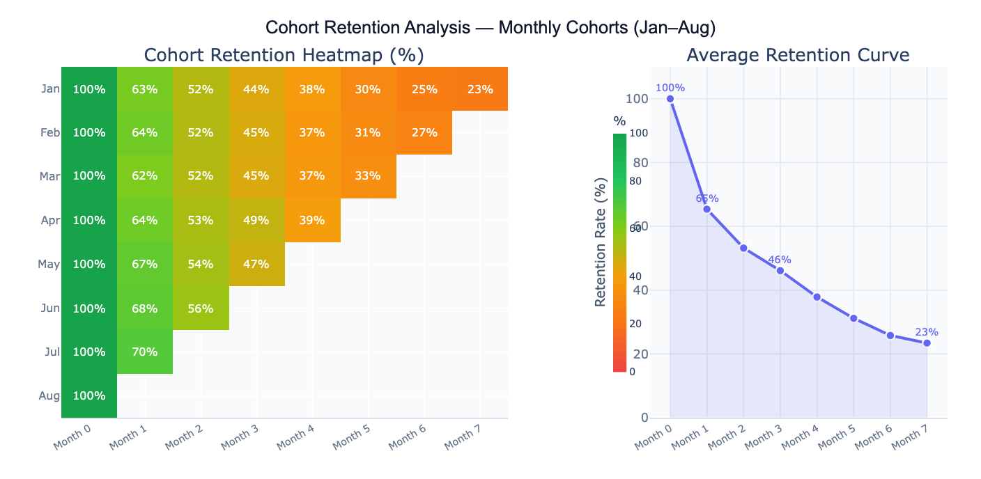
The signature output of cohort retention analysis is the retention heatmap: a matrix where each row is a cohort, each column is a time period since cohort formation (Period 0, 1, 2, …), and each cell contains the retention rate (% of the original cohort still active). The diagonal empty triangle in the bottom-right reflects the fact that newer cohorts haven't had time to accumulate later-period data. Color gradients — green for high retention, red for low — make it visually immediate to spot which cohorts are performing well and at which periods retention drops most sharply. A complementary retention curve plots the average across cohorts, showing the overall shape of engagement decay over time.
A concrete example: a SaaS product tracks 8 monthly user cohorts. The January cohort shows 62% retention at Month 1, 44% at Month 3, and 27% at Month 7. The May cohort — acquired after a product improvement — shows 70% at Month 1 and 52% at Month 3, suggesting the product change meaningfully improved early retention. The average retention curve flattens around Month 5 at ~23%, indicating a "power user" floor — a stable segment who remain active long-term. Day-30 retention (the Month 1 cell) is typically the most critical benchmark for SaaS: above 40% is considered good, above 60% excellent.
How It Works
- Upload your data — provide a CSV or Excel file with individual-level event logs (one row per user-period activity) or a pre-built cohort summary matrix (rows = cohorts, columns = periods, cells = retention rates or active counts).
- Describe the analysis — e.g. "monthly cohorts defined by signup_month column; retention = any login in each subsequent month; retention heatmap; average retention curve; compare top and bottom cohorts"
- Get full results — the AI writes Python code using pandas and Plotly to build the cohort matrix, compute retention rates, generate the heatmap and retention curve, and annotate key benchmark periods
Required Data Format
Option 1 — Event log (one row per user per active period):
| Column | Description | Example |
|---|---|---|
user_id | Unique user identifier | U1234 |
cohort_period | Period when user joined | 2024-01 (signup month) |
active_period | Period when user was active | 2024-03 |
segment | Optional: grouping variable | mobile, paid, organic |
Option 2 — Pre-built matrix (one row per cohort):
| Column | Description | Example |
|---|---|---|
cohort | Cohort label | Jan 2024, Q1 2024 |
cohort_size | Users who started | 1240 |
period_0, period_1, … | Retention count or % per period | 1240, 812, 540 |
For event logs, the AI will build the cohort matrix by counting how many users from each cohort were active in each subsequent period. Specify whether "active" means any event, a specific event type, or a purchase.
Interpreting the Results
| Output | What it means |
|---|---|
| Retention heatmap | Matrix of retention % — rows = cohorts, columns = periods since start; green = high, red = low |
| Day-1/Week-1/Month-1 retention | % of cohort active in the first return period — the most important leading indicator of long-term retention |
| Average retention curve | Mean retention % across all cohorts at each period — shows the typical engagement decay shape |
| Cohort size | Number of users who entered each cohort — smaller cohorts have noisier retention estimates |
| Churn rate | 1 − retention rate — fraction of users lost each period |
| Retention plateau | The asymptote of the retention curve — the "power user" floor who remains indefinitely |
| Cohort comparison | Retention curves overlaid for multiple cohorts — reveals whether product changes improved retention |
| Period-over-period change | How retention at a given age (e.g., Month 3) has changed across successive cohort vintages |
Example Prompts
| Scenario | What to type |
|---|---|
| Basic heatmap | monthly cohorts defined by signup_month; retention = any activity; heatmap with % in each cell; color green=high, red=low |
| Average curve | average retention curve across all cohorts; mark Day-1, Week-1, Month-1, Month-3 with vertical lines |
| Cohort comparison | overlay retention curves for Jan, Apr, Jul cohorts; line chart; which cohort has best Month-3 retention? |
| Churn analysis | compute monthly churn rate (1 − step-retention) for each cohort; heatmap of churn rates; average churn curve |
| Segment breakdown | retention heatmap separately for mobile and desktop users; compare Day-30 retention by segment |
| Retention by acquisition | split cohorts by acquisition channel (organic, paid, social); compare retention curves; which channel retains best? |
| Power users | what % of users from each cohort are still active after 6 months? plot as bar chart by cohort vintage |
| LTV estimate | estimate cumulative sessions per user over 12 months from retention curve; multiply by revenue per session |
Assumptions to Check
- Consistent cohort definition — all cohorts must be defined by the same event (first purchase, signup date, treatment start) applied consistently; if some cohorts are defined by first login and others by first purchase, the cohorts are not comparable
- Activity definition — define precisely what counts as "retained": any login, a qualifying action (purchase, session ≥ 2 minutes), or a specific event; different definitions produce dramatically different retention rates and are not interchangeable across reports
- Cohort size adequacy — small cohorts produce noisy retention estimates; a cohort of 50 users will show large random fluctuations between periods; as a rule of thumb, cohorts of < 100 should be interpreted cautiously, and cohorts of < 30 should be merged or excluded
- Calendar vs age effects — a dip in Month 3 retention across all cohorts simultaneously may reflect a seasonal calendar effect (e.g., summer holiday) rather than a product aging effect; look for patterns that are consistent across cohort vintages vs. patterns that appear at the same calendar month for all cohorts
- Right-censoring of recent cohorts — newer cohorts have missing later-period data (the triangular gap in the heatmap); never compare the average Month-6 retention of January cohorts to that of May cohorts — the May cohort hasn't reached Month 6 yet; compute averages only over the periods available for all compared cohorts
Related Tools
Use the Survival Curve Generator when the event of interest is time-to-churn rather than binary retention per period — survival analysis correctly handles users who haven't churned yet (right-censored observations) and produces a continuous survival curve with confidence intervals. Use the A/B Test Calculator to test whether a product change significantly improved retention at a specific period (e.g., Day-30 retention for the pre- vs post-change cohorts). Use the Conversion Funnel Analysis tool to analyze the sequential steps new users take before becoming retained users — funnel analysis shows where users drop off on the path to activation, while cohort retention shows what happens after activation. Use the Time Series Decomposition tool to separate calendar seasonality from cohort-level retention trends when analyzing retention data over a long time horizon.
Frequently Asked Questions
What is a good retention rate? Retention benchmarks vary dramatically by product type and time horizon. For mobile apps: Day-1 retention of 25–40% is typical; Day-30 retention of 10–15% is average, 20%+ is good. For SaaS products: Month-1 retention of 60–80% is expected for B2B, 40–60% for B2C; Month-12 retention of 40%+ is considered healthy. For consumer e-commerce: 3-month repeat purchase rate of 20–30% is typical. For clinical treatments: the relevant benchmark is protocol-specific adherence targets, often 70–80% at 3 months for chronic condition management. Rather than comparing to industry averages, the most actionable benchmark is your own historical cohorts — is the trend improving, flat, or declining?
What is the difference between retention and churn?Retention rate at period T = % of the original cohort still active at period T. Churn rate at period T = % of users active at period T-1 who became inactive by period T (1 − step-retention). They describe the same phenomenon from different angles. Retention is more intuitive for understanding long-term engagement (62% of January users were still active in February). Churn is more useful for identifying which specific transitions are problematic (the Month-2-to-Month-3 transition has a 28% churn rate — the worst in the funnel). Many teams track both: retention for executive dashboards, churn for operational monitoring.
My retention heatmap has a triangular gap in the bottom-right — is that normal? Yes, this is expected and correct. The triangular missing region represents cohort-period combinations that haven't happened yet — the August cohort hasn't reached Month 7 because only 1 month has passed since August. The heatmap naturally shows this "frontier": each cohort only has data up to the number of periods since it was formed. This is why you should never compute a simple column average across all cohorts for later periods — the average for Month 6 is based only on older cohorts, which may have been acquired under different conditions than newer cohorts. Use cohort comparisons only for periods available to all cohorts in the comparison.