Kaplan-Meier Survival Curve Generator
Create Kaplan-Meier survival curves online from Excel or CSV data. Analyze time-to-event outcomes, censoring, and log-rank tests with AI.
Or try with a sample dataset:
Preview
What Is a Survival Curve?
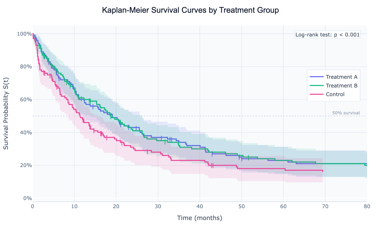
A survival curve (Kaplan-Meier curve) is a step-function that estimates the probability of surviving beyond each point in time for a group of individuals. Starting at 1.0 (100% survival) at time zero, the curve drops each time an event occurs — where an "event" means whatever outcome you're tracking: death, disease recurrence, equipment failure, customer churn, or employee turnover. The curve reaches its final step at the time of the last observed event and then either ends or continues flat if the last observation was censored.
Censoring is the feature that makes survival analysis unique among statistical methods. A censored observation is one where the event hasn't happened yet — the patient was still alive at the last follow-up, the machine was still running when the study ended, or the customer was still subscribed when the data was pulled. Rather than discarding these observations (which would bias the estimate downward) or pretending the event happened at the last follow-up (which would bias it upward), the Kaplan-Meier estimator correctly incorporates censored observations: they contribute to the "at risk" count until their last observation time and then leave the analysis without triggering a step down. This is why survival analysis is the correct method for any time-to-event data with incomplete follow-up.
Survival curves are the standard visualization in clinical trials (comparing survival between a treatment arm and a control arm), oncology (survival by cancer stage or molecular subtype), reliability engineering (time to equipment failure by component), and business analytics (customer churn, time to conversion, employee retention). When multiple groups are compared, the log-rank test provides a p-value for whether the survival curves are statistically different — and the hazard ratio quantifies how much faster one group reaches the event.
How It Works
- Upload your data — provide a CSV or Excel file with at least two columns: a time column (numeric, duration until event or censoring) and an event column (binary: 1 = event occurred, 0 = censored). An optional group column produces separate curves per group.
- Describe the analysis — e.g. "Kaplan-Meier curves by treatment group, 95% confidence bands, log-rank test, annotate median survival"
- Get the visualization — the AI writes Python code using lifelines or manual Kaplan-Meier computation with numpy and Plotly to render the survival curves with all annotations
Required Data Format
| Column | Description | Example |
|---|---|---|
time | Duration from start to event or censoring | 24.5 (months) |
event | 1 if event occurred, 0 if censored | 1 (died), 0 (alive at last contact) |
group | Optional: group/arm label for comparison | Treatment, Control |
Any column names work — describe them in your prompt: "time column is 'days_to_event', event column is 'outcome'".
Interpreting the Results
| Visual element | What it means |
|---|---|
| Step down | An event (death, failure, churn) occurred at this time point |
| Flat section | No events — everyone at risk survived this interval |
| Tick mark on curve | Censored observation — subject left the study without the event |
| Shaded band | 95% confidence interval (Greenwood formula) — wider = fewer at risk |
| Median survival | Time where the curve crosses 50% — half the group has had the event by then |
| Gap between curves | Difference in survival — the higher curve has better outcomes |
| Crossing curves | Survival advantage reverses over time — treatment works early but not late |
| Log-rank p-value | Probability the observed difference between curves is due to chance |
Example Prompts
| Scenario | What to type |
|---|---|
| Clinical trial | Kaplan-Meier by treatment group, 95% CI, log-rank test, median survival annotations |
| Cancer staging | survival curves for stage I–IV, number at risk table, 1- and 5-year survival probabilities |
| Customer churn | survival curve of customer retention by subscription plan, annotate 30/90/180-day retention |
| Equipment reliability | survival curve of time to failure by component type, hazard ratio between groups |
| Competing risks | cumulative incidence curves for death vs relapse as competing events |
Assumptions to Check
- Independent censoring — the reason a subject is censored must be unrelated to their risk of the event; if sicker patients drop out more often, the estimate is biased
- Consistent event definition — the event must mean the same thing across all groups and time periods
- Proportional hazards (for log-rank test) — the log-rank test has the most power when the survival curves are proportional (one is always above the other); if curves cross, a weighted log-rank test may be more appropriate
- No left truncation — subjects must enter the study at time 0; if some subjects are only observed after a delay (e.g. patients who survived long enough to enroll), truncation correction is needed
- Sufficient follow-up — if most observations are censored before the median, the curve may not reach 50% and median survival cannot be estimated
Related Tools
Use the Empirical CDF Plot Generator when you have complete follow-up with no censoring — ECDF is simpler and does not require the survival analysis framework. Use the Density Plot Generator to visualize the distribution of event times when censoring is absent. Use the Logistic Regression tool to predict binary outcomes (event/no event) without modeling time.
Frequently Asked Questions
What is censoring and why does it matter? Censoring means the event hasn't been observed yet — the patient is still alive at the study's end date, the machine is still running, or the customer is still subscribed. If you simply exclude censored observations, you bias the survival estimate downward (the sample looks sicker than it is). If you treat them as events, you bias it upward. The Kaplan-Meier estimator correctly handles censored observations by including them in the "at risk" count until their last known time and then removing them — neither counting them as events nor ignoring them.
My data doesn't have a group column — can I still use this tool? Yes — a single-group KM curve estimates the overall survival of your entire dataset without comparison. It will show the survival function with confidence intervals and report the median survival time. You can add a group column later if you want to compare subgroups.
What's the difference between the log-rank test and the hazard ratio? The log-rank test produces a p-value answering "are these survival curves statistically different?" It doesn't quantify how different. The hazard ratio answers "how much faster does Group A experience the event compared to Group B?" A hazard ratio of 2.0 means Group A's event rate is double that of Group B at every point in time. Ask for both: "log-rank test and hazard ratio with 95% CI".
Can I estimate survival at a specific time point (e.g. 1-year survival)? Yes — ask to "annotate 1-year, 2-year, and 5-year survival probabilities for each group". The AI reads the KM curve at the specified time points and overlays the survival probability with confidence intervals.
What's a "number at risk" table and should I include one? A number-at-risk table shows, below the x-axis, how many subjects remain in each group at each time point. It helps readers assess the reliability of the curve — estimates become less reliable as the at-risk count drops below ~10. Ask for "add a number at risk table below the plot" to include it, which is standard in clinical publications.