Seasonality Analysis Tool for Excel & CSV
Analyze seasonality online from Excel or CSV time-series data. Detect recurring cycles, seasonal strength, and timing with AI.
Or try with a sample dataset:
Preview
What Is Seasonality Analysis?
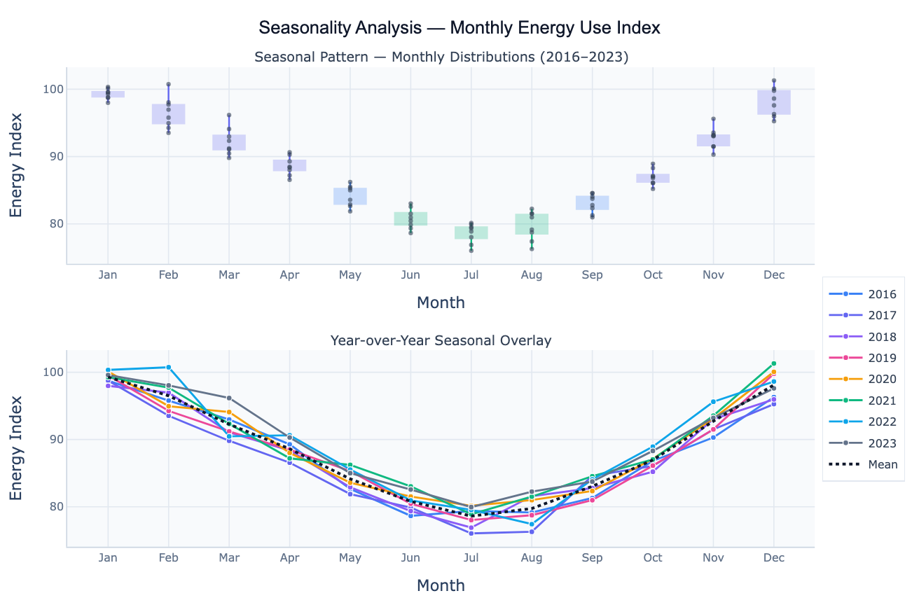
Seasonality is a repeating pattern in a time series that recurs at a fixed period — typically annually (monthly data with peaks in winter or summer), weekly (daily data with higher values on weekdays), or daily (hourly data with morning and evening spikes). Unlike a trend, which represents a long-run direction, or a random fluctuation, which is unpredictable, seasonal patterns are periodic and predictable — they return reliably at the same phase of each cycle. Identifying and quantifying the seasonal pattern is the first step in any time series analysis, as it must be accounted for before comparing values across different parts of the year, forecasting future values, or detecting anomalies.
Seasonality analysis encompasses several complementary visualizations and metrics. Monthly boxplots (also called seasonal subseries plots) show the distribution of values for each period (January, February, …, December) pooled across all years — revealing which months are consistently high or low, and how variable each month is across years. Year-over-year overlay plots draw each year's seasonal curve as a separate line, making it easy to spot whether the seasonal amplitude is growing, shrinking, or shifting over time. The seasonal strength metric — computed from the variance of the seasonal component relative to the combined seasonal and residual variance — quantifies how dominant the seasonal pattern is on a 0–1 scale: near 1 means the data is almost entirely seasonal; near 0 means the seasonal pattern is weak relative to noise.
A concrete example: retail sales data shows strong seasonality — December is consistently the highest month due to holiday shopping, while January and February are typically the weakest. Boxplots across Januaries vs. Decembers make this contrast immediate. A year-over-year overlay reveals whether the December spike is growing (e.g. as e-commerce expands) or whether the relative seasonal pattern is stable. Detecting a shift in seasonal timing or amplitude — such as energy use peaking in July rather than January in a warming climate — is exactly what this analysis is designed to surface.
How It Works
- Upload your data — provide a CSV or Excel file with a date column (monthly, weekly, or daily) and a value column. At least 2 full seasonal cycles are needed for reliable pattern estimation. One row per time point.
- Describe the analysis — e.g. "monthly boxplots of sales across all years; year-over-year overlay; identify peak month; compute seasonal amplitude and strength"
- Get full results — the AI writes Python code using pandas for seasonal grouping, statsmodels STL for seasonal strength, and Plotly to render the boxplot panel, year-over-year overlay, and summary statistics table
Required Data Format
| Column | Description | Example |
|---|---|---|
date | Date or timestamp (any format) | 2020-01, Jan 2020, 2020-01-31 |
value | Numeric time series | 245.3, 312.1, 198.8 (sales, temperature, etc.) |
group | Optional: series label | North, South (for multi-region comparison) |
Any column names work — describe them in your prompt. For sub-annual data (daily/weekly), specify the seasonal period in your prompt (e.g. "weekly seasonality" or "day-of-week pattern").
Interpreting the Results
| Output | What it means |
|---|---|
| Monthly boxplot | Distribution of values for each calendar month across all years — shows median, spread, and outliers per month |
| Peak month / trough month | Month with the highest / lowest average value — primary seasonal peak and off-peak |
| Seasonal amplitude | Max monthly average − min monthly average — how large the seasonal swing is in original units |
| Seasonal amplitude (%) | (Max − Min) / Mean × 100 — seasonal swing as a percentage of the annual average |
| Seasonal strength | 1 − Var(Residual)/Var(Seasonal + Residual) — near 1 = dominant seasonality, near 0 = weak |
| Year-over-year overlay | Each year's monthly pattern as a line — reveals trend, shifting amplitude, or phase shift |
| Seasonal index | Each month's average expressed as a ratio to the annual mean — e.g. 1.35 = 35% above average |
| Changing amplitude | Spread of year-over-year lines widening over time → seasonality is intensifying |
Example Prompts
| Scenario | What to type |
|---|---|
| Basic seasonal summary | monthly boxplots of revenue; year-over-year overlay; identify peak and trough months; report seasonal amplitude |
| Seasonal indices | compute seasonal index for each month (ratio to annual mean); bar chart of indices; which month is 30%+ above average? |
| Day-of-week pattern | boxplots of website traffic by day of week; which day has highest and lowest traffic? report day-of-week amplitude |
| Seasonal strength | STL decomposition; report strength of seasonality; is this series seasonally dominated or trend dominated? |
| Compare time windows | monthly seasonal pattern for 2010–2015 vs 2018–2023; overlay mean curves; has the peak month shifted? |
| Multi-group | monthly boxplots for each region in 'region' column; overlay mean seasonal curves; which region has the strongest seasonality? |
Assumptions to Check
- Sufficient cycles — reliable seasonal estimates require at least 2–3 full seasonal cycles (at least 2 years of monthly data, or 2 weeks of daily data); fewer cycles produce unstable seasonal averages
- Additive vs multiplicative seasonality — if the seasonal amplitude grows proportionally with the trend level, the pattern is multiplicative; in that case, log-transform the series before computing seasonal averages, or use STL which handles this implicitly
- Stable period — the analysis assumes the seasonal period is fixed (12 months, 7 days); if the business cycle has shifted (e.g. fiscal year changed), split the series at the change point
- Missing data — gaps in the series (e.g. one month missing from one year) bias the boxplots for that month; ask the AI to fill gaps with linear interpolation before computing monthly averages
- Calendar effects — day-of-week composition differs across months (some months have more weekdays), trading-day effects, and holiday timing can create apparent seasonality; mention these if you need calendar-adjusted analysis
Related Tools
Use the Time Series Decomposition tool to formally separate the seasonal component from trend and residual using STL, and to quantify seasonal strength and extract the deseasonalized series. Use the Autocorrelation Plot (ACF) to confirm the seasonal period from spikes at multiples of the period in the ACF. Use the Trendline Calculator to fit a long-run trend to the deseasonalized series after removing the seasonal component. Use the AI Heatmap Generator to create a calendar heatmap (month × year matrix) that shows both the seasonal pattern and year-over-year trend simultaneously.
Frequently Asked Questions
What is the difference between seasonality analysis and time series decomposition?Seasonality analysis focuses specifically on characterizing the repeating seasonal pattern — its shape, amplitude, peak timing, and year-over-year stability — using visualizations like boxplots and YoY overlays. Time series decomposition (STL, classical) formally splits the series into three components — trend, seasonal, and residual — producing an explicit seasonal component time series and enabling deseasonalization. In practice, you often do both: seasonality analysis first (to understand the pattern) and decomposition second (to remove it or model it formally). This tool emphasizes the visual and descriptive side; the Time Series Decomposition tool handles the formal extraction.
What is a seasonal index and how do I use it? A seasonal index expresses each period's average as a ratio to the overall mean: if January's average sales are $85k and the annual average is $100k, January's seasonal index is 0.85 (15% below average). Indices above 1.0 are peak months; below 1.0 are off-peak. Seasonal indices are used to deseasonalize raw data (divide observed value by the seasonal index to get the trend-adjusted value) and to forecast future values (multiply the trend forecast by the expected seasonal index). Ask the AI to "compute seasonal indices for each month; bar chart ranked highest to lowest; deseasonalize the series".
How do I detect whether the seasonal pattern is changing over time? In the year-over-year overlay, look for: (1) widening spread between lines — indicates the seasonal amplitude is growing; (2) systematic upward/downward shift of all lines — that is the trend; (3) lines from recent years peaking in a different month than older years — seasonal phase shift. For a formal test, split the series into two halves and compare the seasonal indices between periods. Ask the AI to "compare the mean seasonal curve for the first half vs the second half of the dataset; plot overlaid; test if the amplitude or peak month has shifted".
My data has both a trend and seasonality — should I detrend first? For the boxplots and seasonal indices, detrending first gives a cleaner picture of the pure seasonal shape, because without detrending the recent years' values are all shifted up by the trend and will appear to dominate the boxplots. For the year-over-year overlay, keeping the trend is often intentional — you want to see both the trend (upward shift of lines) and the seasonal pattern simultaneously. Ask the AI to show both: "monthly boxplots of the detrended series (subtract a linear trend); and year-over-year overlay of the raw series".
What seasonal period should I specify for daily or weekly data? For daily data with weekly cycles, use period = 7 (Monday–Sunday). For daily data with annual cycles, use period = 365 (or 365.25). For weekly data with annual cycles, use period = 52. For hourly data with daily cycles, use period = 24. If your data shows both weekly and annual seasonality (e.g. retail daily sales), specify the primary period first and note the secondary one in your prompt — the AI will use MSTL (multiple-period STL) to handle both simultaneously.