Ternary Plot Generator for Compositional Data
Create ternary plots online from Excel and CSV data. Visualize three-part compositions such as mixes, proportions, and shares with AI.
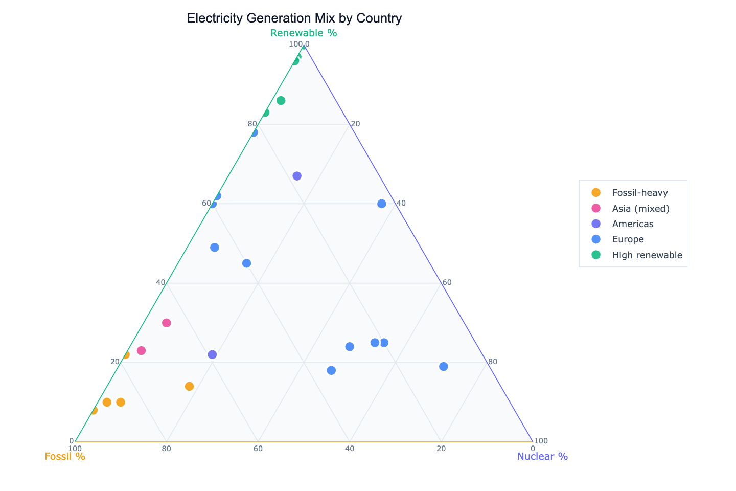
Or try with a sample dataset:
Preview
What Is a Ternary Plot?
A ternary plot (also called a triangle plot or trilinear diagram) represents the composition of mixtures where three components always sum to a constant — typically 100% or 1. Each of the three vertices of the equilateral triangle represents 100% of one component. Any point inside the triangle encodes the proportions of all three components simultaneously: its perpendicular distance from each side gives the share of the opposite component.
The key insight is that ternary plots compress three-dimensional compositional data into a two-dimensional space without losing information, because the three components are not independent — knowing any two tells you the third. They are widely used in geochemistry (rock mineral composition), materials science (alloy or polymer blends), ecology (land use: cropland/forest/urban), and economics (employment by sector: agriculture/industry/services). A country with 70% fossil fuel electricity, 10% nuclear, and 20% renewables is one specific point in the triangle — and plotting many countries at once reveals clusters of similar energy strategies.
Unlike a scatter plot where both axes are independent, moving along any direction in a ternary plot always involves trade-offs between all three components. A country that increases its renewable share must necessarily decrease its fossil or nuclear share — and the ternary plot makes this constraint and its consequences visually explicit.
How It Works
- Upload your data — provide a CSV or Excel file with at least three numeric columns that represent the components. They should sum to approximately 100 (percentages) or 1 (fractions) per row. A label column (country, sample ID, product name) is recommended.
- Describe the plot — e.g. "ternary plot of fossil/nuclear/renewable electricity share by country, color by continent, label France and Norway"
- Get the visualization — the AI writes Python code using Plotly to render the triangle chart with labeled axes and color-coded points
Required Data Format
| Column | Description | Example |
|---|---|---|
label | Row identifier | France, Sample_A |
| Component A | Share of first component | 71 (nuclear %) |
| Component B | Share of second component | 10 (fossil %) |
| Component C | Share of third component | 19 (renewable %) |
The three component columns must sum to ~100 (or ~1). If they don't, ask the AI to normalize them: "normalize each row so the three components sum to 100%".
Interpreting the Results
| Position | What it means |
|---|---|
| Near a vertex | Dominated by that component (close to 100% of it) |
| Near the center | Roughly equal mix of all three components |
| Near an edge | Two-component mixture — the opposite component is near zero |
| Cluster of points | Group of observations with similar compositional profiles |
| Point far from all clusters | Outlier — unusual composition relative to the rest of the dataset |
Example Prompts
| Scenario | What to type |
|---|---|
| Energy policy | ternary plot of fossil/nuclear/renewable electricity share, color by region |
| Soil science | ternary plot of sand/silt/clay content, color by soil classification |
| Food nutrition | ternary plot of protein/fat/carbohydrate share, label each food category |
| Workforce structure | ternary plot of agriculture/industry/services employment, size by GDP |
| Portfolio allocation | ternary plot of equity/bonds/cash allocation by fund, color by risk rating |
Related Tools
Use the AI Scatter Chart Generator when your data has only two components or when both axes are fully independent. Use the AI Pie Chart Generator to show one row's composition as a proportion chart. Use the AI Heatmap Generator to compare many compositional rows across many components (more than three).
Frequently Asked Questions
My three columns don't sum exactly to 100 — is that a problem? Small rounding differences (e.g. 99.8% or 100.2%) are fine. If your data sums to a different total (e.g. absolute values rather than percentages), ask the AI to normalize: "divide each row by its row sum before plotting".
Can I show contour lines or density regions on the ternary plot? Yes — ask for a "ternary contour plot" or "add density contours". The AI will use kernel density estimation projected onto the ternary coordinates to add iso-density curves, which helps when points overlap heavily.
Can I color points by a fourth variable? Yes — ask to "color points by column name using a color scale". The AI will map a continuous or categorical fourth variable to point color while preserving the three ternary coordinates.
What if I have more than three components? You'll need to collapse them into three groups first. For example, if you have six energy sources, group them into fossil / nuclear / renewable. Describe the grouping in your prompt and the AI will aggregate the columns before plotting.