Pie Chart Maker for Excel & CSV
Create pie charts online from Excel and CSV data. Show composition, category shares, and simple part-to-whole comparisons with AI.
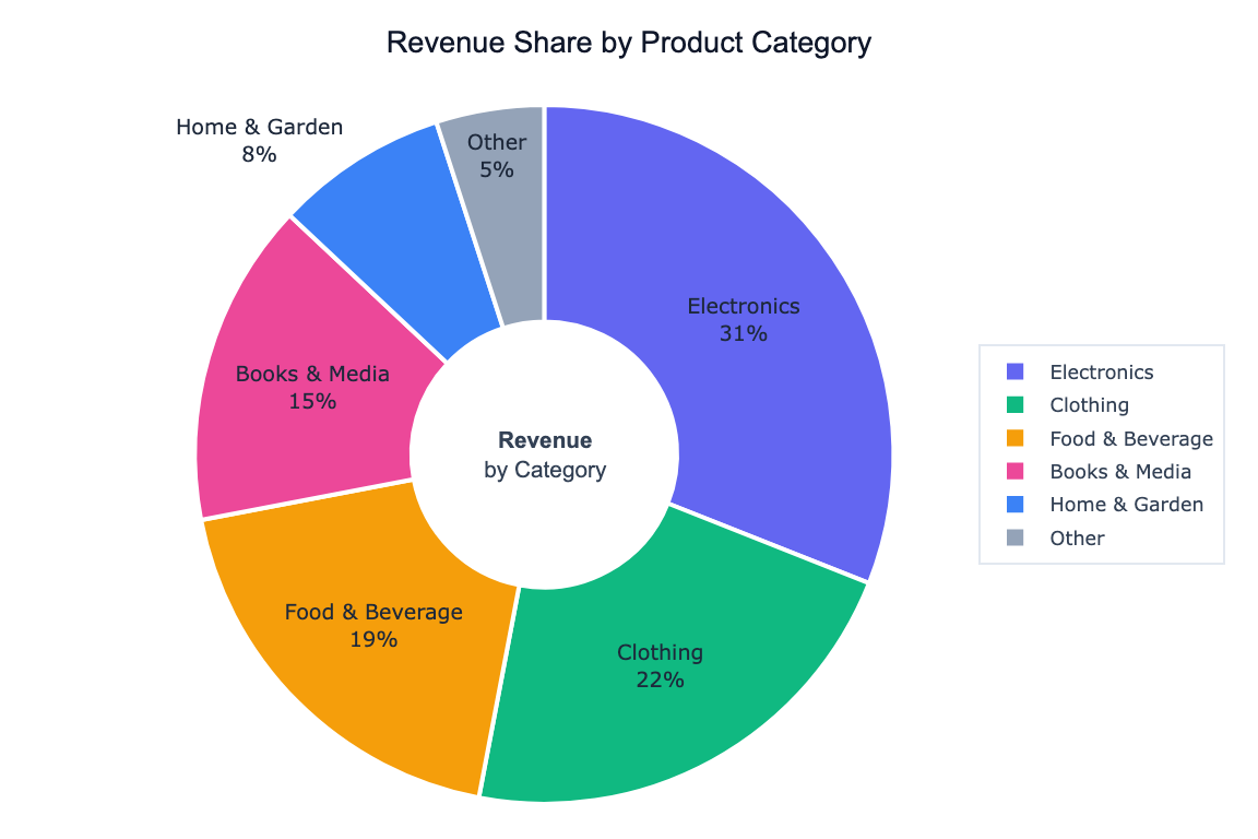
Or try with a sample dataset:
Preview
What Is a Pie Chart?
A pie chart divides a circle into slices proportional to each category's share of the total. It is best suited for showing part-to-whole relationships when you have a small number of categories and want to communicate proportions at a glance.
Use a pie chart when:
- You have 2–6 categories (more than that becomes hard to read)
- The values add up to a meaningful whole (e.g. market share, budget allocation, survey responses)
- The relative size of each slice is the main story
How It Works
- Upload your data — CSV or Excel with a category column and a numeric column
- Describe your chart — e.g. "pie chart of revenue share by product category"
- Get an interactive chart — hover slices to see exact values and percentages, click legend to isolate categories
Pie Chart vs. Donut Chart
A donut chart is a pie chart with a hole in the center. The empty center can be used to display a total or label. Ask for "donut chart" in your prompt to switch styles.
Example Prompts
| What you want | What to type |
|---|---|
| Market share | pie chart of revenue by region |
| Survey responses | pie chart showing count of each answer option |
| Budget breakdown | donut chart of spending by department |
| Top N + Other | pie chart of top 5 countries by population, group remaining as Other |
| Exploded slice | pie chart of sales by category, explode the largest slice |
When to Use a Different Chart
Pie charts work well for proportions, but consider alternatives when:
| Situation | Better choice |
|---|---|
| More than 6 categories | Bar chart — easier to compare many slices |
| Showing change over time | Line chart |
| Comparing absolute values | Bar chart — length is easier to judge than area |
| Proportions are very similar | Bar chart — small angle differences are hard to distinguish |
Frequently Asked Questions
How do I show percentages on the slices? Ask for "pie chart with percentage labels on each slice". The AI can also show both the value and the percentage.
Can I sort slices by size? Yes — ask to "sort slices from largest to smallest starting at 12 o'clock".
What if one category dominates and the others are tiny? Ask to "group categories under 3% into an Other slice" to keep the chart readable.
Can I use custom colors? Yes — specify colors in your prompt, e.g. "use blue for Online, red for In-Store, green for Wholesale", or ask for a named color palette.