Line Chart Maker for Excel & CSV
Create line charts online from Excel and CSV data. Plot time series, compare trends, and annotate changes with AI.
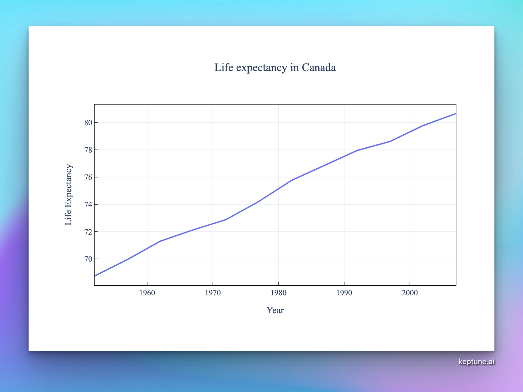
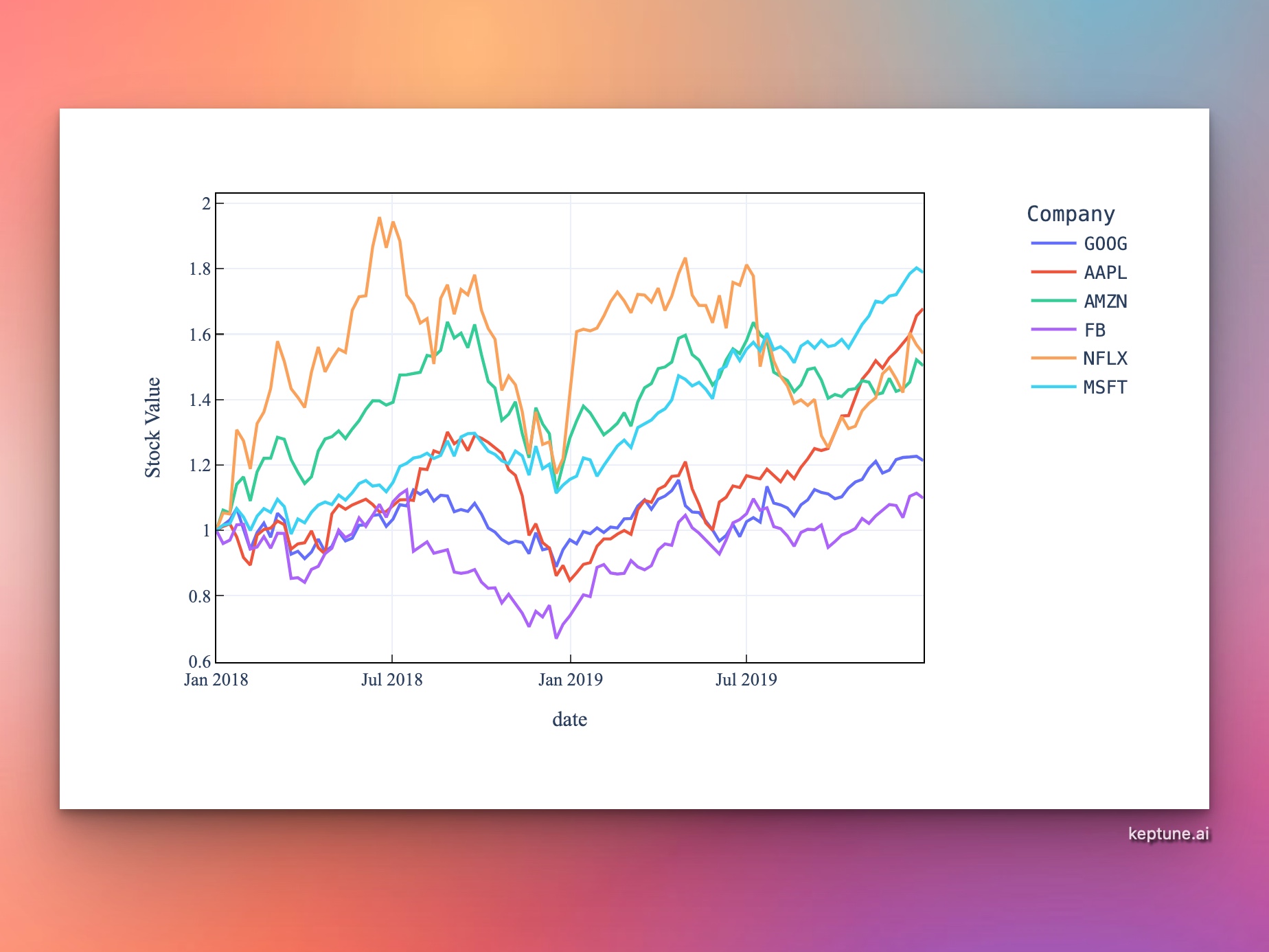
Or try with a sample dataset:
Preview
What Is a Line Chart?
A line chart connects data points with lines to show how a value changes over time or a continuous sequence. It is the standard chart type for time-series data — stock prices, website traffic, temperature readings, sales trends, and more.
Use a line chart when:
- Your x-axis represents time or an ordered sequence
- You want to show trends, rates of change, or momentum
- You need to compare how multiple series evolve over the same period
How It Works
- Upload your data — CSV or Excel with a date/time column and at least one numeric column
- Describe your chart — e.g. "line chart of monthly revenue over time, grouped by product line"
- Get an interactive chart — hover for exact values at any point, zoom into date ranges, compare series
Handling Dates
The AI automatically detects and parses common date formats: 2024-01-15, Jan 2024, 01/15/2024, Q1 2024. If your dates are in an unusual format, just mention it — e.g. "the date column uses DD-MM-YYYY format".
Example Prompts
| What you want | What to type |
|---|---|
| Single trend | line chart of daily_active_users over date |
| Multiple series | line chart comparing revenue for each product_category over time |
| Smoothed trend | line chart of weekly_sales with a 4-week rolling average |
| Year-over-year | line chart of monthly_orders, one line per year |
| Dual axis | line chart of revenue and profit_margin over time with a secondary y-axis |
Line Charts vs. Other Chart Types
| Use a line chart when... | Consider instead... |
|---|---|
| Showing change over time | Bar chart for comparing totals at a single point in time |
| Data points are connected in sequence | Scatter chart if x-axis is not ordered |
| Displaying trends across many periods | Area chart if you want to emphasize cumulative volume |
Frequently Asked Questions
My date column isn't being recognized — what should I do? Mention the format in your prompt, e.g. "dates are in the format YYYYMMDD". Alternatively, reformat the column in Excel before uploading.
Can I add confidence intervals or error bands? Yes — ask for "line chart with shaded confidence interval" or "add error bars representing standard deviation".
How do I highlight a specific event on the chart? Ask the AI to "add a vertical line on 2023-03-15 labeled 'product launch'".
Can I show a line chart without uploading a file? Yes — if your data is small, you can paste it directly into the prompt box, e.g. "line chart: month=Jan,Feb,Mar, sales=120,145,160".