Alluvial Diagram Generator for Excel & CSV
Create alluvial diagrams online from Excel and CSV data. Show how groups, categories, or outcomes flow across stages with AI.
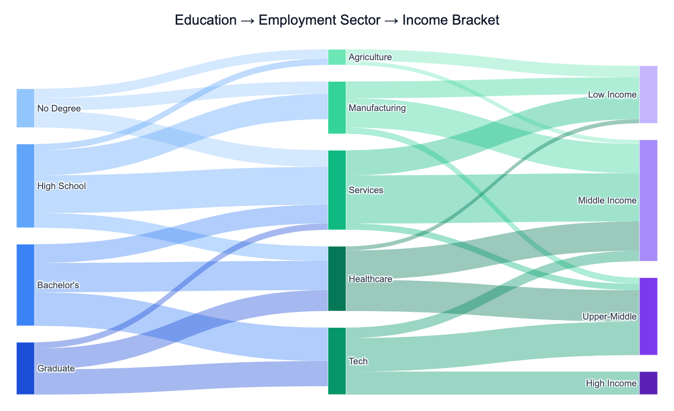
Or try with a sample dataset:
Preview
What Is an Alluvial Diagram?
An alluvial diagram is a type of flow chart that shows how observations, quantities, or populations redistribute across multiple categorical stages. Each stage is represented as a column of stacked blocks (called alluvia), and smooth ribbon-shaped flows (called lodes) connect matching categories between adjacent stages. The width of each ribbon is proportional to the number of observations or the size of the flow it represents.
The key distinction from a regular Sankey diagram is that alluvial diagrams emphasize change in categorical composition over time or across stages — they answer questions like "how did people with a high school diploma end up distributed across employment sectors, and where did those workers land in the income distribution?" A classic use in social science is tracking cohort trajectories: starting from education level, flowing through occupation, and landing in an income bracket. In public health, researchers use them to show how patients diagnosed with one condition later develop comorbidities or respond to different treatment pathways. In energy policy, they map how primary energy sources feed into end-use sectors across different countries.
Alluvial diagrams excel when you have 3–6 categorical stages with 4–12 categories per stage and want to see both the size of each category and how the mixture changes as you move through the stages. They are more informative than a series of pie charts (which show composition at each stage but hide the connections) and more readable than a matrix of transition tables.
How It Works
- Upload your data — provide a CSV or Excel file in one of two formats: (a) long format with one row per observation and one column per stage, or (b) aggregated format with columns for each pair of stages and a count/value column. The AI can handle both.
- Describe the diagram — e.g. "alluvial diagram from education level through employment sector to income bracket, color flows by education, label nodes with counts"
- Get the visualization — the AI writes Python code using Plotly to build the multi-stage flow chart with colored ribbons and labeled nodes
Required Data Format
Long format (one row per observation):
| person_id | education | sector | income |
|---|---|---|---|
| 1 | Bachelor's | Tech | High |
| 2 | High School | Manufacturing | Middle |
Aggregated format (pre-counted flows):
| from_stage | from_category | to_stage | to_category | count |
|---|---|---|---|---|
| education | Bachelor's | sector | Tech | 320 |
| sector | Tech | income | High | 210 |
If your data is in a different shape, describe the column layout in your prompt and the AI will reshape it.
Interpreting the Results
| Visual element | What it means |
|---|---|
| Width of a block | Total size of that category at that stage |
| Width of a ribbon | Number of observations flowing between those two categories |
| Ribbon color | Typically encodes the source category (e.g. education level) |
| Ribbon splitting | One category distributes into multiple downstream categories |
| Ribbon merging | Multiple upstream categories converge into one downstream category |
| Thick ribbon between two nodes | Strong association between those two categories |
| Thin scattered ribbons | Weak or diffuse association — flow spreads evenly across categories |
Example Prompts
| Scenario | What to type |
|---|---|
| Social mobility | alluvial diagram from parents' income to child's education to child's income, color by parental income |
| Patient pathways | alluvial diagram from diagnosis to treatment type to outcome, show patient counts per flow |
| Energy transition | alluvial from energy source to consumption sector to world region, color by source type |
| Workforce shifts | alluvial diagram of employment by sector in 2000 vs 2010 vs 2020, show how shares changed |
| Survey data | alluvial from age group to political affiliation to voting behavior, label widest flows |
Related Tools
Use the AI Sankey Diagram Generator when you want to show directed quantities flowing through a network without emphasizing categorical stages — for example, energy balance flows or budget allocations. Use the Ternary Plot Generator when your data always has exactly three compositional components summing to 100%. Use the AI Heatmap Generator to compare association strengths between two categorical variables across many combinations without emphasizing the flow direction.
Frequently Asked Questions
What is the difference between an alluvial diagram and a Sankey diagram? Both use ribbon-width to encode flow size, but they serve different purposes. An alluvial diagram tracks how a fixed population redistributes across categorical stages — each observation belongs to exactly one category at each stage, and the total width stays constant across all stages. A Sankey diagram shows directed quantities flowing through a network, where totals can change (e.g. energy is lost to heat, budgets split unevenly). Use alluvial for cohort tracking; use Sankey for flow accounting.
My data is one row per observation with a column for each stage — does that work? Yes — this is the ideal long format. Describe the column names in your prompt (e.g. "columns are: respondent_id, education, occupation, income_bracket") and the AI will count the flows between stages automatically before building the diagram.
How many stages and categories can I include? Alluvial diagrams work best with 3–6 stages and 4–12 categories per stage. More stages make the horizontal span too wide; more categories per stage make the ribbons too thin to read. If you have many categories, ask the AI to group rare ones into an "Other" category or to show only the top N by volume.
Can I show change over time rather than a conceptual pipeline? Yes — each time point becomes a stage. For example, "alluvial diagram showing employment by sector in 1990, 2000, 2010, and 2020 for OECD countries" will produce four columns with ribbons showing how the sector mix shifted decade by decade.
Can I color the ribbons by destination category instead of source? Yes — ask to "color ribbons by income bracket" (the final stage) instead of the default source coloring. You can also ask for a gradient (source color on the left side of each ribbon fading to destination color on the right) for a more sophisticated look.