Tornado Plot Generator for Sensitivity Analysis
Create tornado plots online from Excel and CSV data. Rank inputs by impact and visualize one-way sensitivity analysis with AI.
Or try with a sample dataset:
Preview
What Is a Tornado Plot?
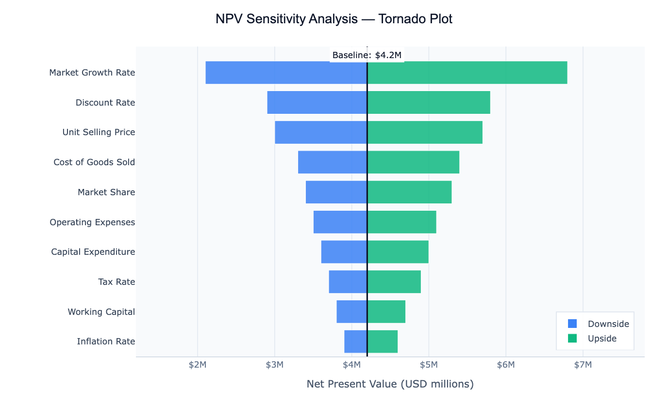
A tornado plot is a horizontal bar chart used in sensitivity analysis — the practice of asking "which input variables matter most to my output?" Each bar represents one input variable, and its width shows how much the output changes when that variable is varied from its low estimate to its high estimate while all other variables are held at their baseline. Variables are sorted from most impactful (widest bar, at the top) to least impactful (narrowest bar, at the bottom), creating the distinctive widening shape that gives the chart its name.
The chart is widely used in financial modelling (how sensitive is the NPV of this project to changes in discount rate, market growth, or unit costs?), project risk analysis (which assumptions drive the most uncertainty in our forecast?), public health (which interventions have the largest effect on an outcome?), and scientific parameter studies (which model parameters control the output most strongly?). By reading a tornado plot, decision-makers can immediately see where to focus attention — either to reduce uncertainty or to target interventions.
A key insight the tornado plot delivers is relative importance. A variable might have a large absolute range, but if it barely moves the output, it will appear as a short bar near the bottom. Another variable with a narrow range might drive enormous output swings and sit at the top. This ranking — which a table of numbers cannot convey at a glance — is what makes the tornado plot so effective for communicating sensitivity analysis.
How It Works
- Upload your data — provide a CSV or Excel file with at least three columns:
variable(input name),low(output value when input is at minimum), andhigh(output value when input is at maximum). Abaselinecolumn is optional but recommended. The AI can also compute sensitivity ranges from raw multi-column data. - Describe the plot — e.g. "tornado plot of project NPV sensitivity, baseline $4.2M, blue bars for downside, green for upside, sort by total swing"
- Get the visualization — the AI writes Python code using Plotly to build the diverging horizontal bar chart with a baseline reference line
Required Data Format
| Column | Description | Example |
|---|---|---|
variable | Name of the input being varied | Discount Rate, Market Growth |
low | Output value when input is at its low estimate | 2.9 |
high | Output value when input is at its high estimate | 5.8 |
baseline | Output at baseline (same value for all rows) | 4.2 |
If you only have raw data (not pre-computed sensitivity ranges), describe your output variable in the prompt and the AI will compute the ranges automatically using percentile or ±N% variation.
Interpreting the Results
| Visual element | What it means |
|---|---|
| Bar width | Total swing — how much the output changes across the input's range |
| Top bar | The variable with the most influence on the output |
| Bottom bar | The variable with the least influence |
| Left side of baseline | Output when input is at its low (unfavorable) value |
| Right side of baseline | Output when input is at its high (favorable) value |
| Vertical baseline line | The output at base-case assumptions |
| Asymmetric bar | Non-linear relationship — the variable affects the output differently in each direction |
Example Prompts
| Scenario | What to type |
|---|---|
| Financial model | tornado plot of NPV sensitivity, baseline $4.2M, sort by total swing |
| Project schedule | tornado plot of project duration sensitivity to each risk factor, baseline 180 days |
| Public health | tornado plot of mortality rate sensitivity to intervention coverage, ±20% variation |
| Energy model | tornado plot of total emissions sensitivity to each energy source share |
| Sales forecast | tornado plot showing which sales drivers have the most impact on revenue |
Related Tools
Use the Exploratory Data Analysis tool to understand correlations and distributions before deciding which variables to include in the sensitivity analysis. Use the AI Scatter Chart Generator to visualize the relationship between individual inputs and your output in detail after identifying the most important drivers.
Frequently Asked Questions
My data doesn't have pre-computed low/high values — can the AI still build the plot? Yes. If you have raw data with multiple columns, describe your output variable and how you want the ranges computed (e.g. "vary each input from its 10th to 90th percentile while holding others at the median"). The AI will compute the sensitivity ranges and then plot them.
What is the difference between a tornado plot and a waterfall chart? A tornado plot ranks variables by their independent impact — each variable is varied alone while others stay fixed. A waterfall chart shows how a series of cumulative changes build up from a starting value to a final value. Use a tornado for "which variable matters most?", and a waterfall for "how did we get from A to B step by step?"
How do I choose the low and high values for each variable? Common approaches: ±10% or ±20% from baseline; 10th and 90th percentiles from historical data; worst-case and best-case expert estimates; or Monte Carlo simulation bounds. Mention your preferred method in the prompt.
Can I show uncertainty ranges instead of a single low/high bar? Yes — ask for a box-whisker tornado or add error bars to show distributional uncertainty around each low and high estimate. You can also ask the AI to color-code bars by the direction of impact (increases vs decreases the output).