Clustergram Generator
Create clustergrams online from Excel and CSV matrices. Combine heatmaps with hierarchical clustering to reveal structure with AI.
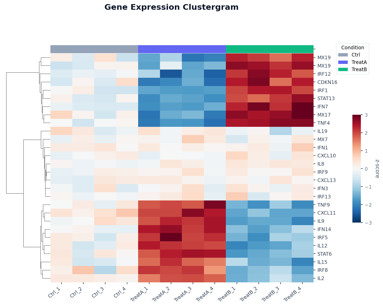
Or try with a sample dataset:
Preview
What Is a Clustergram?
A clustergram (also called a clustered heatmap) combines two ideas: a heatmap that encodes values as colors, and hierarchical clustering that reorders the rows and columns so that similar ones appear adjacent. The result is a visual that simultaneously shows individual values, relative magnitudes, and group structure — all in one chart.
The magic is in the dendrogram: the tree diagram drawn along the left (for rows) and top (for columns). Each branch point represents a merge of two clusters, and the height of the branch indicates how different those clusters are. Long branches mean the clusters are very different from each other; short branches mean they are nearly identical. By reading the dendrogram alongside the heatmap, you can instantly see which genes (or countries, or products) behave similarly, and how many natural sub-groups exist.
Clustergrams are the standard visualization in genomics (clustering genes and samples by expression profile), but they are equally useful in economics (clustering countries by development indicators), market research (clustering customers by purchasing behavior), and any domain where you have a matrix of measurements and want to find structure without pre-specifying the number of groups.
How It Works
- Upload your data — provide a CSV or Excel file in wide format: rows are the entities to cluster (genes, countries, products), and columns are the variables (samples, indicators, time points). Values should be numeric.
- Describe the clustering — e.g. "cluster both rows and columns, diverging red-blue color scale, z-score normalize each row, label the top 20 rows"
- Get the visualization — the AI writes Python code using seaborn or scipy + Plotly to cluster and render the heatmap with dendrograms
Interpreting the Results
| Visual element | What it means |
|---|---|
| Cell color | Value of that row–column combination (after any normalization) |
| Row dendrogram (left) | Hierarchical clustering of rows — rows near each other are similar |
| Column dendrogram (top) | Hierarchical clustering of columns — columns near each other are similar |
| Long branch in dendrogram | The two clusters being merged are very different |
| Short branch in dendrogram | The two clusters being merged are very similar |
| Color band above heatmap | Metadata annotation (e.g. sample group, condition, treatment) |
| Block of uniform color | A coherent cluster — all members behave similarly across conditions |
Clustering Options
| Option | What to ask for |
|---|---|
| Cluster rows only | "cluster rows, keep columns in original order" |
| Cluster columns only | "cluster columns, keep row order fixed" |
| Cluster both | "cluster both rows and columns" (default) |
| Linkage method | "use Ward linkage" / "complete linkage" / "average linkage" |
| Distance metric | "use Euclidean distance" / "correlation distance" / "cosine similarity" |
| Normalization | "z-score normalize each row" / "min-max scale each column" |
Example Prompts
| Scenario | What to type |
|---|---|
| Gene expression | clustergram, z-score rows, cluster both axes, red-white-blue scale, label top 30 genes |
| Country comparison | cluster countries by similarity across all indicators, sequential color scale |
| Time series patterns | cluster products by monthly sales pattern, keep months in chronological order |
| Survey responses | clustergram of average rating by question and department, Ward linkage |
| Customer segments | cluster customers by purchase frequency across product categories |
Related Tools
Use the AI Heatmap Generator if you want a heatmap without clustering — preserving the original row and column order. Use the Volcano Plot Generator to identify which genes are significantly changed before clustering a focused subset. Use the Exploratory Data Analysis tool to get a correlation heatmap and basic statistics before building a full clustergram.
Frequently Asked Questions
What is the difference between a clustergram and a regular heatmap? A regular heatmap preserves your original row and column order. A clustergram reorders both axes using hierarchical clustering so that similar rows and columns are placed next to each other — making patterns and blocks of correlated features immediately visible.
Should I normalize my data before clustering? Almost always yes. If your columns are on very different scales (e.g. GDP in trillions vs. population in millions), a feature with larger values will dominate the distance calculation. Ask for "z-score normalize each row" (standard for gene expression) or "min-max scale each column" (for mixed indicator data) to put everything on a comparable scale.
How do I choose the number of clusters? You do not have to specify a number up front — hierarchical clustering produces a full tree and you can "cut" it at any level. Ask the AI to "draw colored cluster boundaries at k=3 groups" or "color the dendrogram to show 4 clusters" after generating the initial chart.
My data has missing values — will it still work? The AI will handle missing values by imputing with the row or column mean before clustering, or by dropping rows/columns with too many missing values. Mention in your prompt if you have a preference: "drop genes with more than 20% missing samples".