Datasets 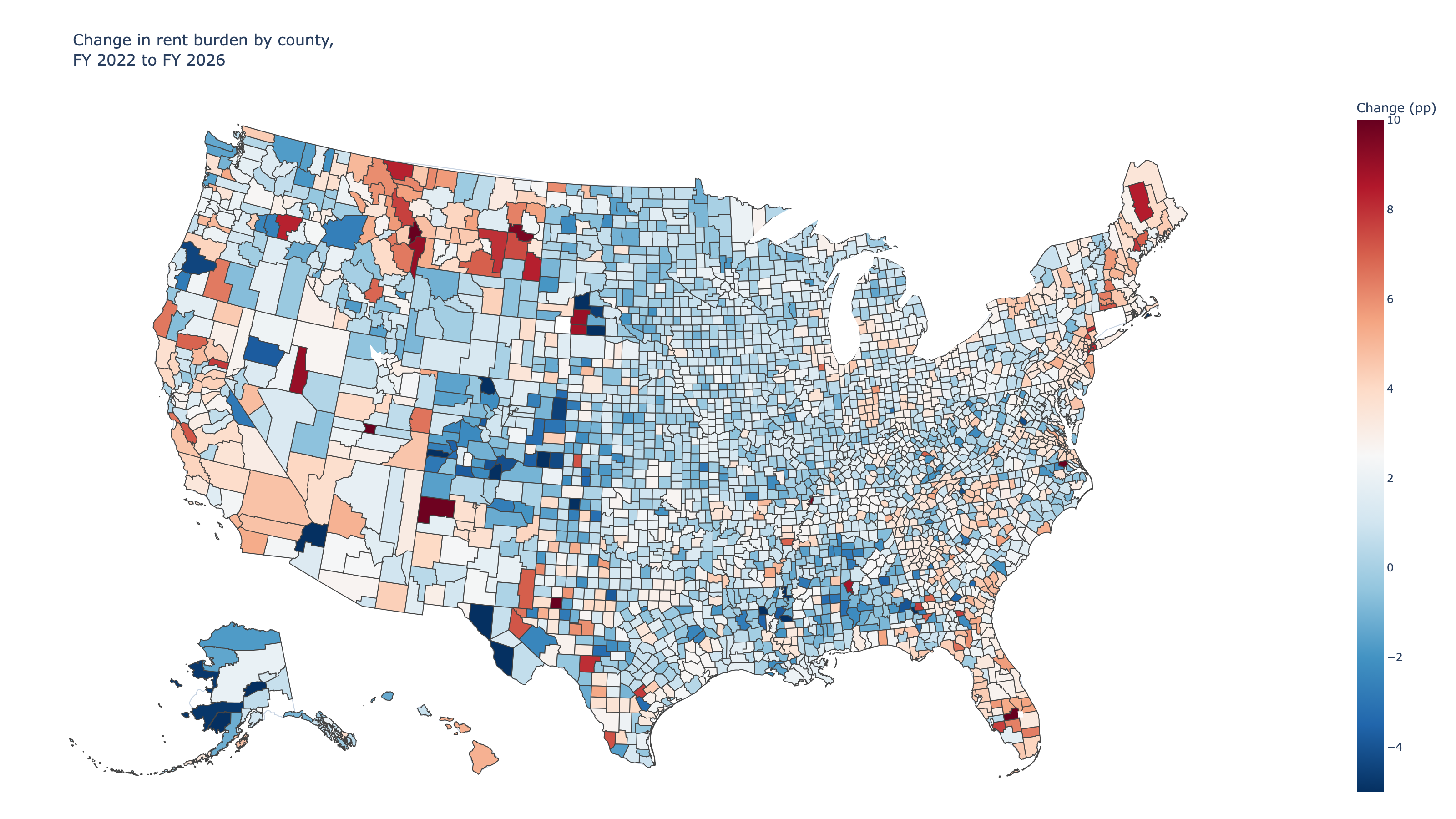
Rents rose 33% in 4 years — incomes didn't keep up in most counties
HUD fair market rents jumped faster than median incomes in 84% of U.S. counties from FY 2022 to FY 2026. Montana, New Jersey, and Florida saw the biggest shifts.
Datasets Used
Fair Market Rents by County, FY 2026
U.S. Department of Housing and Urban Development. Fair Market Rents, Fiscal Year 2026.
Section 8 Income Limits by County, FY 2025
U.S. Department of Housing and Urban Development. Section 8 Income Limits, Fiscal Year 2025.
Fair Market Rents by County, FY 2022
U.S. Department of Housing and Urban Development. Fair Market Rents, Fiscal Year 2022.
Section 8 Income Limits by County, FY 2022
U.S. Department of Housing and Urban Development. Section 8 Income Limits, Fiscal Year 2022.
Everyone can feel that rents have risen. The harder question is where rents have outpaced incomes — where the gap between what people earn and what they pay has actually widened. The answer is: almost everywhere, but not evenly.

By pairing HUD Fair Market Rents with median family income estimates for FY 2022 and FY 2026, this analysis tracks how the rent-to-income ratio shifted across every U.S. county in four years.
## In 84% of counties, rent outpaced income

The simplest way to see this: plot each county's FY 2022 rent share against its FY 2026 rent share. Points above the diagonal line got worse. The vast majority did.
## Montana, New Jersey, and Florida saw the biggest state-level shifts

At the state level, Montana stands out. Median county rents jumped over 60% in four years — far outpacing income growth. New Jersey, Massachusetts, New Hampshire, and Florida round out the top five.
The pattern is not random. States with rapid in-migration (Florida, Montana, New Hampshire) or limited new housing supply (New Jersey, Massachusetts) are the ones where rents have most outstripped incomes.

## The map shows a near-universal shift — but the intensity varies

Coloring every county by how much its rent share changed makes the breadth of the shift visible. Almost the entire map is some shade of red. The few blue pockets are in the Great Plains and parts of the Deep South.
## Some counties improved — but mostly because incomes boomed, not because rents fell

The roughly 700 counties where rent burden actually decreased are worth understanding. In most cases, rents still rose — but incomes rose faster, often in energy-producing or agricultural regions where wages surged.
## The rent squeeze is broad, but not uniform — and that matters for policy

The data makes two things clear. First, the rent-income squeeze is not limited to a few expensive metros. It hit 84% of counties. Second, the intensity varies enormously by state and region, driven by local dynamics in housing supply, migration, and wage growth.

That means national-level rent statistics understate how bad things have gotten in the hardest-hit places (Montana, Florida, New Jersey) while overstating the problem in regions where income growth has managed to absorb the shock. Effective housing policy needs to account for that variation rather than treating the whole country as one market.
Chat With This Data
Ask a question and Keptune will open a new chat with this page’s datasets already attached.
0/2 images ·0/5000