Datasets 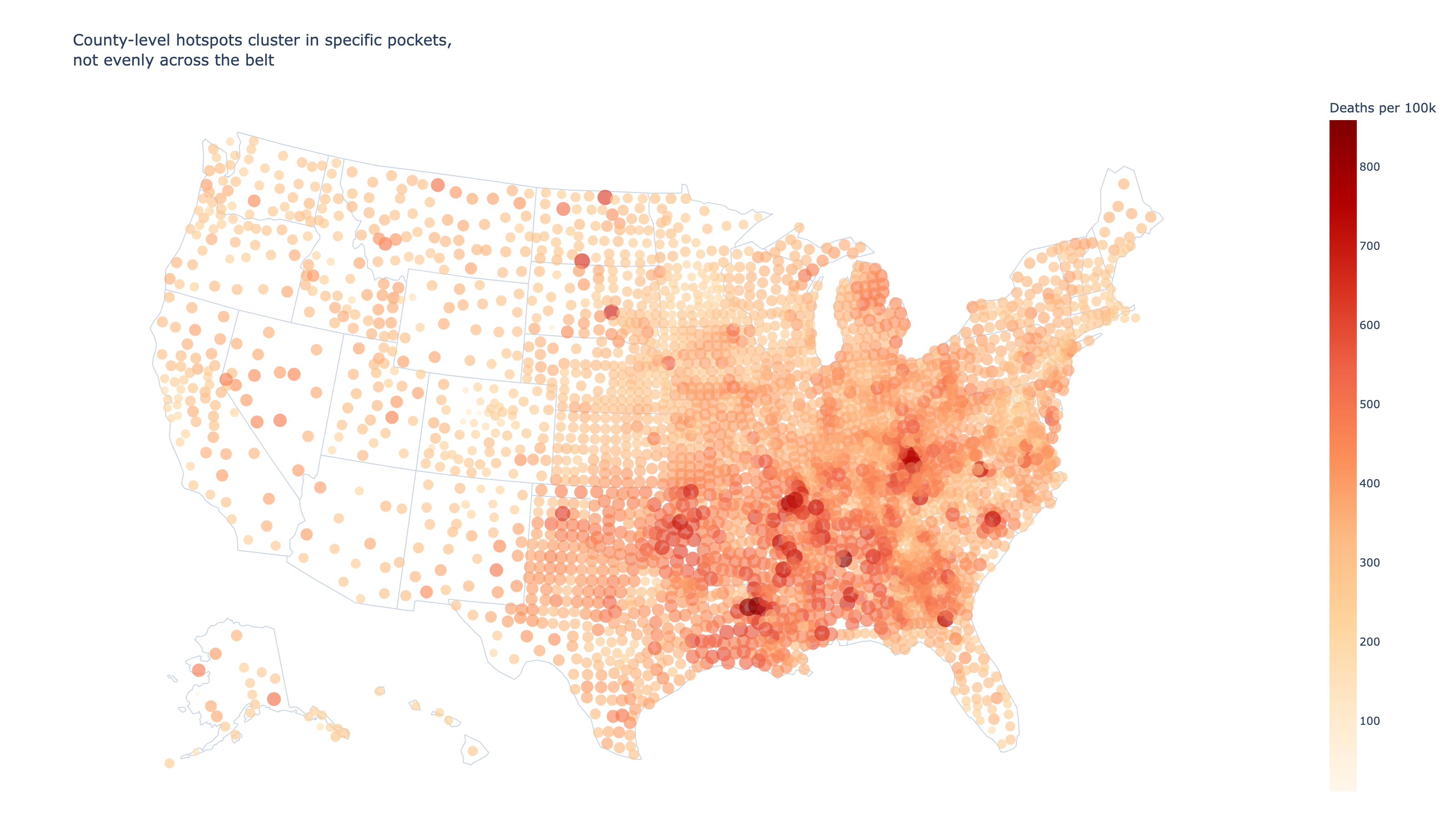
10% of U.S. counties account for the deadliest heart disease hotspots
The heart disease belt is real, but it's sharper than most maps suggest. CDC data reveals the worst mortality is packed into a small cluster of Southern and Appalachian counties.
Datasets Used
Heart Disease Mortality Data Among US Adults (35+) by State/Territory and County - 2019-2021
CDC Division for Heart Disease and Stroke Prevention, Interactive Atlas of Heart Disease and Stroke. "Heart Disease Mortality Data Among US Adults (35+) by State/Territory and County - 2019-2021" [dataset].
Everyone knows the South has higher heart disease death rates. But "the heart disease belt" implies a broad, even blanket across the region. The county data tells a different story: the worst mortality is packed into a surprisingly small cluster of places.

Using CDC mortality data for adults 35 and older, this analysis compares state-level and county-level patterns to show where the concentration really is, and how steeply it drops off.
## Oklahoma leads a belt that stretches from the Delta to Appalachia

At the state level, the pattern is unmistakable. Oklahoma, Mississippi, Alabama, Arkansas, and Louisiana occupy the top five slots, all exceeding 425 deaths per 100,000. The belt isn't a myth — it's visible before you even zoom in to counties.
## Zoom in to counties and the belt sharpens into clusters

State averages smooth over enormous local variation. When you map individual counties, the worst hotspots aren't spread evenly across the South — they cluster in specific pockets of eastern Kentucky, the Mississippi Delta, rural Louisiana, and parts of Alabama and Oklahoma.
## Most of the crisis sits in just a few states

The ranked distribution above shows a steep cliff after the top decile. But which states are those worst-off counties actually in? A handful of states account for a disproportionate share of the top 200 counties.
## The belt is real — but policy should target the clusters, not the region

Calling it a "belt" is accurate in broad strokes, but it obscures the actionable insight: the most extreme mortality is concentrated in a small number of counties, not spread evenly across the South. These counties share common threads — rural poverty, limited healthcare access, high obesity rates — that a regional label alone doesn't capture.

That means public health interventions aimed at "the South" may spread resources too thin. The county data suggests a more targeted approach — directing funding and clinical capacity to the specific clusters where the death toll is steepest — would have a larger impact per dollar spent.
Chat With This Data
Ask a question and Keptune will open a new chat with this page’s datasets already attached.
0/2 images ·0/5000